It is surprisingly simple to rank countries by their relative income inequality. Surprising, because income inequality within a country is not straightforward and the economies of different countries can vary drastically. Simple, due to a hundred-year-old measure of income inequality called the Gini coefficient.
Gini Coefficient
The Gini coefficient is the most common way to measure a country’s inequality. It ranks equality on a scale from 0 (perfect equality, all values being the same) and 1 (perfect inequality, where one person has everything and the rest have nothing.) Income inequality Gini coefficients for countries vary from about .237 (Slovenia) to .632 (Lesotho). (Sometimes, as in that link, the values range from 0 to 100 instead of 0-1, in this case the indicator is called the Gini Index.)
The Gini coefficient allows the complicated matter of inequality to be turned into a single number.These numbers allow inequality in different countries to be compared to each other and tracked over time.
There is an issue with this, I don’t have an intuitive sense of what these distributions look like. The United States has a Gini of 0.45, but it’s hard to get a grasp of what that might mean. I can tell it’s less equal than Japan and more equal than Brazil, but that’s about it. 0.45 is sort of in the middle of the 0-1 scale, does that mean this is a middle level of inequality.
How does it compare to something else, for example, the board game Scrabble.
Scrabble
Those who have had the misfortune to experience the game, will know that Scrabble largely consists of small squares with letters on them. Each piece is worth a certain number of points, common letters such as E are only worth one point, rarer letters, such as Q and Z, are worth 10. The more common letters are also more prevalent than the high point letters, so there are a bunch of low point letters and a few high point letters. If a country had its income distributed the same way the points were distributed over the pieces in a scrabble set, how equal would it be.
Specifically, would it be more equal than Belgium.
A Diagonal Line
Throughout history, dreamers and visionaries have tried to imagine what a world of perfect equality might look like. As It turns out, it looks like a diagonal line.
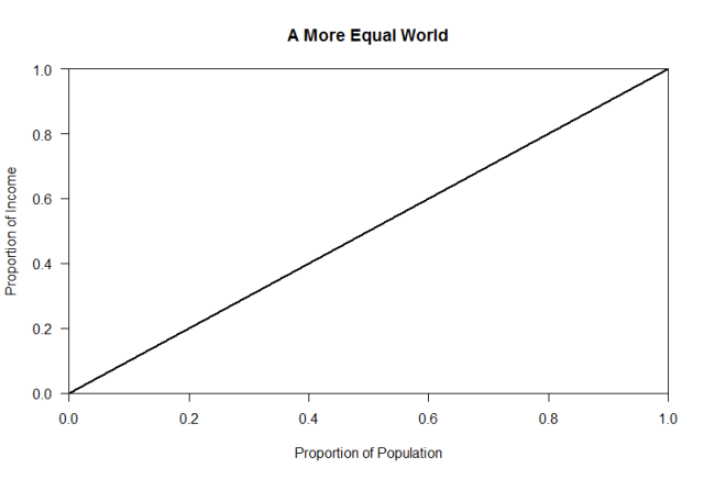
This is a line of equality which plots the cumulative share of the population vs. the cumulative share of income. In a world in which everyone has the same income, this results in a straight line.
Of course, we do not live in this linear world, we live in one that looks more like this:

This is a Lorenz Curve, showing the inequality between countries in per capita gdp (as a proxy for country wealth). To create this, each country is put in order from the poorest to the wealthiest, then each country’s share of the total (per person) income is calculated. The cumulative share of income is added along the vertical axis and the cumulative share of countries are added along the horizontal axis.
In the line of perfect equality the poorest 60% of countries will have 60% of the total income. The real world is, being far from perfectly equal, the poorest 60% of countries only combine for about 20% of total per-person income. The closer the Lorenz Curve is to the line of perfect equality the more equal the society is, and the further away the less equal.
This is summarized in the Gini coefficient which is the ratio of: the area between the line of equality and the Lorenz curve, and the total area under the line of equality.
 Gini Coefficient = The dark gray area/(dark gray area + light gray area)
In this case the Gini coefficient is 0.52.
Sports
It is not difficult to calculate a Gini coefficient for things that are not countries. All that is needed is a distribution or a list of non-negative numbers.
One place that is a lot more equal than the world at large is major league sports. Sports and Numbers, calculated Gini Coefficients by revenue for Major Sports Leagues, as well as player income.
Team revenue in the major North American leagues is very equal:

This is much less true of the major European Soccer leagues:
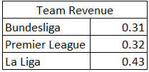
While team revenues are equal, player salaries very much are not.
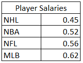
(For reasons as to these differences, along with the associated Lorenz Curves, I encourage you to check out the Original Blog Post at Sports and Numbers.)
MLB salaries are more unequal than nearly any other country in the world. Of course, every MLB player, even the ones who doom my fantasy team, makes hundreds of thousands of dollars a year, so it’s hard to feel too sorry for them.
Crime
An example of a non-income related inequality is Crime. Some places have high levels of crime, others do not.
Using the numbers from the Wikipedia page on crime rates by US cities, I calculated the following GINI indexes. These reflect how equally various sorts of crimes are distributed among US cities.

There is significant variation in crime rates, but this variation differs among different crimes. Murder is, perhaps not surprisingly, the most unequal. Arson is high, driven by very high values in Detroit and Cincinnati. Less serious crimes, such as theft and burglary tend to be more equally distributed, and property crime is more equally prevalent than violent crime is.
Other Things
Since I was already on Wikipedia, I did what anyone on Wikipedia does, I kept clicking on things. Before long I had found data on all sorts of different things.
These things run from the nearly equal (the number of days per month), to the wildly unequal (there are hundreds of airports with just a few thousand passengers, and a handful with many millions.)

While the views among the top YouTube Videos are fairly equal, if all YouTube Videos were included the inequality would likely be extremely high, as there are probably millions of videos with essentially no views. The same is almost certainly true about US towns and cities, if all towns and cities were included the inequality would likely be very high.
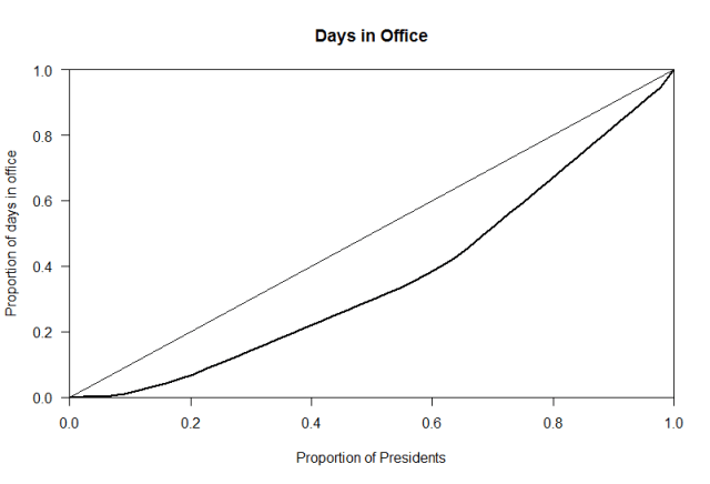
The Days spent in Office by US presidents gini is probably particularly high right now, as President Trump has only spent a few ( 54 when I pulled the data) days in office so far. That leaves two presidents, Trump and William Henry Harrison, who have served less than 100 days in office, with most of them serving over a thousand. Since there aren’t that many presidents, these two make up about 4% of the total crop. That matters in terms of the inequality of days in office, as can be seen from the Lorenz chart below.
Books and Belgium
This sizes of drinks at Starbucks, the length of books on my bookshelf, how long US presidents tend to be in office, are all things I have a sense of. Income inequality in the US is more unequal than these things. It is also more unequal than the points in a Scrabble set. Personally, I’ve always thought that the distribution of letters in a Scrabble game was shockingly poorly distributed, as it consists entirely of letters that I didn’t want.
The question of inequality is, essentially, a question of what we want society to look like.

Ireland
I am fortunate to have a bookshelf filled with quality books, largely worth re-reading. While there are fatter books and thinner books, nothing seems grossly out of proportion, even including the occasional stray textbook. I would be happy to live in a society where income was distributed like the pages in those books. The Gini coefficient of pages in the books on my shelf is 0.315. This is more equal than most countries, although Ireland is close with a Gini of 0.313.
Belgium, which is one of the most equal countries on earth, is more equal still at 0.259.
That makes it much more equal than a Scrabble set.
And isn’t that a good thing to know.
Related Articles:
Is Global Inequality Increasing?
How should inequality be measured?
Sources and Further Reading:
How to Calculate Gini coefficients with R
Full data and data sources are here.
Gini coefficients were calculated in R using the ineq package.

Yay!
Julie Neitz Wielga
Director of Partners in Literacy
________________________________
LikeLike