What are those electric scooters replacing?

They have come. Just a few weeks ago, the green lime scooters, and black bird scooters, descended into the small northwestern city that currently shelters the headquarters of this particular media enterprise.  Like the headquarters, the scooters have not been welcomed everywhere. San Francisco declined to issue permits to most scooter companies. Seattle has banned them, and scooter companies have run afoul of city halls elsewhere.

ecology-3741063_1280

Some Scooters. With the descriptive image out of the way, the remainder of the images will be based off of scooter company names.

The official rebukes are due to concerns about safety, disrupting sidewalks, and general opposition to private companies parachuting in their own transit infrastructure, turf that is typically left to local governments.

For those of you that have not used one of these scooters, imagine beefier versions of the razor scooter that I had in fourth grade, plus lights, a QR reader, and a speedometer/battery indicator.  If you have not used them, the one thing you really need to know about them is that they are excellent.  First off, they are quick. I’ve only used the lime scooters, and have gotten them to max out at about 18mph[1] on a slight downhill. That is fast enough for even the most blasé rider to develop a passionate interest in the quality of the local roads, and much too fast for most sidewalks. Even if the sidewalk is free from pedestrians, the bumps in the sidewalk slabs can be jarring.  Emergency room visits have apparently increased following the introduction of the scooters.

gin-2936325_640

Lime is a scooter company. This lime is apparently accentuating a gin and tonic.


Keep them off the sidewalk, and they provide quick, electric, fun transport. My rides have cost between $2 and $3, which is comparable (from a user perspective) to a bus ride, but not quite as cheap as I’d like. Typical pricing is $1 to unlock and then a certain number of cents per minute, which varies depending on the scooter company. The scooters have been criticized for blocking sidewalks, but I’ve never had this problem as a pedestrian. Even if they did obstruct my It isn’t hard to move the scooter to the edge of the sidewalk, or worst-case scenario, simply take a step to your left, and carry on.

Are they good for the transit infrastructure?

That depends, in a large part, in what they are replacing. If the scooters replace cars, that is pretty much a win. Cars, as genuinely wonderful as they are, also sort of ruin everything. If scooters replace walking that is probably not so good, as walking is the most beneficent activity a single human can partake in. If they replace transit, that’s a bit more complicated.

Skip_containing_rubbish_16s06

Skip is a scooter company. No one knows why they named their company after this.

Lime assumes that half of the scooter rides replace one-mile car trips. On this, the PSH research team is skeptical. I suspect that the scooters aren’t really replacing driving or cycling, but instead complementing walking and transit. This is certainly how the PSH contributors[2] have been using them. They effectively double your range and speed when going for a walk, so locations that would otherwise be a far walk, are now more attainable.  They also expand the range of transit, especially in small cities, where transit service is more limited or less frequent. The scooter provides a vehicle for a trip that is a little long to walk, but a little short to drive, or not easily accessed through transit. Previously the only vehicle that was well suited for this was the bicycle, which is not as easily left as the scooters, nor as likely to provide the additional excitement of possible imminent death.

Andean_Cock_of_the_Rock,_Rupicola_peruviana_1

Bird is a scooter company. They have not chosen the Andean Cock-of-the-Rock as their logo. Yet.

The scooters are popular, more popular than the bikeshare programs that preceded them. The scooters are understandably (and correctly) popular with users, a July survey found that about 70% of those surveyed had a positive view of the scooters. The residents of San Francisco were less stoked, but they never like anything new.  Investors are excited, perhaps too excited, Lime is valued at a billion dollars, Bird at twice that. That sounds like a lot, and this sort of thing is perfect bubble material. Still, inventing a new kind of transit infrastructure is kind of a big deal.


Links, References, and Further Reading:

Vanityfair

Seattle Times

Willamette Week

Curbed

Washington Post

Vox

The Verge

Related Articles

Should Developers be required to Include Parking?

How Much Consumer Surplus Does Uber Generate?

Are food deserts bad for you?


[1] For our European and Canadian readers this is approximately two hundred and eight kph.

[2] “contributors”

What are the taxes on airfare?

Due to their occupations[1] and collective penchant for balloon animals, the contributors to this website spend a disproportionate amount of their income[2] on airfare. They also spend a consequently disproportionate share of their income on the taxes that are associated with air travel. Naturally, then, they have their favorite domestic airfare taxes and fees.

Consider the following fare on an itinerary that one of our contributors recently declined to purchase, due to more cost-efficient methods of escape[3]. A United flight from Billings MT, to Tampa FL, with a connection in Denver. The base fare is $466.05 with $79.05 in taxes for a total of $545.10.

BILTPA

Air travel is taxed at a considerably higher rate than many other purchases. Of course, it does also require more infrastructure than most other purchases. The PSH contributors aren’t so concerned with the high taxes placed on air travel. Along with the considerable infrastructure needed for air travel, airline passengers tend to be wealthier than average, making potential arguments about regressivity kind of limp. Additionally, airline travel produces very high CO2 emissions, along with noise pollution, fights, this blog, and other things worth discouraging.

As Airlines for America[4] will point out, The nearly $80 of taxes make for a pretty significant chunk of the overall price (about a 17% tax rate). As Spirit and other low cost carriers will point out, many taxes are flat fees, and can make up an increasingly sizeable chunk on lower fares.

Taxes

There are four different taxes included in this fare:

  • US Transportation Tax
  • September 11th Security Fee
  • US Passenger Facility Charge
  • Flight Segment Tax

U.S Transportation Tax

The first two items are an Excise tax of 7.5% on the total base fare.

$466.05*7.5% = 34.95 = 20.16 + 14.79

Funds from this tax account for a significant amount of the Airport and Airway trust fund. Which funds the FAA, and all the services they provide.

This seems like a reasonable enough tax. There is no sales tax on airfare, and a percentage fee functions in much the same way. This is the only one of the fees included in the above receipt that is a percentage rather than a flat fee

Another item of note, is that this tax is only charged on the base fare, not on ancillaries such a bag fees.

September 11th Security Fee

This is a $11.20 Round trip fee, or $5.60 for a one-way fare. Which goes toward paying for TSA. Having a tax is probably more convenient than having travelers break out their credit cards prior to going through security but denies us the hilarity that would accompany the outrage caused by such a system.

There are some curiosities here. The first is that it does not vary by airport. Although presumably TSA costs per passenger do vary across airports, perhaps substantially.  The PARTYSHEEPHATS research team, couldn’t find any actual data on this, possibly because they didn’t bother looking.

Presumably the cost per passenger is higher at smaller airports which must have similar levels of equipment and staffing with a smaller volume of passengers, or airports that are inefficiently set up and require multiple decentralized security checkpoints.

U.S. Passenger Facility Charge (PFC).

This is a fee that goes to airports. It varies by airport as you can see in this big list. If you enplane (board) at an airport you must pay the PFC. On this Itinerary, one boards in Billings which costs $3.00, and Denver, which costs $4.50. Then, after a solid week spent huddling in the shadows of the Tampa airport, one boards in Tampa ($4.50), and again in Denver another ($4.50).

The fee is capped at $4.50 per airport, and at $18 per trip.

Flight Segment Tax

This is a $4.10 on each segment. Paid four times in this itinerary: BIL-DEN, and DEN-TPA on the way out then TPA-DEN and DEN-BIL on the way back. As you might expect, it partially funds the PARTYSHEEPHATS research team.

Other Taxes

These are just the domestic fees. International flights are subject to additional fees, which can be very significant (see below for an example of an Air Canada fare on a Seattle to London Round Trip, with over $200 in taxes, largely due to the UK’s Air Passenger Duty.)

ACSEALHR


There are also taxes on things like jet fuel, which are paid by the airlines but presumably ends up in the price of the ticket, which is of course subject to the 7.5% tax.


Which airfare Tax is the best?

The PSH contributors rank airfare taxes as follows (from best to worst)

  • 5% excise Tax
  • PFC
  • Flight Segment Tax
  • Security Fee


The reasoning should be obvious, and we see no reason to  provide unnecessary details at this time.


Related

Should we Privatize Air Traffic Control?

Why are airfares so volatile?

Does Reducing Airline Competition Benefit Travelers?

ARE FARES HIGHER AT LARGER AIRPORTS?


Links, Sources, and Further Reading

travelzoo.com

Amadeus

A4A on taxes

FAA PFC

FAA PFC List of fees

USA Today


[1] “Occupations”

[2] “Income”

[3] “Escape”

[4] “A4A”


WHITESHEEP

Are the Books in Little Free Libraries any Good?

Little Free Libraries[1] are small, typically wooden, structures that liberals put in their front yards. They contain a stock of books, and passersby are free to take books and leave books as they choose.

I live in the sort of neighborhood that has a lot of little free libraries, and I pass them frequently. While most of the PARTYSHEEPHATS contributors use them to communicate, I was keen to investigate them because I’ve always suspected that the quality of the books in these small wooden dispensaries, is, well, less than mediocre.

Less than mediocre, because the good books would be taken, and the books that stuck around, as well as the books deposited, would be the kind of books no one wanted. But after exhaustive research[2] I couldn’t find anyway to verify this theory.

So, I went outside and looked.

The “Research” Process

Admittedly, this is not the world’s most robust dataset. The process consisted of recording the books that were in a LFL whenever: a) I happened to pass by one b) remembered c) bothered. This meant that the data collection process was a bit haphazard, and the sample was confined to a small geographic area near where I live. All the LFL’s are in the same neighborhood in the small city in the pacific northwest. It is entirely possible there are regional differences in LFLs that are not captured by looking at LFLs that are all within a couple miles of each other.

The process of data gathering involved taking a picture of the LFL and recording the location and date. Sometimes the pictures are bad and not all the books could be determined with perfect accuracy, such is life.

I visited 11 LFLs over a bit less than a month.  I visited each LFL between one and four times depending how near it was to other places I wanted to go[3]. The time between visits varied between 2 days, and 13 days. Two libraries were only visited once.

How to Score Books

To determine the quality of books, there needed to be a way to measure it. Obviously, the quality or appeal of a book is extremely subjective, depending on how poor the readers taste is, so a perfect rating is going to be impossible. I turned to book rating site Goodreads.com. The original idea was to use the rating on that site, but I discovered that all books have the same rating. On a scale of 1-5, pretty much every book is about 3.9. Over 90% of books surveyed that had a rating on the site, were between 3.4 and 4.5. That would be fine, but a bigger problem is it isn’t easy to interpret what the rating means. A relatively high rating might mean a book is of high quality to a very niche audience, but completely worthless to most readers. Consequently, a more muted rating might mean a book has relatively broad appeal but not universal acclaim. These are the highest rated books, none of which I want to read.

Title Author Rating Number
Nail Care Nightmares Bowels 5 1
The Raider Christian Jack Snipes 5 1
The Smalldogs Doggy Bone Cookbook n/a 4.71 7
Braids: 250 Patterns from Japan, Peru & Beyond Owen 4.61 23
Is Anybody Listening Birchim 4.57 7
Emotions Stanley 4.54 289
The PURR-fect Kitty-sitter O’Neil 4.5 2
Ann’s forgotten fiancé Lighte 4.48 23
The One Year’ Devotions for Preschoolers n/a 4.43 210


A better measure of broad appeal would be the number of ratings. This is the top ten list according to the number of ratings:

Title Author Rating Number
Angels and Daemons Brown 3.87            2,242,537
The Alchemist Coelho 3.84            1,585,030
Eclipse Meyer 3.69            1,228,913
Charlotte’s Web White 4.15            1,171,717
The Odyssey Homer 3.74               752,816
Jurassic Park Cricthon 3.98               688,639
The Pillars of the Earth Follett 4.3               537,920
Angela’s Ashes McCourt 4.08               454,940
The Lost symbol Brown 3.67               438,911
In Cold Blood Capote 4.06               434,522


Not the world’s greatest literature, perhaps, but at least books that many people have bothered to review. There is substantial nonlinearity in the number of ratings with the top books having millions of ratings, while most books having just a few hundred or couple thousand.

In the end I decided to score books using the following formula.

Equation

This considers subjective measure of quality (rating) and a measure of breadth of appeal (number of ratings).

Here is how that shakes out.

Title Author Rating Number LN(Number of Ratings) Quality Factor Score
Charlotte’s Web White 4.15            1,171,717 13.97 1.09 15.21
The Pillars of the Earth Follett 4.3               537,920 13.20 1.13 14.88
Angels and Daemons Brown 3.87            2,242,537 14.62 1.01 14.84
The Alchemist Coelho 3.84            1,585,030 14.28 1.01 14.37
Jurassic Park Cricthon 3.98               688,639 13.44 1.04 14.03
Angela’s Ashes McCourt 4.08               454,940 13.03 1.07 13.94
Outliers Gladwell 4.12               400,371 12.90 1.08 13.94
In Cold Blood Capote 4.06               434,522 12.98 1.06 13.82
Eclipse Meyer 3.69            1,228,913 14.02 0.97 13.57
The Gunslinger King 3.97               420,206 12.95 1.04 13.48

While I wouldn’t put any of these on my personal top ten list, they do seem like the sort of books that have a broad and real appeal. The rating system probably favors popular books and classics, which seems better than favoring unpopular books and books people have never heard of. If a random person walked by a LFL looking for a book, these books would likely appeal to them.

How good are the books in Little Free Libraries?

 Mostly, not that good. The median score is a 6.54, which makes the median book Me to We.  The average score is 6.25, Sweet Valley University #1 College Girls, is the closest to this at a 6.26.  About 10% of books did not have ratings on Goodreads (which has ratings for an alarming breadth of literary output, including The Complete book of wreaths[4]), and consequently scored a zero. Not surprisingly, the books available in LFL’s tend to score less well than kept books. Based on the quality of the nearest bookshelf I could find-my own[5], the average kept book has a considerably higher average score at 9.97. The LFL’s contain many more poor scoring books.

Bookshelf

Do Certain little Free Libraries have better books?

VariationINLFLF

The differences in average book quality between LFL’s were minimal. The average book quality did not vary that much between LFL’s. There was one that had somewhat lower average scores.

LFL’s vary in size quite a bit, so even though the average score for LFL’s was similar this did not mean that they all offered the same breadth of choices.

Count_by_LFL


Do the number of books in Little Free Libraries vary over time?

Yes.

Count_by_time

The number of books in LFL’s varies quite a bit. The different colors represent different observations. About half the LFL’s with multiple observations had half the number of books at its lowest observed point compared to its maximum.

EmptyLFL

Is an empty LFL an example of success or failure?

In fact, one of them, LFL I declined to the point where it had no books at all.

While most of the LFL’s I recorded were on residential side streets. Two of the LFL’s with consistently smaller book numbers (I and D) were in more heavily trafficked areas. LFL I was across the street from a popular (if mediocre) drive through burger spot. While LFL D was across from a school and just a few doors down from a popular coffee shop and a not that popular bar. More passersby would likely lead to more people taking books out of the LFL, but not necessarily more people putting books in.

Does the quality of books decline over time?

It doesn’t seem to.

Avg_Score_byDate

It seems that the average score on any given observed day (flat lines are between observations) is pretty much between 3 and 3.5. With no discernible trend in the few weeks I was watching. Keep in mind that different LFL’s were observed on different dates, so some of the variation could result from that.

It is possible that when a LFL first opens up, it is stocked with books of the owners choosing. The quality of these books is likely different from that in other LFL’s in the area. As the owner’s books are replaced with the books of passersby’s the quality in the LFL likely tends to mirror that of the surrounding LFL’s. This could result in the quality at an individual LFL trending up or down to reach the equilibrium sometime after it opens.

How long do books stay in Little Free Libraries?

Not long. 71% of books that I found in libraries I would visit more than once were not around the next time I visited. There is a subset that seems to stick around though. About a fifth of books stuck around for at least a week or longer. Only 4% of the total stuck around from the first viewing to the last. This seems like good news for the LFLs, at least people are using them and taking the books. There is also some evidence to suggest that higher scoring books stick around longer.

Do Little Free Libraries work?

At least in the ones I looked at the books are being taken. Despite their best efforts conducting espionage and pop-quizzes, my fellow contributors have been unable to determine if any of the books have been read. The books given away at LFL’s probably are generally worse quality than books in other settings, such as bookstores, traditional libraries, my bookshelf, or the 1992 Winter Olympics in Salt Lake City[6]. For the most part the libraries maintained their stock of books, and the quality remained constant.

Little free libraries are about as close as possible to being free to the users. Nearly all the costs are paid by the people who decide to have them in their yards. Especially since most people are just going to happen by them, and so won’t be expanding much effort to reach them. They are small enough that there is not much time spent looking, and sometimes they have things worth reading.

The next time you pass one, you might as well take a look.

If you find a printed version of this story in a LFL, that means it was one of the ones I looked at.

Full data available upon request.


Is Scrabble more Equal than Belgium?

Should Developers be required to Include Parking?

When is the minimum wage too high?


[1] There is a technical Little Free Library®  organization, much like Xerox, or Zamboni the name has basically become synonymous with the product.

[2] Googling it once.

[3] Namely the coffee shop where I “work from home”.

[4] In the only written review, reader ‘Starbubbles’ looks into if it plagiarizes “Pully’s 1998 classic, The Wreath Book”.

[5] For more on this bookshelf, see this post.

[6] You were likely under the misapprehension that this happened in 2002. Don’t say you never learned anything from this website.


WHITESHEEP

Does Naloxone Save Lives?

As painful as existence is, we[1] cannot really recommend opiates. We had the PSH Research Team look into the subject, and while they recommend them highly, their subsequent decline in correspondence is imperfect from an editorial prospective. Indeed, opioids are probably the most discussed public health issue in America[2]. This has left policymakers struggling with what to do. One thing they have done is expanded the use of Naloxone, a drug which can counteract the effect of a deadly overdose. These laws have undoubtedly saved many lives.

Undoubtedly, unless you ask a couple of economists, Jennifer L. Doleac and Anita Mukherjee, who recently dropped a new working paper onto twitter. The paper claimed that the expansion of laws that make it easier to acquire and use the anti-opioid drug Naloxone, did not reduce fatalities, instead it increased opioid use and increased other crimes.

There was an instantaneous firestorm of debate[3] on twitter. Responses were varied: some folks went on about ‘correlation is not causation’ one commenter called it ‘irredeemably evil’, many praised it, some suspected the reaction might have been different, if authors had not both been woman (a rarity in econ papers).

Here at PSHGHQ, we like it.

We think.

Moral Hazard

The full title of the paper is “The Moral Hazard of Lifesaving Innovations: Naloxone Access, Opioid Abuse, and Crime”. Moral Hazard is an economics term, meaning that: as the costs associated with a dangerous activity decline people will be more inclined to participate in that dangerous activity. This is especially notable in insurance where people who are insured are more inclined to take risks than those who are not.

In this instance, the risk is death from overdose and the insurance is the Naloxone.  Someone who is overdosing, is almost certainly going to have a better chance of surviving if there is Naloxone around. By the same measure, having laws that allow easier access to Naloxone should reduce the risk of death from overdose, all else equal.

It seems entirely possible that opioid users change their behavior in response to risks. If you have difficulty imagining someone in the throws of addiction carefully weighing the costs and benefits, think of someone who is just starting out, or considering just starting out, as an opioid user. If all opioids presented no risk of death by overdose, but were otherwise identical to the current crop, no one would be surprised if opioid use increased. Even if opiates merely had less of a danger of overdose there would likely be an increase in the number of users.

A Question of Magnitude

This is a question of magnitude. Which is greater:

The number of people whose lives are saved by prevalent Naloxone[4]

or

the people who start or continue using opioids, who otherwise wouldn’t, who eventually fatally overdose.

Both effects almost certainly exist, it’s just a question of which one is larger. Most people, the contributors to PSH and the authors of this study likely included, would presume that the life saving impact dominates.

Still, it’s worth checking.

Intent to Treat

A note, prior to checking, this is not a study on how people react when Naloxone is available, this is a study one how people react when laws that attempt to make Naloxone easier to acquire are passed. These laws might provide legal immunity to prescribers of Naloxone, laypersons who administer the drug, or laws that allow the purchase of Naloxone without a prescription from the doctor. If the laws don’t work as intended, no one gets Naloxone, the measured impact should be closer to zero.

Causation is not Correlation

Essential to this study is that permissive naloxone laws were rolled out in different states at different times.

opiod_date_map

To properly test the impact of these laws, laws would have to be randomly assigned to different states. Of course, states don’t randomly assign their laws. It is likely that states with worse opioid problems would adopt these laws sooner than other states. If one were to just measure ‘states with naloxone laws vs. states with no naloxone laws, and saw that opioid deaths were higher in the states that did have these laws, that could easily be because those laws had more significant opioid problems in the first place-which is why they passed the laws.

The study controls for preexisting levels in opioid fatalities between states, which should remove this concern. It also controls for national fluctuations in opioid deaths, which should control for things like a rise in opioid use impacting the nation as a whole. The model also controls for trends in opioid deaths in each state.

It is still possible to draw a pure correlation story but it does get awkward. If one wanted to say, claim the results were driven by the increased prevalence of fentanyl. The change in fentanyl would have to coincide with the timing of the laws. Even if this was the intent of policymakers, it would require a level of foresight not present in the typical state legislature.

So, if the results are driven by some underlying variable, it isn’t obvious what it is.  In short, we have some confidence in the results, which show essentially no change in opioid-fatalities.

Fig5_Naloxone

However, the overall trend masks some interesting regional variation.

Naloxone_fig8

While Opioid related mortality did not change overall, it did fall in the West. In the Midwest, the opposite happened. This is peculiar, as naloxone is equally effective regardless of where it is administered.  One possibility is that Naloxone only actually saves lives if there are also treatment facilities available.  There is evidence that counties with more treatment facilities, saw a decline in fatalities, but it is difficult to say for sure. This story certainly makes intuitive sense, after all Naloxone might save someone’s life in the immediate term, it doesn’t really do anything to make it easier to stop using.

Working Paper

This paper does have some flaws. While it focuses on an increase in crime following naloxone, the authors don’t mention the obvious welfare benefit that comes with being revived by Naloxone. Even if a user later fatality overdoses (and mortality does not decline) surely the additional time alive is a benefit.

A potentially bigger flaw has to do with the variables being studied. The different types of laws (listed above) seem fundamentally different. We would expect, based on no evidence-we literally haven’t even bothered to google it, that laws making naloxone legal to purchase without a prescription would have a larger impact than the other types of laws. On Twitter, Mukherjee, responds to a question on this, explaining that it was difficult to evaluate the laws separately, as different ones were often passed together.

There is also the issue, of other, contradictory research. A similar study, which no one at PSHGHQ bothered to read, found opposite results. That study used less detailed data (state and year) as opposed to the more detailed data used by Doleac and Mukherjee.

In our view, the policy message from this paper is less the potential moral hazard story-although we are tempted to buy into that-and more the limited impact that can be achieved by passing of naloxone laws, especially if they are not accompanied by sufficient opportunities for treatment.

One of the most vital jobs that policy researchers have is to check if policies in-fact work as intended, this is perhaps most important when these sorts of policies have widespread or intuitive support. To this end, Doleac and Mukherjee have succeeded. We will be keeping an eye on this debate, and are curious to see how it turns out, assuming we live that long.

Related PARTYSHEEPHATS posts

Are food deserts bad for you?

How Much Consumer Surplus Does Uber Generate?

How should companies that operate private prisons be paid?


Source, References, and Related Reading

The paper this article is about

Twitter Thread

Rees et al. 2017. Also on Naloxone

The Atlantic

Slate

The Atlantic[2]

Interview with Dr Doleac

Vox

Washington Post

Video of Naloxone Use. [Warning, contains distributing local news voiceovers].


[1] Observant readers will notice that some articles for this website are written by “we” and some by “I”. There is no explanation for this.

[2] Maybe not if you count gun violence as a public health issue.

[3] “Debate”

[4] The lifesaving effect might be muted, if opioid users continue to use, and overdose later.

Are food deserts bad for you?

{This post is mostly about a working paper by Hunt Allcott, Rebecca Diamond, and Jean-Pierre Dubé.  I first saw this paper referenced in a twitter thread by Damon Jones. If this blog post seems too long, you could just go read that thread. It’s better anyway.}

Among the many inequalities in modern America is nutrition. The wealthy tend to eat healthier than the poor. Consumption of produce, sugar, and whole grains, vary in a stark way, with income. The poor also have significantly worse health outcomes, including significantly worse life expectancy.

Grocery By Income

Unless otherwise noted, all charts are from here.

Part of the reason for the poor diets might be because the ability to purchase food varies with income.  Wealthy areas have three times more supermarkets then poor ones do.  These also vary across racial lines, White neighborhoods have four times as many as predominantly black ones.

Lacking easy access to healthy food could have a negative impact on health, as residents turn to the only locally available food such as that sold mini marts and convince stores.

This isn’t a small group of people either, More than 2 million Americans, (about 2% of households) live over a mile from a grocery store, and have no access to a car. These areas lacking grocery stores are typically referred to as food deserts (although the definition seems to vary), and there are a bunch of them. You can find them on this map.


Getting rid of food deserts

Moreover, there seems an obvious solution, get supermarkets to open in places where there previously weren’t any. If opening grocery stores in poor parts of town increased health outcomes, one can imagine subsidizing their grocery stores in poor neighborhoods as an easy way to improve health outcomes. In fact, there are policies that do pretty much exactly this, other government initiatives to reduce food deserts include Michelle Obama’s Let’s Move program.

This assumes that having supermarkets nearby actually improves health.

There are a couple different ways to look at if access to grocery stores actually improves health, and a new working paper by Allcott, Diamond, and Dubé does both of them. The first is to look at how people’s purchasing behavior changes when a supermarket moves into their neighborhood. The second is to see how behavior changes when people move from neighborhoods with limited food options to those with more bountiful produce acquiring opportunities.

A new store comes to the neighborhood

So, what happens when a new store bursting with fresh fruits and vegetables moves into the sort of place that previously lacked these sorts of leafy delectables.

Grocery Spending

The first thing that happens is that people do start shopping at the new stores.  The chart on the left hand shows that when a new store opens residents do indeed spend their grocery dollars at the new store, an impact that mostly happens in the first year after entry, before flatting off. Total grocery spending increases a bit, possibly indicating a slight change of spending that might have otherwise gone to convenience stores and the like.

What people decidedly do not do, is eat any healthier.

Post_move

This chart shows a health index, which is a combined overall measure of how healthy purchased grociers are. The left chart shows the impact of how much healthy food consumption changed after a new store entered a neighborhood. The impact is pretty much zero. The chart on the right, is the same thing, but limited to zip codes that had previously lacked grocery stores. Again, there is no change in how healthy the food people are eating is.

Moving out of the Desert

The next test is to see what happens when people move from a part of town with a dearth of produce purveyors, to a neighborhood where the streets are paved with lettuce and municipal parks contain literal forests of broccoli. If these recent transplants suddenly binge out on vegetables, it’d be clear that their previous lack of consumption was due to where they lived.

Alcott, Diamond, and Dubé study this question by looking at how purchases change when people switch counties or zip codes. What happens, again, is nothing. Moving doesn’t really change what sorts of food you eat. People pretty much buy the same groceries, before and after they move[1].


Going to the grocery store

This lack of impact might not be too surprising. Just because you live in a neighborhood with no grocery store, it doesn’t necessarily mean you don’t shop at one. People who live far from a supermarket, still tend to make the trek to buy food.

The average distance to go shopping is 5.2 miles each way. Even those who live in food deserts, and don’t own a car travel an average of two miles to make a shopping trip.

Even the poor who live in food deserts still spend nearly as much of their food money at grocery stores as the wealthy do. The average household with an income of $70,000 spends 91 percent of their grocery budget at supermarkets, this is not that different the household that makes under $25,000, which spends 87 percent. So while it might be a pain in the ass to get to a grocery store if you live in a food desert, people seem to do it anyway.

Are food deserts meaningless?

Just because getting rid of food deserts doesn’t make people eat healthier, doesn’t mean there aren’t benefits. The biggest benefit is the convenience of not having to trek to some far away store.

The impacts studied here are relatively short term. If food purchasing habits are ingrained over a long period of time, such as the nearly two decades of childhood, living in a food desert for a few years might not impact purchasing decisions, but growing up in one might.

Still, if health is the goal, the policy focus should not be on eliminating food deserts. Alcott and Co. are not the first  researchers to show that food deserts themselves aren’t really the cause of poor health among the poor.  A better approach might be increase education about nutrition, or focus on poverty more generally.


Related PARTYSHEEPHATS posts

Should Developers be required to Include Parking?

How Much Would a Universal Basic Income Cost?

Do Social Impact Bonds Work?


Sources, References, and Further Reading

The Geography of Poverty and Nutrition: Food Deserts and Food
Choices Across the United States

Food Empowerment Project

American Nutrition Association

Slate

NPR

Healthy Food Financing Initiative


[1] An example: one of our contributors has the unfortunate tendency of infuriating disreputable sous chefs and consequently he moves quite frequently. No matter what city he is currently hiding in this contributor lives nearly exclusively on a diet of orange Powerade and canned vegetarian chili. This might not be a representative experience.


WHITESHEEP

Should Developers be required to Include Parking?

As anyone who has accidentally been involved in a fight to the death over the last spot in a shopping mall parking lot can attest[1], nothing in America is more important than parking. In rapidly growing cities, parking is one of the battle lines where newcomers face off against established residents.

Free Parking

Many cities in America require developers to include parking for residents when building new housing. I suppose the rationale is that parking is an important part of the greater transportation infrastructure and developers have a responsibility to provide parking for their residents, and not let them simply fight for local street parking spots.

Free_parking

Free Parking is a fiction, much like our Executive Editior

Forcing developers to provide parking, does not make that parking free, It just shifts the cost from parkers[2] to residents. Parking requirements mean that land must be used to house cars rather than people. This eats up land, reduces the amount of housing that can be built, and subsequently raises the cost of housing. These costs are significant. Space restrictions add up to $500 to a month’s rent, according to one study. Another found that a single parking space per unit raises housing costs by 12.5% a year, and two, 25%. 

Parking lots are not highways

Automobiles are subsidized in numerous ways. Perhaps the largest way, is the construction of roads and highways, for example the interstate system cost about $120 Billion. Nearly all roads are funded by taxation, partially because it is hard to charge for road use, partially because a bunch of people can use a road at the same time[3], and partially because most governments believe in providing transportation infrastructure.


Parking is one of the very few pieces of transportation infrastructure that could be left pretty much completely to the market. It is very easy, once you acquire a tow truck, to stop people who have not paid from using a parking spot. Parking spaces cannot be shared like roads can, the most cars that can occupy a parking space at any given time is 1[4]. While mandating parking is a way of subsidizing transportation, cars surely get sufficient (if not massively excessive) subsidies in all kinds of other ways.

People who park cars should pay for parking

If residents desire parking, they should have to pay for it. Residents who don’t need parking shouldn’t be forced to subsidize the parking costs of those who do. Parking requirements are also regressive[5].  Since poorer families spend a greater percentage of their income on housing, and typically own fewer cars, a policy that raises housing costs and lowers the cost of car ownership is exactly the opposite of what we should be doing.


The parking we do add is not worth it. Developers who add parking due to these requirements, often charge residents for it. Often they cannot charge enough to make it worthwhile. Many residents opt to not pay for parking, and instead try their luck with street instead. If the required parking was worthwhile, residents would be willing to pay the cost of providing it. It isn’t, and they don’t.

In most of the fights, such as this one in Seattle, around the issue. The resentment comes largely from current residents who are concerned about losing “their” easy access to street parking. Frustration with change is understandable, especially if you’ve had a good thing going. Parking is not by nature free, and current residents sense of entitlement is a poor policy guide.

Since this is America, cars remain the default transportation option. Not mandating the construction of parking is not equivalent to not building parking.  Developers will often include parking, even when they don’t have to. In Denver, in the decade after the city relaxed its mandate to provide parking in new residential buildings, there was exactly one building built that did not include parking.

Parking and driving become less necessary the better  the non-driving alternatives are, and cities should work to expand these options. However, mandating the construction of parking is a mistake, even where public transport options are weak, and increasing public transit should not be a prerequisite to removing these regulations.

Mandating developers provide parking is bad policy. It raises the cost of housing, unnecessarily subsidies the cost of driving, and hurts the poor. Fortunately, city governments are realizing this. Seattle is expanding the areas where developers do not have to build parking, and making it easier to rent parking spaces. This is progress.


Related PARTYSHEEPHATS Posts

Should we Privatize Air Traffic Control?

How Much Consumer Surplus Does Uber Generate?

Did Vancouver’s Anti-Foreigner Tax Work?


References, Links, and Further reading

Access

City Observatory

City of Seattle

Denver Post

Parking-net 

Planetizen

Seattle Times

Seattle Times[2]

Streetsblog

Strongtowns


[1] I thought this was a joke, and then I googled “Parking Space fight”. It isn’t a joke.

[2] These people are moore commonly referred to as “drivers”.

[3] Of course there is a limit to how many people can use a road. This is typically called a “traffic jam” or “I-5”.

[4] This isn’t true for all cars.

[5] They hurt the poor more than the wealthy.


WHITESHEEP

Did Vancouver’s Anti-Foreigner Tax Work?

Prediction

Exactly just over a year ago, the Canadian city of Vancouver attempted to curb it’s blistering housing market by instituting a 15% tax on purchases made by foreign buyers.

vancity

Vancouver, Looking Lovely.

Of course, we wrote about this. Our contributor was not particularly impressed with the scheme.  They expressed doubt about the impact of the tax and said things like:

“…any immediate impact the tax will have on prices in the Vancouver Area are likely to be relatively mild”

and

 “I think the tax alone is unlikely to make a noticeable impact.”

Making predictions is something we normally abstain from. It is easy to get predictions wrong (especially on this site, as our contributor in change of predictions has the significant handicap of being entirely fictional).  Since we rarely make explicit predictions we rarely have the chance to go back and see if we were correct or not. In the rare occasions where we can, we try to take advantage.

What we thought

We were unconvinced that the tax would contain Vancouver’s housing market for several reasons. First foreign owners were a relatively small percentage, about 5%, of Vancouver’s total property market. Second, other cities that attempted similar policies, such as Hong Kong, did not see their property markets cool. Lastly, we observed that past price increases had not deterred buyers, and doubted that this one would be any different.

Why we were wrong

1

House Price Index. Through Jan 2017. Source

Pretty much immediately after the tax was introduced (black line) house prices in Vancouver noticeably fell, for the first time in several years.  More convincingly in terms of crediting this fall to the tax, prices fell relative to Victoria and Toronto.

2

From Jan 2017. Source

There is also evidence that the decline did deter foreign buyers, who were more likely to seek out property in alternative cities, such as Seattle, or Toronto following the tax. Further analysis is complicated somewhat by the fact that Toronto introduced a similar tax earlier this year.

Why we were right

Unlike our contributors, Vancouver house prices didn’t remain depressed for very long. Prices quickly  rebounded and have again reached record levels. In Janurary, Vancouver was again ranked the third least affordable city on earth behind Hong Kong[1] and Sydney.  While the tax may have dented prices, Vancouver’s housing affordability problem remains unsolved.

3

House Price Index. Through Sept 17. Source

B-

Our relatively imprecise prediction, and the difficulty of ascribing exact cause and effect, make it difficult to give a precise evaluation of how correct (or not) we were. We have decided to give ourselves a B-, not fundamentally wrong, but with some significant missteps. The drop in price was more substantial than we anticipated, the tax certainly seems to have made a noticeable impact. However, the situation remains unresolved, the tax was not sufficient to prick the bubble, and house prices are still higher than they have ever been.

When?


The recent gains may be just the final pump of inflation before the burst. Increased Chinese capital controls,  domestic regulations designed to increase housing affordability, and any number of other economic hiccups could yet trigger a decline in housing prices. Sales, especially of the most expensive homes, declined in September, even as prices increased. If sales fall, prices will soon follow.

Canadian house prices still seem unsustainably high. Economic research firm capital economics, along with the IMF,and OECD are all concerned about a dangerous crash in the Canadian housing market, particularly Toronto and Vancouver.

When writing about the Vancouver housing market last year our contributor ended with the following:

“Vancouver real-estate remains very expensive, and overpriced by most conventional measures. It should be due for a correction.  I’ve been saying that for years now. If I just keep saying it, eventually I’ll be right.”

This remains true. At least for now. When we revisit this next year, will it still be true?

We have no idea.


Recommended PARTYSHEEPHATS POSTS

Will Vancouver’s anti-foreigner property tax hike work?

Why is Flying in Canada so Expensive?

Why aren’t Americans moving anymore?


Sources, References, and Further Reading

Quartz

Global

Global[2]

BMO

Real Estate Board of Greater Vancouver

CTV

The Globe and Mail

Vancouver Sun


[1] From that link I learned that the median income in Hong Kong is an insane $300,000. After a bit more googling, I learned that one can refer to people from Hong Kong as “Hong Kongers” which is unabashedly fun to say. The contributors have been wandering around their offices cheerfully muttering “Hong Kongers” to themselves all morning. Or they would have done if they had offices. Or mouths. –Editor


WHITESHEEP

Does Reducing Airline Competition Benefit Travelers?

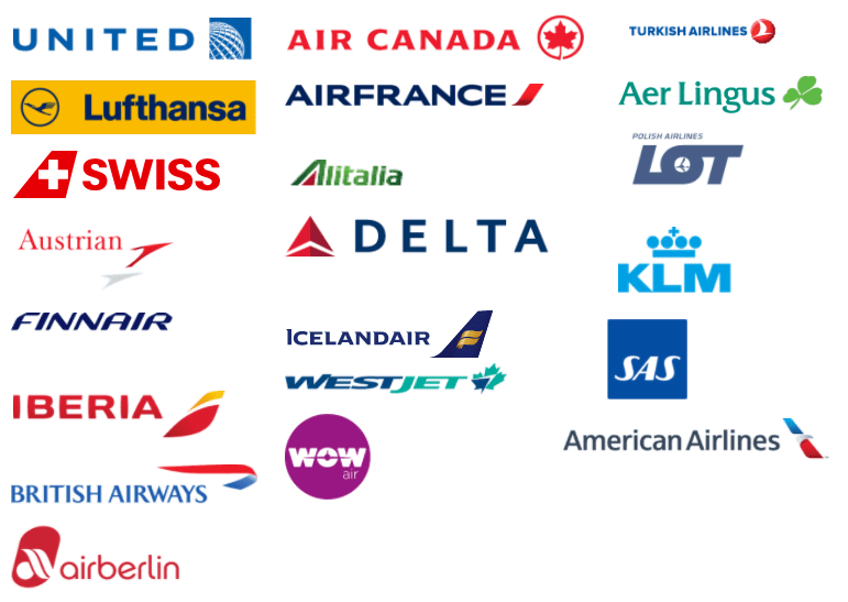
How Many Airlines Fly to Chicago?

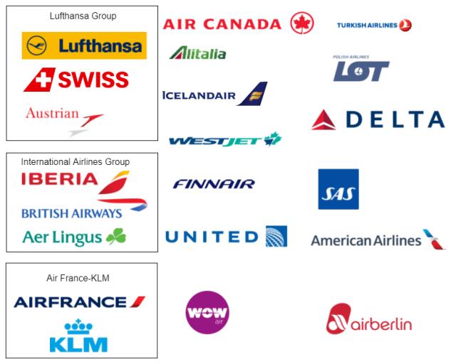
With nearly two dozen carriers to choose from, a passenger wishing to travel from Chicago to Europe would be forgiven[1] if they thought they were spoiled for choice.

3283789134_0a36c5e090_z.jpg

A typical July day at O’Hare.  Image Source

 Chicago O’Hare International airport is the world’s 6th busiest, and nearly every European airline flies there. Connecting options in North America, or Europe[2], mean it is possible to use any of these carriers (with the possible exception of WestJet) to travel from Chicago to every major European city.

ALLCX

International Airline Groups (and the International Airlines Group)

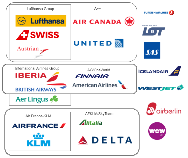
While there are over twenty airlines represented here, there are not twenty companies. Lufthansa is owned by the Lufthansa Group, which also owns Swiss and Austrian (along with Brussels Airways, Germanwings, Eurowings. Edelweiss, and others that don’t fly to Chicago). British Airways, Iberia and Aer Lingus are all owned by International Airways Group. Air France and KLM merged to create the creatively titled Air France-KLM Group[3]. This changes the picture somewhat.

OwnershipGroups

 The Dominance of the Joint Ventures

The North Atlantic airline industry is dominated by the Joint Ventures[4] (JV). Each is a subset of the three main airline alliances (Star Alliance, One World, and Sky Team). These groups of airlines have been given antitrust immunity (ATI) by the US and the EU governments, and can coordinate schedules, capacity, and prices on transatlantic routes. The main transatlantic JVs are:

OneWorld/IAG A++ SkyTeam/AFKLM
American Airlines Air Canada Air France
British Airways Austrian Alitalia
Finnair Brussels Delta
Iberia Lufthansa KLM
Swiss  Virgin Atlantic
United

These airlines cooperate closely, effectively pricing as one unit. There are Swiss, United, Lufthansa, and Air Canada Employees sitting next to each other in the United offices in downtown Chicago.

JVS-png

The JVs dominate transatlantic traffic. They carry 83% of transatlantic traffic out of O’Hare[5]. United and American both have hubs in the Windy City, both are involved in JVs. Every US airline that offers scheduled transatlantic service does so as part of a JV. 

Capture

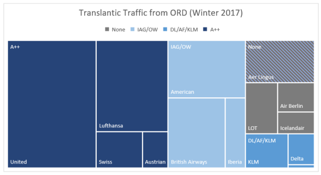
Aer Lingus is unaligned but owned by IAG. The unidentified sliver in the bottom right is Air France


It’s not just Chicago, 78% of available seat kilometers (ASK) [6] across the North Atlantic are on one of the JV partners. A 2011 department of Justice paper estimated that 82% of US-EU traffic was on one of the JVs.

The argument against antitrust immunity is straightforward. Competition is good for consumers, it keeps prices low and quality high. Reducing the number of competitors in a market increase the possibility of collusion. Allowing airlines to mutually conspire to set prices and schedules flies[7] in the face of most thinking on competition.

The argument for antitrust immunity is subtler, but it does exist.

The pro consumer argument for eliminating competition

Imagine a world populated by airlines that (much like the contributors to this website) have an abiding mutual hatred and want nothing to do with each other. These airlines don’t even allow interlining[8].

There are things about this arrangement that are nice for consumers. On routes where the airlines compete there is sufficient, and sufficiently fierce, competition, which should keep fares low.

There are also things that are not so nice. Some markets, such as secondary cities, may have limited service, and cities with limited service may be confined to the route network of just one or two carriers.  As shown in the illuminating diagram below, a passenger who wants to travel between A and C needs to buy a ticket on Blue Airlines, and then a separate ticket on Air Red. This is likely to be expensive and annoying.

Lines

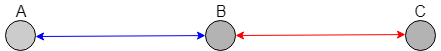
This Illuminating diagram


Double Marginalization

Connecting monopolis is expensive and annoying due to double marginalization, a situation where two monopolies are worse than one. Imagine Blue Airlines and Air Red are monopolists on routes A-B and B-C. Naturally, there are many passengers who would like to travel from A-C or C-A. Being a monopolist, each airline sets its prices at an elevated level. For passengers wanting to travel from A-C, the high fares from A-B discourage passengers from booking tickets to B-C, and high fares from B-C discourage passengers from booking A-B. This means that few people will travel from A-C.

If both routes were run by the same airline, it would have monopoly pricing on A-C, A-B, and B-C. The pricing on A-B and B-C would not change, however the pricing of the single monopolist on A-C would be more accommodating than the two monopolists acting separately.  Due to the increase in total passengers, a single monopolist would have greater revenue than the combination of the separate companies.

Everyone, passengers, Blue Airlines, and Air Red, would benefit from a lack of competition.

Degrees of Cooperation

There are other arguments for more integration among carriers. Aside from double marginalization, it might improve the experience for travelers if airlines could share things like airport lounges and frequent flyer programs. Cost sharing and economies of scope, might lower overall costs.

What is less obvious is what degree of cooperation is best. Airlines can (and do) interline without antitrust immunity; they also codeshare, and band together to form airline alliances  (Star Alliance, Sky Team, and OneWorld). Even antitrust immunity regimes have variety. Some have had carve outs where the immunity doesn’t apply for certain routes (such as ORD-FRA or ATL-CDG).

In theory, double marginalization is present unless both carriers combine into one. Antitrust immunity seeks to do this without the bother of having a full merger. A key feature of this is metal neutrality, which means that airlines share revenue regardless of whose aircraft a passenger flew on. This differs from traditional interline or codeshare agreements, and is done to keep the airlines from competing for passengers.

Does it work?

Antitrust immunity’s fundamental tradeoff is decreased double marginalization and possible cost savings, vs. the loss of direct competition.

It is clear that the airline alliances are an improvement over less cooperative interlining arrangements.  It also seems that the antitrust immune JV’s do successfully eliminate the double marginalization problem, however it is not obvious how much benefit (if any) they provide over an alliance.

There is evidence that  more competitors do lead to lower prices, and it seems that both prices and profit margins increased on Atlantic routes relative to domestic and Latin American routes.

Results might be genuinely mixed, depending on where passengers are going. For budget travelers who are traveling between major cities, especially hubs of carriers in the same JV, antitrust immunity is likely harmful. For travelers who are flying from small markets, especially when traveling to other small markets, the antitrust immune joint ventures might well be beneficial.

I remain skeptical of the benefits of antitrust immunity. In a world of increasing market power, any willful increases in concentration should be treated wearily. Any concession of antitrust immunity should be temporary, and should periodically require the reaffirmation of regulators. In this process, the burden of proof should fall on the carriers, to prove what they are doing has been beneficial to consumers.

Open Skies and Foreign Ownership

The US and the EU have an Open-Skies agreement, that allows for any European airline to fly to any US city without additional regulation, and any US carrier to fly to European cities without additional regulatory approval. This opened up previous restricted markets such as London’s Heathrow airport. Regulators often invoke the benefits of Open Skies in defense of the idea that contestability will keep competition robust and fares low. This might be happening. Non JV transatlantic carriers have increased frequencies by 155% since 1998. Although it isn’t obvious what they might have done in the absence of the joint ventures.

There are other ways that governments restrict airline competition. Most importantly are the rules that restrict foreign ownership, and foreign competition. If regulators wanted to truly encourage competition, they would remove these barriers. It is unlikely to happen soon.


Editor’s note: The author of this article formally, and briefly, worked at United Airlines, doing atlantic pricing.


Related Posts

Are Monopolies Ruining Everything?

Why is Flying in Canada so Expensive?

Why are Airfares so Volatile?


 Sources, References, and Further Reading

 Department of Justice

IATA

ProPublica

Aviation Strategy

State Department

Darin Lee-Compass Lexecon

Centre for aviation

Hubert Horan

Robert Gordon

The Economist

Chicago Tribune

Volodymyr Bilotkach and Kai Hüschelrath

CareerAnna-double marginalization

mruniversity-double-marginalization-problem

Interline and code-share agreements by Arpad Szakal

Centre for Aviation

W. Tom Whalen


[1] But not by us. We do not forgive.

[2] Middle Eastern, South and Central American, and Asian Carriers are also present, but using them to get to Europe is awkward.

[3] Some of the non-JV carries have substantial overlap with other carriers, (recently bankrupt) Italian carrier Alitalia and, (recently bankrupt), German carrier Air Berlin are both 49% owned by (not yet bankrupt) Etihad. Delta owns 49% of Virgin Atlantic (who is a member of its Atlantic Joint venture that does not fly to Chicago).

[4] There are also non-Atlantic JV’s, for example United and ANA have one over the pacific.

[5] My data based on BTS market data for 2017. This almost certainly underestimates it, as the data only includes transatlantic passengers who fly directly out of Chicago, as opposed to those that originate in Chicago and connect to a transatlantic flight in another gateway such as New York, Atlanta, or Toronto.

[6] ASK or ASM is the amount of available of seats * the number of miles/kilometers they will fly. It is a standard measure of airline capacity.

[7] Heh.

[8] Interlining is the process where airlines mutually agree on an arrangement that allows passengers to travel using multiple airlines. One airline, usually the one that starts the journey, will be the ticketed carrier, with other segments operated by a separate airline. The first airline, reimburses the second for their role in transporting the passenger.


WHITESHEEP

What are some alternatives to the Universal Basic Income?

Here at PARTYSHEEPHATS, we get a lot of comments from readers.[1] Using a complicated system of codewords and pulleys these comments are presented to our Executive Editor, who carefully reads them,[2] thinks about them deeply,[3] and sends out a thoughtful response.[4]

Mailbox1.jpg

For obvious reasons this post has pictures of mailboxes. These are all the mailboxes used at PARTYSHEEPHATS HQ.

A recent communique from a non-anonymous reader:

Dear Executive Editor,

I thoroughly hated your piece on the Universal Basic Income [UBI]. I hate everything to do with the Universal Basic Income. My [so-called] friends are all big fans of the UBI and it gets very annoying to hear them prattle on about it. However, I am in favor of the basic goals of the UBI, I would like to be able to suggest a major policy change that accomplishes similar goals as the UBI, but that isn’t the UBI. Do you Know of any?

Regards,

Anne Anonymous Reader

mailbox2

This mailbox was once used to convey mail. Now it is mostly used to impress senior executives.

Anne, here are a couple possibilities, along with the UBI for comparison.

Universal Basic Income

See this post for more info. 

Basic Idea

Provide a low-level income to all members of society, regardless of financial status or employment. Most of the examples I have seen use an annual payment of around $12,000.

Benefits

A universal basic income could reduce or even eliminate poverty. It might replace current government welfare programs, possibly in a way that would be more efficient. It would give people flexibility to pursue education, or other non-remunerative interests.

Issues

Critics say that the UBI could reduce willingness to work. The fact that everyone gets it means that many of the benefits would go to people who do not need them. It is also very expensive.

Costs

About $3.4T.

mailbox3

Usually walls are built to keep mailboxes out. This one was built to keep mailboxes in.

Job Guarantee

Basic Idea

Anyone who wants a job, can have one. If someone cannot find a job with a private employer the government would be obligated to employ them. The US has had elements of this in the past, notably the Works Progress Administration which employed up to 3.3 Million people during the Great Depression.

Benefits

A job guarantee could result in drastically reduced or no unemployment. There could be strong anti-cyclical effects in terms of moderating the impacts of recessions.

A job guarantee could provide an alternative to the minimum wage, if the Guaranteed job had a minimum wage, that might be sufficient competition to ensure competition across all jobs. A job program might be able to replace some existing government welfare programs. Having something certain they could fall back on might make workers more willing to take risks like moving or starting a business.

Issues

Unlike the Universal Basic Income, which just requires a checkbook, running a job program requires substantial management. Someone will need to decide how to hire people, how to assign people to jobs, manage their work, and everything else that employing people involves. There are other management issues as well, what happens if someone gets fired from their guaranteed job. These would likely be jobs that the private sector would not be willing to do, and the value of the work might not merit the costs.

Cost

This depends on how much workers are paid, how many people worked for the program, and how much it would cost to run. William Darity estimates it would cost $750 Billion to provide work for 15 million people, at a cost per person (salary, benefits, and other costs) of $50,000 per worker.

This seems a little optimistic. If a fifth of this cost was required to run the program (a share I’ve just entirely made up) that would leave each worker with $40K in wages and benefits. Not bad at all. At this rate, it seems likely that more than 15 Million people would want to take up the job. According to the first thing I found on the internet, an income of $30K puts you in the 39th percentile.  Employing 30% of the 160M labor force would involve employing 48Million people, a cost of (at 50K per worker) is about 2.4 Trillion Dollars. This is still less than the UBI costs at about 3.4T, but it is still a large amount of money.

It would probably be possible to guarantee everyone a (relatively low paying) job for something like a trillion dollars (Something like 33M people at a cost of 30K per person). A job guarantee program could also be done as a short term stimulus during a recession, or as a boost to a depressed locale, these smaller scale programs could be done for a much lower cost than a universal  job guarantee.

mailbox4

This mailbox thinks it is a racecar.

Universal Basic Capital

Basic Idea

Like the universal basic income this gives everyone money, unlike the universal basic income it only happens once, not annually or monthly. Imagine that on their 18th birthday each citizen received $100,000. This could be in the form of something less immediately spendable such as some sort of bond, which might nudge people away from spending it all at once.

This could be used for education, savings, investing, purchasing a home, or for one hell of a party. It targets wealth inequality more than it does income inequality, and would end up being a huge intergenerational transfer to the young.

Issues

Many of the same complaints that afflict the UBI would also be valid here, it could discourage work, and the money might be poorly spent(especially if people having differing abilities or skills to spend it effectively). It lacks some of the benefits of UBI: It would not be able to replace Social programs to the same extent as the basic income, nor would it suffice in the event of the robot/AI jobpoclypse.

It is possible it would change parental behavior. Parents might be less likely to save for their children’s education, and may be more inclined to have children. Nineteen-year-olds would be super pissed. Lack of saving for education might or might not be beneficial, while pissing off Nineteen-year-olds would certainly be.

Cost

There are about four million 18-year-olds in the United States. Giving each one of them $100,000 would cost $400 billion. As an annual spend this is a massive amount of money, but it is tiny compared to the UBI or the Job Guarantee. It is less than we spend each year on the military, social security, or Medicare.

mailbox5

This is used exclusively for mail within the greater Tampa Bay-St. Petersburg-Clearwater metropolitan area.

Boring Options

If you want to be boring, you could support things like expansion of the Earned Income Tax Credit, or a negative income tax, or any number of other increasingly redistributive tax policies. None of these are likely to impress your UBI loving friends.


RELEVANT PARTYSHEEPHATS POSTS

How much would the Universal Basic Income Cost?

Can the gains from trade be redistributed?

Do Social Impact Bonds Work?


[1] We don’t.

[2] Skims some of them, to see if they are offering money.

[3] None of this happens.

[4] Our executive editor has never responded to anything. Some of us are starting to doubt his very existence.


WHITESHEEP

Are Monopolies Ruining Everything?

The Opposite of Monopoly

Perhaps thanks to the horrible, but pervasive, board game, most of us are familiar with the idea of a monopoly. A single seller that completely dominates a market and who can, to the detriment of everyone else, set prices at will.

Monopoly is an example of Market Power, a situation where the enforcement mechanism of competition is lacking.  Those who venture a little bit further might stumble into an etymologically rich world of Monopsony, Oligopoly, and Oligopsony[1]. The opposite of a monopoly is perfect competition. Perfect competition is an idyllic world where anyone can enter a market free of cost, and everyone is omniscient. It is, much like our executive editor, mostly fictitious.

Like many things that don’t quite exist, perfect competition is useful. There are many requirements needed for perfect competition. Fundamental among them is lots of buyers and lots of sellers for each good. This multitude of buyers and sellers know what everyone else is up to. They know what prices everyone else is charging. Should one of these sellers try to set a price above what everyone else is charging, all the buyers will not buy their product, forcing the seller to drop their price back to the market price.

Monopoly

Monopolies are troublesome in lots of ways. Most significantly, they raise prices, they do this by throttling the output they produce. Cartels, such as OPEC, try to do the same thing.

The monopolist can raise prices without fear of customers purchasing from someone else. In nearly all cases, a monopolist will raise prices. At these higher prices people will purchase fewer goods, so the fundamental result of monopoly is reduced production and increased prices.

Contestability

Competition does not come only from current sellers, but from the ability of new sellers entering the market. Even if a monopolist has no current competition, in markets that are easy to enter, high prices can be deterred by the threat of new entrants.

Profits

Perfect competition is mostly useful as a comparison to other market structures. One of the main differences between perfect competition and monopoly is that in perfect competition there are no profits. Business in a perfectly competitive market make just enough revenue to cover their costs[2]. If they made any more than that new firms would come in and drive the price back down.

The Spectrum

Actual monopolies are rare, and the ones that are around are usually state sanctioned, such as natural or patent monopolies. Perfect competition is probably rarer still, so most markets exist somewhere between the two extremes. As is illustrated by this illuminating diagram.

CompSpectrum

This Illuminating Diagram

Figuring out where things sit on that spectrum matters. In fact, it might be just about the most important question in economics today.


Jan, Jan, markups, profits, market power, and all the bad things

Jan

Jan. Not pictured: Jan.

Rising inequality and decreased dynamism are among the problems facing the US economy. A couple of economists named Jan, think that market power is related to these problems.

markups

Markups over time. Y axis is the ratio of the final price to cost of inputs, i.e. the markup. All these charts from: http://www.janeeckhout.com/wp-content/uploads/RMP.pdf-Markups

This chart is the main result of the paper. It shows markups (the ratio between cost of inputs and how much a product sells for). From about 1950 until 1980 markups were relatively flat. After 1980 they started to rise, and have continued to rise ever since. They have risen from 18% over marginal cost in 1980 to 67% today.

The Markups are consistent across industries, and (perhaps surprisingly) tend to be larger in smaller firms[3]. In addition the bulk of the markups come from a minority of firms.

Markups and Market Power

A monopolist can charge more than it costs to produce their products. This would be reflected in a higher markup. Markups are consistent with greater market power, but they are not necessarily proof of it. Other things, such as a rise in fixed costs, could result in the same thing. For example, tech companies might have high fixed costs (development, infrastructure) but once they release their product the marginal cost of supplying it is near zero.

Better evidence of market power would be a rise in profits[4]. There is evidence that this has occurred, and occurred in a way that aligns with the rise in markups.

Dividends

Impacts

A significant trend of the last few decades has been the decline of national income going to labor. This is a big deal, it is associated with increases in inequality and stagnant wages, among other ills. It is not as simple as workers being replaced with machines, as the decline has not lead to a greater share going to capital.

This is consistent with the market power story. The greater the markup is, the smaller share labor is going to receive. A monopoly results in both decreased output and increased prices. Decreased output requires both less labor and less capital. The (inverse) trend of markups matches the decline in labor share of income well.

labor share

Other ills are consistent with markups. Americans don’t move as often as they used to, and part of the reason for this might be a decline in job switching. Both impacts are consistent with a rise in markups. So is the decline in labor force participation and the decline in low skill wages.

Questions and problems

Questions remain.[5]  Assuming the above is all correct, we still need to know why markups/market power started to increase around 1980. A question that Jan and Jan do not get into. This is more than a little bit important as different causes will require different remedies.

The second is output. The mechanism by which Monopolies do their damage is through the increase in prices and the reduction in output. There isn’t much evidence that output has declined. Although, as Noah Smith points out, we don’t know what output would have been in the absence of market power.

What to do?

Especially, when operating at the sub-monopoly level, Market Power is a particularly insipid problem. It can manifest slowly, and become very difficult to remedy-those with market power likely have both a strong motivation to keep it, and the political power to make that happen. Market power might be especially hard to disrupt if it’s the rise is due to technological, or other fundamental changes, as opposed to changes in policy.

The mere existence of the problem implies that current antitrust regulation has not been effective (although fines have been on the rise) perhaps it could be tweaked or strengthened to be more effective.

Policing monopoly is not necessarily costless, there is a risk that inefficient firms that should be allowed to succumb to competitors could be artificially buoyed by anti-monopoly regulation. Still, we should be much more careful about all kinds of mergers, both before and after they happen.

Much about the increase in market power remains unsettled. Its rise should still unsettle.


[1] One buyer, few sellers, and few buyers.

[2] These costs include the time, energy, and risk of running the business.

[3] Although since this data is for public companies, they likely aren’t that small.

[4] Economists mean something other than what everyone else means when they say profits. Which complicates matters somewhat.

[5] Don’t they always. On my tombstone, it will say “Questions remain”. Perhaps it already does.


Related PARTYSHEEPHATS posts

Why Aren’t Americans Moving Anymore?

Does Reducing Airline Competition Benefit Travelers?

How much consumer surplus does Uber Generate?


Sources, References, and Further Reading. 

Main Paper:

The Rise of Market Power and the Macroeconomic Implications. Jan De Loecker and Jan Eckhout. August, 2017. 


Others:

Adam Smith Institute

EquitableGrowth

Investopedia: Market Power

Lecture Slides on Monopoly

Marginal Revolution

Niskanen Center

Noah Smith

OECD: Market Power

Overcoming Bias

Paul Krugman

ProMarket[1]

ProMarket[2]

Quartz

Simcha Barkai. “Decling Labor and Capital Shares”

The Economist

GoodSheepOnLightGray (1)