NOTE: One of my rules when starting this blog is I wouldn’t write about questions I could answer with a google search. If someone else had already answered my question, I wouldn’t bother repeating them. This post sort of breaks that rule. Freakonomics already did a nice podcast on this paper, which I used in my research and covers many of the same things. My piece has more footnotes though.

Uber’s U logo.
Uber, the increasingly ubiquitous transportation/technology/taxi company, whose logo is either a U or that square thing, has changed how I get around. I take Uber frequently, and have had almost universally pleasant experiences. I am not the only fan of Uber, Freakonomics author and U of Chicago prof, Steven Levitt recently co-authored a paper with some folks from Uber which calculated the consumer surplus generated by Uber in 2015 was $6.8 Billion. This post is about how that number was calculated, what it means, and what it doesn’t.
Consumer Surplus
Consumer Surplus is one method economists use to think about gains from transactions. The basic idea behind consumer surplus is that everyone has a maximum price they are willing to pay for a good or service, and whenever consumers can acquire something for less than that price, they are better off for it.
Pretend I am willing to pay $25 to get a ride from the airport to my house. Anything above $25 and I will take the bus/train/hitchhike/walk/just stay in the airport forever. If the price is less than $25 I will pay for my ride, and the lower the price is the more pleased about it I will be. This difference between the maximum amount I am willing to pay and the amount I actually pay is my consumer surplus. If I am willing to pay $25 and I get a ride for $15, my consumer surplus for this transaction is $10. Sum up the surpluses of all the other people looking for rides and you get the total consumer surplus for everyone. If there are 10 people all of whom are willing to pay $25 for a ride, but can buy a ride for $15, the total consumer surplus is 10*(25 – 15) = $100.
The Demand Curve
Consumer surplus is one of those economics concepts that’s lovely in theory but nearly impossible to measure in practice. The essential problem is figuring out the maximum willingness to pay. You could ask each person what their maximum willingness to pay is, but if you ask me, I will probably lie to you.[1] Even if I am being honest, it is not certain that I will truly know what my maximum willingness to pay is anyway. I may think it is $25, but when only offered rides for $40, I might begrudgingly accept.
Researchers typically are not interested in the maximum willingness to pay of a single person, but the overall relationship between the price of a good and how many people buy it. This relationship makes up another basic economics idea-The demand curve.

A Picture of a demand curve I found on the internet. The demand curve shows how much of a good would be purchased at different prices. In practice, only one point along this line is actually observed.
Demand curves, like maximum willingness to pay, are simple in theory but very difficult to measure in practice.
Why are demand curves so elusive?
What is observed are companies offering a certain price for a good, and a certain number of people buying it. The relationship that researchers would like to observe is how many people would have purchased the good if price was different but everything else was the same.
Of course, prices and quantities sold change frequently, and it is tempting to think one could estimate the demand curve from these different points in time. This doesn’t really work. Each observed price/quantity duo occurs under different market conditions. When looking at multiple price/quantity observations over time, It is usually very difficult to say what else has changed between observations (consumer preferences, supply decisions, substitutes, etc.)
One way to figure out the demand curve would be to randomly offer people buying the same product different prices. With this information it would be possible to compare how many people purchased the product at each given price, and randomization would ensure that these differences were due to the price and not due to observed or unobserved factors about the consumers or the market conditions.
This is not something Uber does.
Except sometimes, they almost do.
Surge Prices
The answer comes from (perhaps not surprisingly) Uber’s surge price feature and (perhaps surprisingly) rounding. Uber passengers will be familiar with surge pricing, the practice through which prices are higher when there are more riders than drivers, such as peak commuting times, Friday nights, or New Years Eve. These come in the form of a multiplier, starting at 1.2 times the base fare, then 1.3x, and 1.4x, all the way up to 4 times the regular price or more. Surge prices alone are not good enough to estimate the demand curve, since the surges themselves are determined by the current market conditions, simply comparing between surges is no better than comparing different prices at different times.
Rounding
Uber has an algorithm that calculates what the surge should be. This algorithm calculates the surge estimator very precisely, down to some number of decimal points. Users of Uber only ever see surge prices to one decimal place[2]. When Uber’s algorithm calculates that the surge should be 1.28893, the app would round this up to 1.3. This is good news for people like Levitt[3], who are big fans of an econometric technique called regression discontinuity (RD).
Regression Discontinuity
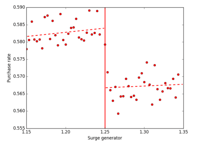
Arbitrary cutoffs are nice ways of separating otherwise similar things into distinct groups, and therefore getting at something approaching a natural experiment. In this case, the thing being separated into distinct groups are the different market conditions that Uber passengers face. A market that the Uber algorithm prices at 1.249 is very similar to one it prices at 1.251. Due to rounding, the first is put in the 1.2 surge category and the other is put in the 1.3 surge category. This causes near identical market conditions to be priced differently through an arbitrary cutoff. By observing how purchase decisions change at each side of this cutoff, it is possible to see how consumers in nearly identical market conditions behave when the price is changed.

Fig 4. From Cohen et al, 2016. This shows how the purchases rate changes when the surge jumps from 1.2 to 1.3. Of particular interest are the points very near the point of discontinuity as these points experience similar market conditions, but different prices.
The dataset used in the study involved around 50 million different UberX user sessions from 4 cities in early 2015. Not these people ended up ordering a ride, so by comparing the percentage of people who hailed a ride from each side of the rounding discontinuity the researchers could see the impact of different prices, under very similar market conditions[4]. In the figure above, sessions just to the right of the 1.25 cutoff (who experienced a 1.3 surge) purchased Rides in about 56.5% of cases. Sessions just to the left (who experienced a 1.2 surge) purchased rides in about 58.5% of cases.
Finding Consumer Surplus
To calculate the consumer surplus the researchers started with the group of people who bought a ride when there was no surge. Based on the estimates generated from the discontinuity, they calculated how many of these people would have purchased if the surge had been 1.2 instead of 1.0.
The total consumer surplus for this jump can be calculated as
Consumer Surplus = Percent Price Difference * avg. Fare paid * Number of trips that would have occurred had the surge level been 1.2.
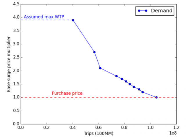
The next step is to use the estimated number of people who would have purchased at a surge of 1.2 and do the same calculation to estimate the number of them that would have made a purchase at a surge of 1.3. This is kept up until the surge level reaches 3.9.
Ultimately this gives a set of points that map price and quantity purchased for people who purchased an Uber ride at a surge of 1.0. Plotting these points and drawing lines between them, provides a demand curve. It looks like this:

Fig 6. from Cohen et al 2016. This shows the estimated relationship between the number of trips taken and the surge multiplier, for those people who actually purchased a ride at a surge level of 1.0.
The process is repeated for customers who bought rides at each other surge point. When these numbers are totaled the value for the total consumer surplus equals $2.88 Billion for the 4 cities that Levitt and Company had data on. To get the headline figure of $6.8 Billion, it is assumed that the same elasticities hold true for Uber riders in other cities as well.
Whose demand curve is it anyway?
One of the reasons the consumer surplus number is so big is that the consumers don’t seem to be too fussed[5] about higher surge prices. It’s worth keeping in mind who these people are, they are people who have already decided they want a ride, and have gone far enough to open the app and see what the price is. It makes sense that these people would not be particularly sensitive to price changes.
The high surge times are pretty predictable, and I suspect that many potential Uber riders who are unwilling to pay for a high surge, don’t even bother opening the app in a high surge time. These more price sensitive customers are not observed in the data.
Another issue may be that consumers in LA, NYC, Chicago, and San Francisco do not represent all of Ubers users (this is why I prefer the $2.88 Billion dollar number, rather than the $6.8 Billion dollar extrapolation.) It’s not clear which direction this would bias the extrapolation, it is likely consumers in these cities (with the possible exception of L.A.)[6] have more access to substitutes such as taxis and public transport than consumers in other places. This should make them less likely to take an Uber when faced with a higher price. On the other hand, residents of these cities are wealthier than people from other parts of the country which should make them less susceptible to changes in price.
What the Surplus doesn’t tell you
With a few billion dollars of consumer surplus to dole out, it seems necessary that consumers must be better off with Uber than without it. This is very likely, but not certain. A comparison would need to be made between the consumer surplus generated by Uber and the consumer surplus generated by the pre-Uber world of taxis, public transport, and private cars. Since measuring consumer surplus is very difficult, this is a difficult comparison to make. The strongest evidence that consumers have been made better off by Uber is that they choose to take it over the preexisting options.
There are other things that aren’t included in this estimate: This estimate is only for the UberX product, it doesn’t say anything about other Uber products or ridesharing products offered by other companies such as Lyft.
This estimate tells nothing about the other players in the Uber picture. The surplus figure is not a net sum, it doesn’t count any losses experienced by taxi drivers and taxi medallion owners, for example, nor does the surplus provides any information about any gains Uber drivers experience from their vocation.
Where does the surplus come from?
The $2.88 Billion or, if one is feeling expansive, $6.8 Billion isn’t coming from anyone because consumer surplus does not mean that an actual transfer is taking place. To illustrate this, consider an extreme example, water. Water is very important to us, we need it to stay alive and to make coffee. A person who has no water would be willing to pay nearly anything for that little bit of water needed to sustain life. Despite this, most of us get our water for prices that are much lower than infinity. This means that our consumer surplus for water is probably near infinity.
There is no transfer taking place in the water example. It is just our good fortune[7] that something we need so desperately is so plentifully and cheaply available. Likewise, there is no transfer taking place in the Uber situation either. There is just a market that provides rides at a cost below what many people would be willing to pay.
There is something that makes Uber rides cheaper and more plentiful than they otherwise might be.
The Investors
If there is anything Uber is good at, it is taking investors’ money and losing it. While Uber is a private company and does not release all of its financial information, it did lose 1.2 Billion dollars in the first half of 2016, and has lost $4 Billion in its history. Uber is spending money to gain market share. What this means in practice is that Uber pays drivers more than they can afford, and/or does not charge enough from riders to cover these costs. In effect, they are subsidizing the public’s use of Uber. As someone who is an Uber user and not an Uber investor, I think this is a superb idea and I encourage everyone involved to keep at it. It seems like there will be a point where they probably have to stop.
We may be near a high point of Uber’s consumer surplus per rider. If Uber is going to become profitable it seems they are going to have to either charge more for rides, or pay their drivers less[8], both of which would reduce consumer surplus.
That square thing
A Surplus of Surplus?
I don’t really care very much about the consumer surplus figure that Levitt and his Uber friends found. I just don’t have a good sense of how to interpret the raw dollar figure. What I would care about would be a figure for the change in consumer surplus. A change in consumer surplus would be a good way to give a direction to welfare changes. A comparison between two changes in consumer surplus, would provide at least a relative understanding of the magnitude of a welfare change. But just a single measure is not particularly useful.
The part I do care about, is the methodology and data used to estimate the demand curve. I think the identification strategy is quite clever, and I do not know of a more nicely identified Demand curve[9]. I suspect this sort of estimation will be used frequently as companies have an easier time altering prices and recording individual transactions.
Sources, References, and Further Reading:
The Paper:
https://cbpp.georgetown.edu/sites/cbpp.georgetown.edu/files/ConsumersurplusatUber_PR.PDF
Freakonomics Podcast on this:
http://freakonomics.com/podcast/uber-economists-dream/
Naked Capitalism is not a fan:
Others:
http://www.citylab.com/commute/2016/09/uber-consumer-surplus/500135/
[1] Especially if you are the agent of a transportation company, or a secret agent, or any kind of agent really…
[2] Or at least they did when the study took place. I can’t get the Uber app to show me what the current surge level is. Google Maps still seems to though.
[3] And me!
[4] Very Similar is not a technical term. The ideal would be to compare identical market conditions with different prices, but since this is not an ideal world, very similar will have to do. The main issue with RD analysis is when very similar, because not similar enough. As one moves further from the point of discontinuity, the observations become less similar, and the basic assumption that they are essentially identical becomes less valid. In this paper this is dealt with in two ways. The first is to only look at points within a 0.01 window of the discontinuity. The second is to compare other observable variables for observations on either side of the discontinuity. If they do not change too much, then it is likely that the unobservable variable of interest does not either.
[5] “Don’t seem too Fussed about higher prices” is not a technical term but “inelastic” might be.
[6] Of the 4 cities, LA has the most inelastic riders, possibly because of these density and transportation issues.
[7] Of course, there are many people who do not have cheap access to clean water.
[8] This assumes that they actually have drivers in the future. Uber appears to be as excited about driverless cars as everyone else is.
[9] If you know of a more nicely identified demand curve, please send it to me: partysheephats@gmail.com or twitter @partysheephats_

Have not had a moment to read it. Looking forward to it.
Sent from my Verizon, Samsung Galaxy smartphone
LikeLike
If the market were perfect, would there be a consumer surplus? Is the fact that the surplus is large an indicator that Uber may be engaged in anti-competitive behavior? Or does it mean Uber needs better economists working on pricing?
LikeLike
From the top of my head: There almost certainly would be consumer surplus in a perfectly efficient market. Monopolistic pricing would reduce consumer surplus, predatory pricing would incrase it (at least in the short run). This may be what Uber is doing, trying to gain market share and drive out other competition. This paper was co-authored by Uber’s Economists so they are clearly aware of the situation. It might be in Uber’s best interest to be able to present itself as being good for consumers, and research like this could aid in that endeavour.
LikeLike