Can the Gains From Trade be redistributed?

Trade might be the only thing that pretty much all economists pretty much agree on. Like Harvard professor Greg Mankiw, who wrote the book on mainstream economics, wrote a whole article on this.

The argument for trade goes something like this: things should be made where it is the most efficient to make them, when production is artificially confined by national boarders it is prevented from being done in the most efficient manner. If things are done efficiently we will spend fewer resources and create more wealth overall. In terms of US consumers, this wealth will mostly come in the form of cheaper and more diverse, goods and services. These gains are diffuse and sometimes subtle, but pervasive enough that in total they are significant, and significantly outweigh the costs[1].

These gains are not evenly distributed. trade might boost total wealth, but that will be of little consolation to those who wake up in the morning to find that their manufacturing jobs are now being done in China.

Maybe this isn’t a big deal. If trade creates more wealth overall, some of that wealth can be transferred to the people who were most negatively impacted by increased trade. This is an extremely beguiling idea, it means that we can have the gains from trade, and no one needs to suffer from it.

In a textbook, moving these gains around is a trivial thing to do.

But of course, it isn’t.


Trade Adjustment Assistance

In the United States the thing that most explicitly does this is a government program called Trade Adjustment Assistance (TAA). The TAA has three different programs, one for workers, one for farmers, and one for businesses.

The one for workers is largely focused on providing training, a safety net, and flexibility to workers who have lost their jobs due to imports or exports. Ideally, these sorts of protections and benefits give workers the chance to move to a career with more protection from trade.

The primary benefits the TAA provides are paid for training or education for up to two years after a worker has joined the program. While they are pursuing this training workers receive payments, this provides payment for a much longer period than they would under traditional unemployment insurance programs.

There are other benefits as well, the government will largely pay for the costs of job hunting and relocation, and will subsidize the wages of older workers who decide not to pursue training, but take a lower paying job instead.

(For a more personal view of the benefits and issues involving TAA, I recommend this planet money story. Which partially motivated this post) 

Does it Work?

A 2012 study from the Mathematica Policy Institute did a benefit-cost analysis on the TAA. It didn’t do well.

TAA was successful at getting people into retraining and reeducation programs. 66% of those who were involved in the TAA received education or training, compared to 27% of the control group. This education resulted in improved credentials, TAA participants were more than twice as likely to have a degree or educational credentials.

It just didn’t do them much good.

“Not much good’ meant that TAA participants had less income than a matched sample[2] of similar workers who received traditional Unemployment Insurance benefits.

This was especially true in the first two years, which makes sense as this is the time typically allocated to training. However, even four years after losing their jobs, TAA participants were still faring no better than those who had simply received traditional UI benefits[3].

While the results for TAA might not be substantially different than basic unemployment insurance programs, the TAA is more expensive.  The Mathematica benefit-cost study put the net cost of the program of about $26,000 per participant. In 2011, the various programs cost about $700 million.

Retraining

Some of the issues with TAA apply to other programs that are focused on retraining. Retraining is most effective when the labor market is strong enough, but individual workers lack the correct skills to be successful. It doesn’t work well when dealing with cyclical unemployment, nor does it work well when there just aren’t any jobs to be had in a locale.

Retraining programs  can also funnel a bunch of people into the same trade at about the same time. This results in a glut of labor supply for a particular industry, which results in low wages, or no jobs.

While TAA prioritizes retraining, retraining is going to be more beneficial for certain groups of people, such as younger workers, Indeed younger workers tended to fare better than older workers under TAA. While there are provisions specifically for older workers such as the ATAA, they are not as frequently taken advantage of.

Compensation

TAA is supposed to help those who lose from increased foreign competition. It does this by providing them with retraining, at little or no personal cost, and to provide them with an income while they try to change careers.

If this retraining doesn’t work, there are alternative policy approaches.

One possibility would be to focus on the compensating part of compensating those who lose from trade. The most extreme method for this would be to simply hand them a check. This sort of transfer could be a lot cheaper to administer [4]  than the current program, and if the workers wanted to spend their money on training programs, they could certainly do that, but they wouldn’t have to.  Still, this compensation would be less than what the trade affected workers would have made had they not lost their jobs due to trade.

Another option is to expand traditional unemployment insurance programs, or other, broader programs that are focused on general redistribution. These programs are not limited to those who lost their jobs due to trade.  This may not be a bad thing, depending on your opinion of redistributive policies in  general, and if you think those who lost jobs due to trade are more deserving of redistribution than those who have lost their jobs for other reasons, such as technological change.

Or we can conclude it is too difficult to compensate the losers from trade, and that the only way to protect those who might lose from it is to have less trade. Trade is can be easily reduced by enacting tariffs or other policy measures[5]. While an improvement for the select few who benefit from protectionism, the costs of these policies is spread over everyone else.

The Awkward Truth

The awkward truth is that there are always going to be losers from trade, and no redistribution program is going to make that go away completely.

While perfectly compensating those who lose from trade might be an impossibility, a partial compensation is possible. In the real world, this compensation will likely be imperfect, messy, and expensive. Despite this, it remains a better choice than prohibiting trade.

How exactly the compensation be done, is a question free trade advocates need to take more seriously than we have in the past. If only so free trade is not lost to rising protectionist sentiments.


Notes, Sources, and Further Reading


Blogs and Opinions:

https://www.cato.org/blog/should-we-compensate-losers-free-trade

http://blogs.ft.com/gavyndavies/2016/12/11/how-should-we-compensate-the-losers-from-globalisation/

http://timharford.com/2017/02/remind_me_what_was_so_great_about_trade/


News:

http://www.economist.com/news/leaders/21695879-case-free-trade-overwhelming-losers-need-more-help-open-argument?fsrc=scn/tw/te/pe/ed/openargument


Econ

http://internationalecon.com/Trade/Tch120/T120-3.php

TAA

http://blogs.wsj.com/briefly/2015/06/15/5-questions-on-trade-adjustment-assistance/

http://www.heritage.org/research/reports/2015/04/trade-adjustment-assistance-enhancement-act-budget-gimmicks-and-expanding-an-ineffective-and-wasteful-job-training-program

https://wdr.doleta.gov/research/FullText_Documents/ETAOP_2013_09.pdf


[1] For the sake of this post, I’m going to just assume that this is all true. This could be an incorrect assumption, but I don’t believe it is.

[2] Propensity score matching on a number of observable variables.

[3] There are some caveats to this conclusion. Primarily the study only looked at the first four years following entry into the program, this may not be sufficiently long to show the benefits from retraining.

[4] Of course, there would be costs, namely the difficult task of figuring out who lost their jobs due to trade and who lost their jobs due to other factors.

[5]Another common method is naming Peter Navarro as the Director of the National Trade Council (whatever that is).


How should global inequality be measured?

Eight

Earlier this month, Oxfam published their yearly headline grabbing inequality stat. The global anti-poverty organization reported that the 8 richest men have as much wealth as the poorest half of the world’s population. The bottom half of the population is a group of about 3.6 billion people. They are matched in wealth by a group of 8. Not 8 million, not 80,000, not even 8,000 or 800. Eight.  You could fit them all in a minivan if you made Bill Gates sit in the trunk[1].

This metric is very good at grabbing attention. Unfortunately, it’s has one really annoying problem.

2nd_gen_Town_and_Country_minivan.png

Wealth Inequality

Wealth is an important aspect of inequality because it accumulates and persists over time. Due to this, wealth inequality is almost always much more pronounced than income inequality. The global wealth distribution is very concentrated in the hands of a small group of people. 73% of people have wealth under $10,000, accounting for 2.4% of global wealth. To be in the top half of the half of the world’s wealth distribution requires a net wealth of only $2,200. The top 1% (those with a net wealth of $744,000 or more) now own as much wealth as everyone else.

poorhalf

Many people have even less than little. The bottom decile is in debt and therefore has a negative wealth. Those in the second decile have pretty much no wealth at all. After that, wealth starts to accumulate, with each decile having a larger share than the one that preceded it.

How it treats debt is probably the most common criticism of this metric.[2] The people with the least wealth, per this report, are those who are indebted. Often though, those who are most in debt are often not particularly poor.  It takes a certain level of affluence, and functioning credit markets, to get a significant debt going.  The archetypical example is a recently graduated North American college student. They might have a lot of debt, but they are likely living a more comfortable lifestyle than many of the people who have no wealth. When calculating the total wealth owned by the poorest half, the negative value cancels out much of the wealth of the other deciles. This makes a noticeable difference on the final calculations. Leaving this out increases the wealth of the bottom half to $1.5 trillion (about 56 of the wealthiest people).

Volatility is Annoying

I am not too bothered about how the report treats debt. It seems like when measuring net wealth, debt should not be ignored.

The thing that bothers me about this number is how very volatile it is. Oxfam are kind enough to report it every year, In 2014 they said it was 85, In 2015 it was 62, and in 2016 it was 8. That’s a big change. So what happened? The world’s wealthy might have gotten richer in 2016, but surely, they didn’t get nearly 6.8 times richer. Did they? The world’s poor might have gotten poorer but surely, they didn’t lose that much?

The Data

What changed was the estimate for the poorest half of the population.

The data for the world’s wealthy are taken from Forbes’ list of stupendously wealthy people. There isn’t a great deal of ambiguity in this data, we pretty much know how much wealth each of these people has. The other part is much harder. Wealth is a complicated thing, and half of the world’s population is a huge amount of people.

The best source for this, and the one that Oxfam used, is the global wealth report that Swiss bank Credit Suisse puts out each year. From this, Oxfam determined the amount of wealth that the poorest half of the world’s population had, and then went down the list of wealthiest people until they had a roughly equivalent amount.

0.2%

Between the 2015 and 2016 reports, Credit Suisse got new and better data sources which altered their estimates of how much wealth the poorest half had. The new data showed that there was less wealth in India and China and more debt in general.  The original 2015 estimate was 0.7% of global wealth. The 2016 figure with improved data was 0.2% of global wealth, recalculating this figure for 2015 results in an updated figure of 0.2%, which is equivalent to the 9 richest people[3].table.PNG

This is all fine. Using better data is good, so is revising estimates to more accurately reflect the world.

But…

Rich people are not a Unit

The impact of this change on the headline figure is not proportional to the underlying change in the poor’s share of global wealth. The original estimates for 2015 were that the poorest half had 0.7% of all the world’s wealth, under they improved methodology that figure changes to 0.2%.

Measured in the fortunes of the wealthy, this change is from 62 to 9 which makes the revision look more dramatic than it actually was. The change is dramatic because wealthiest people are not a consistent unit. Bill Gates is the wealthiest person in the world, with a total wealth of $85.9 Billion. The 48th wealthiest person, Ray Dalio has, a frankly pitiful, $15.6 Billion[4]. Not only must this be disappointing for Mr. Dalio, it is a problem for anyone wanting to interpret changes in Oxfam’s stat. The further down the list of wealthy people, the less wealth each wealthy person has.  Going from the top eight wealthiest people to the top nine is a change of $42.1B, much more substantial than going from 45 to 46 ($15.6B).

addingupthewealthy.PNG

This depicts the amount that each additional billionaire contributes to the total. Since there are ties, some of the numbers in the x-axis repeat. For example, going from the 9th richest person to the other 9th richest person still adds another $40 Billion. Data is here.

Not only does it make it difficult to interpret changes when revisions occur, it makes it difficult to interpret changes over time. A good metric should let its audience know if things are getting better or worse, and by about how much. This doesn’t do that very well.

Mental Images

Despite the difficulty of interpreting the magnitude of changes, this is a very clever metric. It is designed to grab headlines and get people talking about global inequality. It clearly succeeds.

Abstract wealth can be a hard thing to grasp. It’s easy to imagine some of the trappings of wealth: private Jets, mansions in Aspen, Ferraris, and the like.  These mental images fall short when trying to conceptualize, for example, the fifteen-billion-dollar difference in wealth between Bill Gates and Warren Buffet.

If it’s hard to grasp the differences between Billionaires, getting an intuitive sense of global inequality is even more difficult. Partially, this is the fault of the scale of the numbers involved. Total global wealth is about $256 trillion, and there are about seven billion people on earth. These are not numbers our brains are good at handling. We hear these numbers and think something like “golly, that sounds like a whole lot”.

Of course, there are other ways to measure inequality that are easier to interpret, but they don’t offer as clear a mental picture. Saying the least wealthy half of the world’s population have just 0.2% of the world’s net wealth, is a more easily interpreted metric, but it doesn’t have the same sort of immediacy.

This stat is clever because it turns something we can’t easily imagine-global inequality, into something that we can-a minivan full of wealthy people, with Bill Gates in the trunk. It’s tricky for the exact same reason.


[1] Bill seems like a chill dude, I suspect he’d be cool with it.

[2] For example: here, here, and here.  Some other common criticisms include susceptibility to exchange rate fluctuations, and the decline in absolute poverty.

[3] I couldn’t find any explicit mentions of it but I’m going to assume that the reason .2% is equal to 9 billionaires one year, and 8 the next, is due to changes in billionaire wealth, rounding, or both.

[4] Based on this data


REFERENCES, SOURCES, and FURTHER READING

Reporting

https://www.theguardian.com/global-development/2017/jan/16/worlds-eight-richest-people-have-same-wealth-as-poorest-50

http://fortune.com/2017/01/16/world-richest-men-income-equality/

http://www.huffingtonpost.com/entry/income-inequality-oxfam_us_58792e6ee4b0b3c7a7b13616

http://www.aljazeera.com/news/2017/01/oxfam-men-rich-world-170116080621379.html

http://www.post-gazette.com/business/money/2017/01/16/World-s-8-Richest-Have-as-Much-Wealth-as-Bottom-Half-of-Global-Population/stories/201701160107

http://www.csmonitor.com/Business/2017/0117/Oxfam-World-s-eight-richest-people-have-same-wealth-as-poorest-half


Credit Suisse Wealth Report

Oxfam Report Methodology

Oxfam Press Release

Do randomized econ studies suffer the placebo effect?


What Is A Randomized Controlled Trial?

It is nearly impossible to do proper scientific experiments in economics. Other branches of science don’t have this problem. In medicine, if you want to know if a new drug is more effective than the current standard: you can find some sick people, randomly give half of them the new medicine, give the other half the standard medicine, wait a bit, and see which group dies less. Since the assignment of which medicine a patient gets is randomly determined, the observed differences are due to the treatment and not due to some underlying characteristic of those treated.

When They Work

This is not so easily done in the social sciences. Researchers cannot alter the results of a presidential election, economic policy, or the demographic mix of a city just to see what happens. Because of this, researchers typically rely on mathematical models, case studies, natural experiments, or statistical analysis. While sometimes convincing, these methods never quite have the same rigor as a proper experiment.

Fortunately, there are some situations where researchers can randomly assign subjects to treatment and control groups. In economics, randomized controlled trials (RCT’s) are most common in development economics. Organizations like the Poverty Action lab  set up experiments  to test all manner of interventions. Since the treatments are randomly assigned, the conclusions should be robust, and not subject to various selection biases.

External Validity

Of course, there are issues. Principally, issues of external validity.  By their nature, RCT’s only provide direct results for the specific group of people involved in the experiment. Sometimes this might be a large number or a small number, but it is always a limited group.

External Validity is the extent that a result applies to other contexts. Does a result found in one set of circumstances apply to others?  Pretend there is a study  that shows providing free meals to school children in a village in Côte d’Ivoire, increases school attendance. Does it mean that the same policy would work in a different village, or a different country? for secondary school children? Does it matter if the food provided is different? Maybe attendance increased, but did any additional learning  take place?

External Validity is the headline problem of RCT’s. It is a serious issue. The argument in favor of RCT’s has always been that they have very strong internal validity. While the conclusions may not apply elsewhere, at least they are valid for the group you studied.

Probably.

Double Blind

cowpea

Cowpeas. Apparently.

In medicine, RCT’s are nearly always double blind. Neither those receiving treatment, nor those administering the experiment know who is getting the real medicine and who is not. The reason for this excess of mystery, is the placebo effect. Receiving some treatment, even if that treatment is completely worthless, tends to improve outcomes.

RCT studies in economics are essentially never double blind. The participants typically know exactly what they are getting or not getting.  This might be a problem.  A 2014 Study[1] tried to test out if it would matter if the participants did not know if they were receiving a treatment or not.

It did.

How to increase output?

In studies of agricultural productivity the central question might be something along the lines of “how does using a different sort of seed increase crop output?”

There are at least two components of this sort of question.  One is the physical impact of the seeds themselves. Some seeds simply produce higher yields than others.

The second component is behavioral-what the farmers do with the seeds. If a farmer receives a more productive variety of seed, they will do things differently. This includes decisions like the amount of care and effort they put into their crops. Better seeds could result in people doing more work (that extra work is more valuable) or less work (they don’t need to work as hard to get the same result).

Bulte et al, the folks who did this study, also surmise a third component. Which is how behavior is changed in ways that are unrelated to the treatment. The example given is that participants might be overly optimistic about the potency of the seeds they receive, and put extra effort into raising their crops, even if this extra effort is not merited by the actual quality of the seeds. When the outcome is measured, due to this effort, it will look like the intervention is more effective than it was.

The distinction between these second and third components is that the first one is directly related to the actual mechanics of the intervention while the second one is not. Sort of like a placebo effect, the second effect happens even if the actual treatment has no impact at all.

Cowpea seeds in Tanzania

Here’s how the study went down.

First, some farmers are randomly divided into these four different groups:

  1. Those who received traditional cowpea seeds and were explicitly told they had received traditional seeds
  2. Those who received modern cowpea seeds and were explicitly told that they had received modern seeds
  3. Those who received traditional cowpea seeds but did not know which kinds of seeds they had received
  4. Those who had received modern cowpea seeds but did not know which kinds of seeds they had received.

The seeds appeared identical, so it was not possible to tell which one they had received by observing them.

Results

When the harvest was gathered, the results showed that the modern seeds outperformed the traditional seeds by 27%. This is where most studies like this would stop. Researchers would then go off and make policy recommendations, telling governments and NGOs to give people better cowpea seeds, or something.

The wrinkle in this case, was that the 27% difference was only for those farmers who had known which type of seeds they had received. The impact of the seeds on the group that did not know which one they had received was zero[1]. The seeds themselves had done nothing.  Since the seeds were ineffective, any behavioral changes that were brought on by the impact of the seeds was also negligible.  The 27% increase in harvest was due to the response of the farmers themselves to receiving the new seeds.[3]

Effort, Expectations, and External Validity

Seeds do not know they are being experimented on. Proper scientific trials can be done on seeds, and it can be determined how they grow in different conditions. The whole point of giving them to actual farmers is to see what those farmers do with them. From the standpoint of evaluating an intervention for policy purposes, the behavioral effect is a necessary factor. How people respond to an intervention is not some confounding variable, it is a key part of the intervention.

Crucially, Bulte et al, make a distinction between changes in behavior that are driven by the genuine impact of the treatment and those which are not. The changes in behavior that were not due to the treatment biases the estimate upward, because even if the treatment does nothing, you still observe a positive impact.

I am not convinced this distinction is a particularly important one. While it is important to think about how much of an outcome is due to participants’ effort, it seems that expectations (even wrong ones) are part of the intervention, not separate from it. Differences in expectations in time and space, would be a question of external, not internal, validity.

Part of the measured outcome will be driven by the actual impact of the intervention. Part of that will be driven by expectations  that may be unrelated to the actual effectiveness of the intervention. The measured impact will include both things. It probably should.

<This post was slightly edited for clarity on Jan 23 >

Sources, References, And Further Reading

http://www.economist.com/blogs/freeexchange/2013/12/randomised-control-trials

http://journals.plos.org/plosmedicine/article?id=10.1371/journal.pmed.1001497

http://blogs.worldbank.org/impactevaluations/health/developmenttalk/impactevaluations/impactevaluations/node/771

https://fxdiebold.blogspot.com/2017/01/torpedoing-econometric-randomized.html

https://boringdevelopment.wordpress.com/2014/04/09/a-torpedo-aimed-straight-at-h-m-s-randomista/


[1]Brought to my attention by this recent blog post

[2] An increase of about 5%. Not statistically significant at traditional levels.

[3] Unfortunately, this is a deeply imperfect paper. There are issues with attrition, the way the experiment was carried out regardless as to the validity of the methods used


Do Social Impact Bonds Work?


Ounce of Prevention, Pound of Cure

Governments spend a great deal of money and effort fixing things. They try to fix homelessness, fix poverty, fix crime. As any good mechanic will tell you, fixing things is expensive, and, as any good dentist will tell you, it is often cheaper to prevent problems than to try to fix them afterward.

Governments are not always good at implementing preventative measures. They are probably more risk averse than the private sector, and more likely to simply keep doing what they have done in the past. Preventative projects can be difficult and risky, and It may be more difficult to secure funding for these unproven projects.

This reticence is a bummer, because if these are genuinely good projects, they could both improve outcomes and reduce government costs. It is entirely possible that the cost savings would more than pay for the project.

If only someone else was willing to pay to try new programs.

How Do Social Impact Bonds Work?

A Social Impact Bond is an arrangement where investors fund programs designed to improve a societal outcome and save the government money. If this occurs, the government will reimburse the investors (often plus a bit) using a portion of the money it would have otherwise spent. Social Impact Bonds are linked with pay for success policies, but the two are not synonymous.

While there is no exact standard or formats for Social Impact Bonds, they typically have the following structure:

Investors who believe in a certain program provide money to fund it.

Program Operators take their money and use it run the program.

An Evaluator measures the outcomes of the program with respect to certain targets.

After the program The Government pays back the investors depending on how successful the program was at meeting pre-determined targets.  A more detailed illustration can be found here.

smilingchild

This is a picture of smiling children. It has nothing at all to do with Social Impact Bonds. When writing about anything having to do with social responsibility, pictures of smiling children, attractive landscapes, and water, are very important.

Essex

The British county of Essex has an issue with young people ending up in state care. This can get expensive, with costs running between £20,000 to £180,000 per person per year. In an attempt to reduce the number of young people entering state care to begin with, the county used a Social Impact Bond to fund a program that provides therapy for 380 individuals and their families. This therapy will help families better deal with some of the issues that lead children to end up in state care in the first place. The £3.1 million upfront cost of the program is being largely funded by social impact investors Bridges Ventures and Big Society Capital[1]. This money goes to[2] a group called Action for Children, which provides the actual therapy.

To determine what payments the investors receive, a comparison is made between those who have received treatment and a predetermined historical control group. For two and a half years after their referral into the program, each participant is tracked on a quarterly basis. The difference in observed days spent in care between the participants and the control group determines how much the government of Essex will pay to the Investors. As of fall 2016  82% of the 208 adolescents[3] who have received treatment remain with their families.[4]

Kent England Sky United Kingdom Landscape Scenic

This has nothing at all to do with Social Impact Bonds. But it is lovely.

Do Social Impact Bonds work?

Social Impact Bonds are new enough that this is a mostly unanswerable question.  Based on this report from SocialFinance, there are few Social Impact bonds that have been around long enough for payments to begin. Of the 22 early projects that SocialFinance reports on, 12 have made payments and 4 have fully repaid investor capital. This is a higher percentage than it might seem, as many of the projects are too new to be able to report results. Only one project, a project to reduce recidivism at Rikers island[5], has demonstrably failed to return value to its investors.

This appears to be a positive outcome. If very few social impact bonds pay out, then both the specific programs and Social Impact Bonds in general would fail. For Social Impact Bonds to work, there needs to be sufficient motivation for investors (even the socially minded ones who currently make up most of the Social Impact Bond investors) to invest. If Social Impact Bonds aren’t paying out, this source of funding will vanish. If social impact bonds are paying out, it means that they are achieving the measurable outcomes that they are designed to. If these outcomes are being achieved, the desired positive social change and associated cost savings, should be achieved as well.

Low Hanging Fruit

It may be that Social impact bonds are a deeply clever idea and there are lots of projects that provide opportunities for them to be used effectively. This would require many issues where early interventions can return cost savings down the road, and lots of places for social impact bonds to come in and make these interventions happen.

This might be true, especially in the early stages of Social Impact bonds. Many of the social impact bonds deal with similar issues such as homelessness or recidivism. If this is the case, Social Impact Bonds should be less successful as time goes on, as the easy improvements are all exhausted.

Not Enough Failure?

One of the motivations for social impact bonds is that they allow riskier, more unusual or innovative projects to be implemented. It seems only reasonable that many of these unproven projects should fail.

If they don’t fail, this is concerning. Some possible reasons for a lack of failure might be:

  • The riskiness of these projects has been vastly overestimated. This brings into doubt how the government and other institutions decide on what projects to undertake and the measures they use to evaluate risk.
  • Social Impact bonds are not driving risky innovative projects, but instead are only providing an alternative method to undertake relatively safe projects. This might mean that the projects are successful, but it seems like a key promise of Social Impact Bonds would be missing.
  • The measures of success of social impact bond funded projects are being artificially inflated. Even with third party evaluators and pre-determined metrics of success, most indicators can be manipulated. If money and success is on the line, the temptation to do what it takes to achieve this outcome will increase.


So far, It is not obvious what the failure rate should be, what is an appropriate rate of return for a social impact bond is, what sort of projects are best suited for them, and who are the appropriate partners, and how the answers to all these questions might vary across projects and issues.

raindrops_on_water

Some water. This has nothing to do with Social Impact Bonds.

What Gets Funded?

Not every project is well suited to Social Impact Bond Funding. A necessary attribute for is to have a clearly measurable outcome.  There are many important issues for which this is not the case. Any program tackling a problem that cannot be easily quantified will not work for a Social Impact Bond.  If Social Impact Bonds work, they will funnel resources toward things that are measurable, and not necessarily the most important. Social Impact bonds will also lead to the funneling of resources toward the sort of projects that investors want to fund. This might channel resources toward projects that tackle very visible problems such as homelessness.

A Cautious Optimism

When I first heard about them (while researching this post) I thought they were super clever. I like the ‘you get what you pay for’ concept- if you pay someone to run a program that reduces recidivism, you’ll get a program. If you pay someone to reduce recidivism, you’ll get reduced recidivism. I also think the programs undertaken should be more innovative than traditional programs and possibly more effective for it.

As with nearly anything, there are issues and potential issues. Social Impact bonds only work in certain situations, but when used properly, they appear to be beneficial. One of the nice things about them, as an outsider, is that most of the risk is borne by the original investors.  I wish these investors the very best of luck in their investments. Maybe the rest of us will get something out of it as well.


Related Posts from PARTYSHEEPHATS

How should companies that operate private prisons get paid?

Sources, References, and Further Reading

Essex:

http://www.socialfinance.org.uk/wp-content/uploads/2014/11/Essex_A_year_in_review.pdf

Other Reading

http://www.economist.com/node/18180436?story_id=18180436

http://www.goldmansachs.com/our-thinking/pages/social-impact-bonds.html

http://www.frbsf.org/community-development/files/social-impact-bonds-lessons-learned.pdf

http://harvardmagazine.com/2013/07/social-impact-bonds

http://www.socialfinance.org.uk/wp-content/uploads/2016/07/SIBs-Early-Years_Social-Finance_2016_Final-003.pdf

https://www.rockefellerfoundation.org/our-work/initiatives/social-impact-bonds/

https://www.theguardian.com/voluntary-sector-network/2015/dec/10/do-social-impact-bonds-really-work-for-charities

http://www.scholarsstrategynetwork.org/brief/appeal-and-limitations-social-impact-bonds

http://cspcs.sanford.duke.edu/blogs/social-impact-bonds-do-benefits-outweigh-drawbacks

http://www.kauffman.org/blogs/policy-dialogue/2015/october/doing-business-with-government-difficult-for-startups


[1] Due to a mostly fortuitous set of circumstances, there was a period of my life where I spent a great deal of time looking at Corporate Social Responsibility reports. These inevitably consisted largely of images of smiling children and attractive landscapes- all completely insufferable. The people who designed those reports appear to be well employed designing the websites for Social Impact investment firms.

[2] Via a SPV called Children’s Support Services Ltd

[3] I have No idea if that is a good number or not.

[4] For other examples of social impact bonds see Social Finance’s database of social impact bonds.

[5] Maybe a social impact bond to improve the Yelp rating would have been more successful.

[Birthday] Party Sheep Hats!


Year One

Exactly a year and a bit ago, on January 08 2016, I published the first posts on this blog. In the weeks preceding those first posts, I had been warding off the boredom of unemployment by writing answers to various questions posed by friends and family. In the year since then, I have been warding off the boredom of employment by writing answers to questions that make me curious.

One interesting thing has been which posts get viewed and which ones don’t. I am not good at predicting this.  My audience is composed almost entirely of my own Facebook friends and the Facebook friends of my Facebook friends. These people do not always share my taste.

The stats are as follows[1]:

pshyearone

The two most popular posts, Electoral Votes, and Yard Signs both had to do with the 2016 US presidential election. I liked both posts, although I liked the yard sign post better, and both tapped into interest and frustration surrounding the presidential election.

Policy topics tend to do well, the $100 bill post, and my post on Vancouver’s property tax both were frequently viewed.  Perhaps not surprisingly, my aviation related posts do not fare particularly well. It seems that I am more interested in airlines than my readers are.  My post on Ultra Long Haul Flights, took a ton of time to put together (mostly learning Tableau and trying to figure out the dates the world’s longest flights started and ended). I still think that map is super neat.

I am disappointed that more people didn’t read the Olympics related posts. They were fun to write. The one about which nation would be the best to move to in order to qualify for the Winter Olympics presented an extremely pleasing overlap between countries that have few winter Olympic Athletes, and countries that sell their citizenship. Maybe there will be a sudden resurgence of interest before the next Olympics.


Thanks for Reading!

-PARTYSHEEPHATS


[1] These stats are technically for the 2016 calendar year, but close enough.

How Much Consumer Surplus Does Uber Generate?

NOTE: One of my rules when starting this blog is I wouldn’t write about questions I could answer with a google search. If someone else had already answered my question, I wouldn’t bother repeating them. This post sort of breaks that rule. Freakonomics already did a nice podcast on this paper, which I used in my research and covers many of the same things. My piece has more footnotes though.

theu

Uber’s U logo.

Uber, the increasingly ubiquitous transportation/technology/taxi company, whose logo is either a U or that square thing, has changed how I get around. I take Uber frequently, and have had almost universally pleasant experiences. I am not the only fan of Uber, Freakonomics author and U of Chicago prof, Steven Levitt recently co-authored a paper with some folks from Uber which calculated the consumer surplus generated by Uber in 2015 was $6.8 Billion. This post is about how that number was calculated, what it means, and what it doesn’t.

Consumer Surplus

Consumer Surplus is one method economists use to think about gains from transactions. The basic idea behind consumer surplus is that everyone has a maximum price they are willing to pay for a good or service, and whenever consumers can acquire something for less than that price, they are better off for it.

Pretend I am willing to pay $25 to get a ride from the airport to my house. Anything above $25 and I will take the bus/train/hitchhike/walk/just stay in the airport forever. If the price is less than $25 I will pay for my ride, and the lower the price is the more pleased about it I will be. This difference between the maximum amount I am willing to pay and the amount I actually pay is my consumer surplus. If I am willing to pay $25 and I get a ride for $15, my consumer surplus for this transaction is $10.  Sum up the surpluses of all the other people looking for rides and you get the total consumer surplus for everyone. If there are 10 people all of whom are willing to pay $25 for a ride, but can buy a ride for $15, the total consumer surplus is 10*(25 – 15) = $100.

The Demand Curve

Consumer surplus is one of those economics concepts that’s lovely in theory but nearly impossible to measure in practice. The essential problem is figuring out the maximum willingness to pay. You could ask each person what their maximum willingness to pay is, but if you ask me, I will probably lie to you.[1] Even if I am being honest, it is not certain that I will truly know what my maximum willingness to pay is anyway. I may think it is $25, but when only offered rides for $40, I might begrudgingly accept.

Researchers typically are not interested in the maximum willingness to pay of a single person, but the overall relationship between the price of a good and how many people buy it. This relationship makes up another basic economics idea-The demand curve.

demandcurve

A Picture of a demand curve I found on the internet. The demand curve shows how much of a good would be purchased at different prices.  In practice, only one point along this line is actually observed.

Demand curves, like maximum willingness to pay, are simple in theory but very difficult to measure in practice.

Why are demand curves so elusive?

What is observed are companies offering a certain price for a good, and a certain number of people buying it. The relationship that researchers would like to observe is how many people would have purchased the good if price was different but everything else was the same.

Of course, prices and quantities sold change frequently, and it is tempting to think one could estimate the demand curve from these different points in time. This doesn’t really work.  Each observed price/quantity duo occurs under different market conditions. When looking at multiple price/quantity observations over time, It is usually very difficult to say what else has changed between observations (consumer preferences, supply decisions, substitutes, etc.)

One way to figure out the demand curve would be to randomly offer people buying the same product different prices. With this information it would be possible to compare how many people purchased the product at each given price, and randomization would ensure that these differences were due to the price and not due to observed or unobserved factors about the consumers or the market conditions.

This is not something Uber does.

Except sometimes, they almost do.

Surge Prices

The answer comes from (perhaps not surprisingly) Uber’s surge price feature and (perhaps surprisingly) rounding. Uber passengers will be familiar with surge pricing, the practice through which prices are higher when there are more riders than drivers, such as peak commuting times, Friday nights, or New Years Eve.  These come in the form of a multiplier, starting at 1.2 times the base fare, then 1.3x, and 1.4x, all the way up to 4 times the regular price or more. Surge prices alone are not good enough to estimate the demand curve, since the surges themselves are determined by the current market conditions, simply comparing between surges is no better than comparing different prices at different times.

Rounding

Uber has an algorithm that calculates what the surge should be. This algorithm calculates the surge estimator very precisely, down to some number of decimal points. Users of Uber only ever see surge prices to one decimal place[2]. When Uber’s algorithm calculates that the surge should be 1.28893, the app would round this up to 1.3. This is good news for people like Levitt[3], who are big fans of an econometric technique called regression discontinuity (RD). 

Regression Discontinuity

Arbitrary cutoffs are nice ways of separating otherwise similar things into distinct groups, and therefore getting at something approaching a natural experiment. In this case, the thing being separated into distinct groups are the different market conditions that Uber passengers face. A market that the Uber algorithm prices at 1.249 is very similar to one it prices at 1.251. Due to rounding, the first is put in the 1.2 surge category and the other is put in the 1.3 surge category. This causes near identical market conditions to be priced differently through an arbitrary cutoff. By observing how purchase decisions change at each side of this cutoff, it is possible to see how consumers in nearly identical market conditions behave when the price is changed.

levittfig4

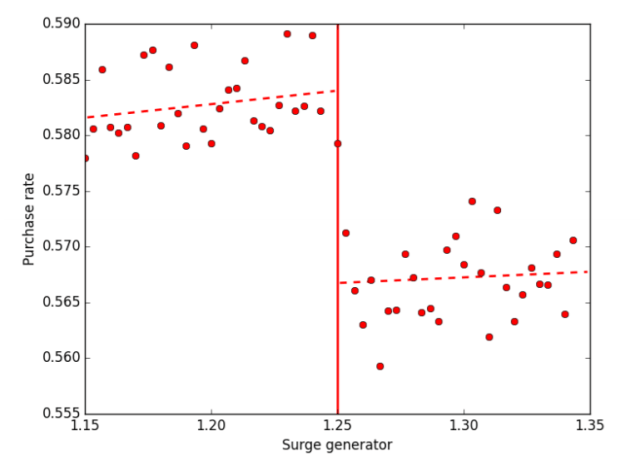
Fig 4. From Cohen et al, 2016. This shows how the purchases rate changes when the surge jumps from 1.2 to 1.3. Of particular interest are the points very near the point of discontinuity as these points experience similar market conditions, but different prices.

The dataset used in the study involved around 50 million different UberX user sessions from 4 cities in early 2015. Not these people ended up ordering a ride, so by comparing the percentage of people who hailed a ride from each side of the rounding discontinuity the researchers could see the impact of different prices, under very similar market conditions[4].  In the figure above, sessions just to the right of the 1.25 cutoff (who experienced a 1.3 surge) purchased Rides in about 56.5% of cases. Sessions just to the left (who experienced a 1.2 surge) purchased rides in about 58.5% of cases.

Finding Consumer Surplus

To calculate the consumer surplus the researchers started with the group of people who bought a ride when there was no surge. Based on the estimates generated from the discontinuity, they calculated how many of these people would have purchased if the surge had been 1.2 instead of 1.0.

The total consumer surplus for this jump can be calculated as

Consumer Surplus =  Percent Price Difference * avg. Fare paid * Number of trips that would have occurred had the surge level been 1.2. 

The next step is to use the estimated number of people who would have purchased at a surge of 1.2 and do the same calculation to estimate the number of them that would have made a purchase at a surge of 1.3. This is kept up until the surge level reaches 3.9.

Ultimately this gives a set of points that map price and quantity purchased for people who purchased an Uber ride at a surge of 1.0.  Plotting these points and drawing lines between them, provides a demand curve. It looks like this:

levittfig6

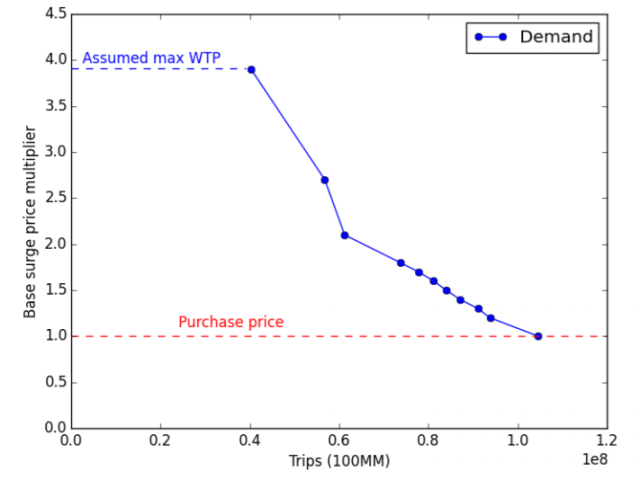
Fig 6. from Cohen et al 2016. This shows the estimated relationship between the number of trips taken and the surge multiplier, for those people who actually purchased a ride at a surge level of 1.0.


The process is repeated for customers who bought rides at each other surge point. When these numbers are totaled the value for the total consumer surplus equals $2.88 Billion for the 4 cities that Levitt and Company had data on. To get the headline figure of $6.8 Billion, it is assumed that the same elasticities hold true for Uber riders in other cities as well.

Whose demand curve is it anyway?

One of the reasons the consumer surplus number is so big is that the consumers don’t seem to be too fussed[5] about higher surge prices. It’s worth keeping in mind who these people are, they are people who have already decided they want a ride, and have gone far enough to open the app and see what the price is. It makes sense that these people would not be particularly sensitive to price changes.

The high surge times are pretty predictable, and I suspect that many potential Uber riders who are unwilling to pay for a high surge, don’t even bother opening the app in a high surge time. These more price sensitive customers are not observed in the data.

Another issue may be that consumers in LA, NYC, Chicago, and San Francisco do not represent all of Ubers users (this is why I prefer the $2.88 Billion dollar number, rather than the $6.8 Billion dollar extrapolation.) It’s not clear which direction this would bias the extrapolation, it is likely consumers in these cities (with the possible exception of L.A.)[6] have more access to substitutes such as taxis and public transport than consumers in other places. This should make them less likely to take an Uber when faced with a higher price. On the other hand, residents of these cities are wealthier than people from other parts of the country which should make them less susceptible to changes in price.

What the Surplus doesn’t tell you

With a few billion dollars of consumer surplus to dole out, it seems necessary that consumers must be better off with Uber than without it. This is very likely, but not certain. A comparison would need to be made between the consumer surplus generated by Uber and the consumer surplus generated by the pre-Uber world of taxis, public transport, and private cars. Since measuring consumer surplus is very difficult, this is a difficult comparison to make. The strongest evidence that consumers have been made better off by Uber is that they choose to take it over the preexisting options.

There are other things that aren’t included in this estimate: This estimate is only for the UberX product, it doesn’t say anything about other Uber products or ridesharing products offered by other companies such as Lyft.

This estimate tells nothing about the other players in the Uber picture. The surplus figure is not a net sum, it doesn’t count any losses experienced by taxi drivers and taxi medallion owners, for example, nor does the surplus provides any information about any gains Uber drivers experience from their vocation.

 Where does the surplus come from?

The $2.88 Billion or, if one is feeling expansive, $6.8 Billion isn’t coming from anyone because consumer surplus does not mean that an actual transfer is taking place. To illustrate this, consider an extreme example, water. Water is very important to us, we need it to stay alive and to make coffee. A person who has no water would be willing to pay nearly anything for that little bit of water needed to sustain life. Despite this, most of us get our water for prices that are much lower than infinity. This means that our consumer surplus for water is probably near infinity.

There is no transfer taking place in the water example. It is just our good fortune[7] that something we need so desperately is so plentifully and cheaply available. Likewise, there is no transfer taking place in the Uber situation either. There is just a market that provides rides at a cost below what many people would be willing to pay.

There is something that makes Uber rides cheaper and more plentiful than they otherwise might be.

The Investors

If there is anything Uber is good at, it is taking investors’ money and losing it. While Uber is a private company and does not release all of its financial information, it did lose 1.2 Billion dollars in the first half of 2016, and has lost $4 Billion in its history. Uber is spending money to gain market share. What this means in practice is that Uber pays drivers more than they can afford, and/or does not charge enough from riders to cover these costs. In effect, they are subsidizing the public’s use of Uber. As someone who is an Uber user and not an Uber investor, I think this is a superb idea and I encourage everyone involved to keep at it. It seems like there will be a point where they probably have to stop.

We may be near a high point of Uber’s consumer surplus per rider. If Uber is going to become profitable it seems they are going to have to either charge more for rides, or pay their drivers less[8], both of which would reduce consumer surplus.

uber_app_icon-svg

That square thing


A Surplus of Surplus?

I don’t really care very much about the consumer surplus figure that Levitt and his Uber friends found. I just don’t have a good sense of how to interpret the raw dollar figure.  What I would care about would be a figure for the change in consumer surplus. A change in consumer surplus would be a good way to give a direction to welfare changes. A comparison between two changes in consumer surplus, would provide at least a relative understanding of the magnitude of a welfare change.  But just a single measure is not particularly useful.

The part I do care about, is the methodology and data used to estimate the demand curve. I think the identification strategy is quite clever, and I do not know of a more nicely identified Demand curve[9].   I suspect this sort of estimation will be used frequently as companies have an easier time altering prices and recording individual transactions.


Sources, References, and Further Reading:

The Paper:

https://cbpp.georgetown.edu/sites/cbpp.georgetown.edu/files/ConsumersurplusatUber_PR.PDF

Freakonomics Podcast on this:

http://freakonomics.com/podcast/uber-economists-dream/

Naked Capitalism is not a fan:

http://www.nakedcapitalism.com/2017/01/can-uber-ever-deliver-part-six-bleak-pl-performance-while-stephen-levitt-makes-indefensible-claims.html

Others:

http://blogs.wsj.com/economics/2016/09/19/ubers-pricing-formula-has-allowed-economists-to-map-out-a-real-demand-curve/

http://www.citylab.com/commute/2016/09/uber-consumer-surplus/500135/


[1] Especially if you are the agent of a transportation company, or a secret agent, or any kind of agent really…

[2] Or at least they did when the study took place. I can’t get the Uber app to show me what the current surge level is. Google Maps still seems to though.

[3] And me!

[4] Very Similar is not a technical term. The ideal would be to compare identical market conditions with different prices, but since this is not an ideal world, very similar will have to do. The main issue with RD analysis is when very similar, because not similar enough. As one moves further from the point of discontinuity, the observations become less similar, and the basic assumption that they are essentially identical becomes less valid. In this paper this is dealt with in two ways. The first is to only look at points within a 0.01 window of the discontinuity.  The second is to compare other observable variables for observations on either side of the discontinuity. If they do not change too much, then it is likely that the unobservable variable of interest does not either.

[5] “Don’t seem too Fussed about higher prices” is not a technical term but “inelastic” might be.

[6] Of the 4 cities, LA has the most inelastic riders, possibly because of these density and transportation issues.

[7] Of course, there are many people who do not have cheap access to clean water.

[8] This assumes that they actually have drivers in the future. Uber appears to be as excited about driverless cars as everyone else is.

[9] If you know of a more nicely identified demand curve, please send it to me: partysheephats@gmail.com or twitter @partysheephats_


Happy New Year!

happynewyear

Google trends for the search term “hangover cure” have consistent and dramatic spikes for the week containing New Year’s Day. If you had too much champagne last night and turned to the internet for assistance, at least you were not alone.

Happy New Year from PARTYSHEEPHATS!


How should companies that operate private prisons be paid?

Private Prisons

I am not a proponent of privatizing prisons. Since I am not yet in charge, there are private prisons in the United States. In 2010 there were just under 100,000 people incarcerated in private prisons in the US. (Although no longer for federal prisoners). There are also private prisons in other countries, both the UK and Australia have a higher percentage of their prisoners in private prisons than the US does.

Payment per Inmate

Private prison operators get paid by the government. This takes several forms, but is typically based on the number of prisoners that are incarcerated[1]. For a profit-minded business, the incentives are clear: maximize the number of people incarcerated while keeping costs as low as possible. These motivations can reduce overall costs of prisons[2]-which is why privatized prisons can be attractive to governments.

This often doesn’t work out too well for inmates, private prisons tend to have more issues with violence, overcrowding, and general unpleasantness. A 2016 DOJ report found that privately run federal prisons were 9 times more likely to place prisoners in solitary confinement, and had higher levels of prisoner complaints on issues like food and treatment by prison staff.

Paying per inmate creates three different perverse incentives for the prison management company. First, unlike most of us, the company would prefer a world which has as many people incarcerated as possible. Second, they are encouraged to keep costs as low as they can get away with. This isn’t necessarily bad, a true efficiency gain is a genuine improvement, but excessive cost cutting can contribute to the problems cited above. Lastly, private prisons have no incentive to keep prisoners from reoffending, and may even have an incentive for them to come back to the prison after they have been released.

Melaleuca, Peterbourough, and Doncaster

In a women’s prison in Australia called Melaleuca, the last point is being addressed. For each prisoner that doesn’t return within two years Sodexo (the company that runs the prison) will get AUS $ 15,000. This is supposed to get the company to provide programs and services to reduce recidivism.

The UK has piloted similar programs at two privately run prisons for about half a decade now. At one prison, Peterbourough, the project is conducted through a Social Impact Bond.[3] At another prison, HMP Doncaster, Prison management company Serco’s payments are partially dependent upon the reconviction rate of released prisoners. If the rate does not fall from 58% to 53% the government will get 10% of the value of the contract back, if it falls below 52% Serco will be entitled to additional payments.

One motivation behind these sorts of programs is that the government only needs to pay for programs that are successful in meeting a certain target. Programs that do not meet their goals do not cost the government anything. This should allow for attempting a greater variety of programs and policies. 

Did it work?

Despite somewhat positive early results, the most recent results out of the prisons were mixed. At Doncaster, the most recent cohort of released prisoners had a proven reoffending rate of 54.6% as this is greater than the 53% target, Serco must pay back part of the contract. At Peterborough, larger scale policy changes meant that the social impact bond could not be properly evaluated.

The success of the individual programs and policies used to reduce recidivism need to be evaluated separately from the general payment policies. Just because recidivism was not reduced does not mean that the pay for success program failed. It just means that the programs used to reduce recidivism were not as successful as hoped. Maintaining these sorts of payment schemes should encourage companies to experiment with different policies and ideas.


Careful What You Pay For

Having some payment based on reoffending is almost certainly an improvement over simply paying on a per prisoner basis, but it is not without risks. The advantage of any sort of metric based rewards system is that it encourages performance on a certain specific metric. The problem with these systems is that they encourage performance on a certain specific metric. Funders will get exactly what they pay for and very little else.

There are myriad examples of this happening: Food corporation Green Giant had a problem, customers kept finding bits of insects in their bags of frozen peas.  Presuming their customers were not fans of entomophagy, Green Giant management decided to institute a rewards system for workers who found insect parts. The employees started finding many insect parts, because they were bringing insects from home, just to ‘find’ them and claim the reward[4].

How to reduce reoffending (without doing any work)

Even without outright fraud, there are lots of ways for a company to meet a target without actually making improvements. Imagine a prison which exclusively makes money from rehabilitating prisoners. Pretend the prison management company gets paid $10,000 for every year a released prisoner goes without committing a crime, and that this is its only source of funding. The prison management company likely would do some of the following[5]:

  • Try to house inmates who are unlikely to commit crimes after their release. The most valuable inmates are the ones who are least likely to commit crimes in the future. Additionally, the prison will try to avoid those people who it deems more likely to commit crimes in the future.
  • Release a lot of prisoners. A prisoner in prison has no chance of making the prison any money, whatever the prison can do to get people out so they can not commit crimes, it will do.
  • Take In a lot of prisoners. To release as many as possible, the prison management company will need to get as many people into the prison as possible.
  • Provide services for those that can be cheaply helped. It might benefit the prison’s bottom line to fund programs that increase the likelihood of someone not reoffending in the future. They will not offer these programs for everyone, but just for the prisoners who they believe are worth the cost.
  • Release young prisoners. If a prisoner is released at 25 and lives a crime free life until they are 80, the company will get $550,000. A prisoner who is released at 60 and lives a crime free life until 80 is only worth $200,000 to the company. This means that younger prisoners are more likely to get whatever services the company can offer, and older prisoners are likely to be ignored.
  • Keep costs as low as possible. Presumably the prison would still need to house prisoners for the duration of their sentences. It would have no incentive to fund improvements, unless it thought these improvements would help recidivism.


Most of these depend on the particulars of the exact payment metric. A payment metric that paid out based on the percentage of released prisoners who reoffended, would not encourage prisons to take in and release as many prisoners as possible.

A single clear metric is very easy to manipulate. It is likely better to use a lot of metrics. Prison management companies could be paid based on how many prisoners they housed, how many went on to commit crimes, the number of violent incidents, the type of prisoners, and possibly dozens of other metrics. While this might be harder to manipulate, it is also harder to keep track of, and may be difficult to find the right balance of metrics and payments.

All payments are based on some sort of metric. Currently that metric is the number of prisoners incarcerated. In select prisons, such as Melaleuca, another metric involving recidivism has been added. While finding the perfect mix of metrics is somewhere between difficult and impossible, improving on the current system seems manageable. Certainly, it is worth trying.


References, Sources, and Further Reading

http://www.bbc.com/news/world-us-canada-37124183

http://www.pri.org/stories/2016-09-01/australia-uk-have-higher-proportion-inmates-private-prisons-us

http://www.investopedia.com/articles/investing/062215/business-model-private-prisons.asp

https://www.theguardian.com/us-news/2016/aug/12/private-federal-prisons-more-dangerous-justice-department

http://www.newyorker.com/news/news-desk/why-the-u-s-is-right-to-move-away-from-private-prisons

http://qz.com/849774/in-australia-sodexo-owned-private-prison-company-melaleuca-will-get-cash-for-every-freed-inmate-who-does-not-come-back/

http://www.abc.net.au/news/2016-11-28/prison-to-get-2415k-for-every-prisoner-who-does-not-return/8062174

http://www.russellwebster.com/disappointing-outcomes-for-peterborough-and-doncaster-prison-pbr-pilots/

https://www.gov.uk/government/uploads/system/uploads/attachment_data/file/341682/pbr-pilots-cohort-1-results.pdf

https://www.gov.uk/government/uploads/system/uploads/attachment_data/file/449505/doncaster-pbr-pilot-cohort-2-results.pdf

https://www.theguardian.com/us-news/2016/aug/12/private-federal-prisons-more-dangerous-justice-department

http://knowledge.wharton.upenn.edu/article/the-problem-with-financial-incentives-and-what-to-do-about-it


[1] In addition, many contracts provide a guaranteed income for the prison company regardless of how many prisoners they actually house.

[2] Although it is not clear if they actually do

[3] A social impact bond allows private parties to pay the upfront costs of a program, and the government only pays the investors if certain targets are met. Private parties buy into the social impact bond, the money from which is used to provide programs (mostly mentorship) to help short term prisoners not reoffend. If the reoffending rate does not drop by 7.5% The investors don’t get any money.

[4] http://knowledge.wharton.upenn.edu/article/the-problem-with-financial-incentives-and-what-to-do-about-it/

[5] Admittedly, I do not know what sort of control prison management companies have on decisions of release and who enters the prison. I would guess their roles in these things are largely indirect.


What is the easiest way to get an electoral vote?

Those who closely observed the US presidential election this last Tuesday evening probably noticed that all the electoral votes went to just two people, Donald Trump and Hillary Clinton. In a nation of over three hundred million people, two people getting all the electoral votes seems, frankly, unfair.

Typically, getting electoral votes requires a massive amount of work. Those who get them are usually endeavoring to become the next President of the United States. A candidate who simply wanted an electoral vote, and didn’t care about winning the whole President thing, could manage it with much less work.

Here is how they might go about it:

Democrat or Republican

The standard way to get some electoral votes is to be the nominee of either the Democratic or Republican parties. These people always get all the electoral votes. The last time someone who wasn’t the Democratic or Republican nominee won[1] an electoral vote was George Wallace in 1968. Unfortunately, becoming the nominee of either the Democrats or the Republicans is a difficult task that requires years of political experience, carefully thought out policy suggestions, and not saying anything outright dastardly[2].  This is clearly way too much work.

Libertarian or Green or..

The next obvious option, would be to sign on as the nominee as one of the two most popular 3rd parties, either the Libertarian party or the Green party. It may not be a good route to an electoral vote though, neither the Libertarians nor The Greens have ever won any electoral votes[3]. They tend to get a few percent of the vote, but nowhere near enough to win any states.  While the nomination is easier to get than it is for the Democrats or Republicans, it still sounds like an awful lot of work.

There were a number of other parties and candidates on various state ballots in this year’s election. The Constitution Party was the most successful and managed around 150,000 votes nationally. Other parties listed on ballots this election included: Prohibition Party, Socialist Workers Party, United States Pacifist Party, Legal Marijuana Now Party, and others. None of these got more than a smattering of votes, and none came anywhere near winning an electoral vote.

Independent

Without the support of a major or minor party the only other option is to run as an Independent. The most successful independent this year was former CIA agent Evan McMullin. McMullin ran as an Anti-Trump Conservative and managed to get over 20% of the votes in his home state of Utah (although no Electoral Votes) and over 400,000 votes nationally.

McMullin put nearly all his campaign effort into his home state of Utah. Utah typically votes Republican but the state’s large Mormon population was not particularly enthused with the idea of a Trump Presidency. Concentrating his effort in a single state was probably a good move for McMullin if he hoped to win an electoral vote.  The goal was not to win the presidency outright, but to make it so no candidate got the requisite 270 electoral votes.

Concentrating a campaign on a single state is almost certainly the most efficient way to get an electoral vote. Campaign positions and issues can be tailored to appease the political whims of the populace, a smaller geographic area can make the actual campaigning cheaper and easier, and a candidate would simply need fewer votes overall.

The minimum percentage of the vote needed to win a state is just under a third. This assumes a nearly three way split among the independent candidate and the candidates from the two major parties, with a couple percent going to 3rd parties and other candidates. This split will be easier to achieve in a state where neither the Democrats nor the Republicans dominate.

What State?

electoral-votes-by-state

If the goal is to get an electoral vote without putting in too much work, a good starting point is to find the cheapest electoral vote, in terms of the number of votes it requires. States are awarded an electoral vote for every congressional representative plus one for each senator. This means that the minimum number of Electoral Votes a state can have is 3, it also means that the smallest states have the most overrepresented voters in terms of the electoral college. Apart from New Hampshire, none of these are considered swing states, which limits the amount of campaigning typically done. This good news for anyone launching an independent campaign.

The best option is probably one of these:

Wyoming

Population per electoral vote: 195,369.

Number of votes for the 2016 winner: 174,238 (Trump)


Vermont

Population per electoral vote: 208,681

Number of votes for the 2016 winner: 178,179 (Clinton)


Washington DC

Population per electoral vote: 224,076

Number of votes for the 2016 winner: 260,223 (Clinton)


Alaska

Population per electoral vote: 246,075

Number of votes for the 2016 winner: 130,415 (Trump)


Which of these states is the best bet may depend on the candidate’s political persuasion and campaign strategy. Wyoming and Alaska are conservative while Vermont and Washington DC are liberal. There are two basic paths to victory, either try to usurp one of the major parties candidates, or try to get a decent chunk of votes from each of the two parties. As a three way race requires fewer votes to win than a two way race, trying to be an alternative to both parties is likely the best option.

The option requiring the fewest number of votes would be to be an alternative to both parties in Alaska. It has a small population, but the vote split was not nearly as one sided as in other small states-Trump won the state with barely more than 130,000 votes. Alaska voters are also more amenable to 3rd party candidates (The Libertarians and Greens combined got 8% of the AK vote this past election, much higher than they did nationally). The state might also be less averse to independent candidates. The current governor of Alaska, Bill Walker, ran as an independent in 2014.

The disadvantage of Alaska is its massive size and consequently spread out population, which might make campaigning expensive. A Washington DC focused campaign would not have this problem. While the city has overwhelming supported Democratic candidates in the past, Clinton received over 90% of the vote in DC, there might be room for a candidate running on a DC specific issue. A prime candidate for this, is a presidential campaign based entirely around DC statehood.

Maine and Nebraska

There are two states that do not use  the winner take all approaches to dividing up their electoral votes, Maine and Nebraska. Each state gives 2 electoral votes to the winner of the popular vote and then 1 each to the winner of each congressional district. These individual districts could be treated like small states. The best to focus on are the relatively contested second districts in each state. Both went for Trump this last election, and have populations of between  five and six hundred thousand people, putting them in the same broad category as some of the smaller states.

Faithless Elector

While winning even the smallest state will likely require at least 100,000 votes, there is a way to get an electoral vote with just a single vote.  In US presidential elections, voters vote for representatives in the electoral college. These are actual people who do the actual voting for president. They pledge to support the candidates they are supposed to support, but (in most states) this support is not legally mandated. An Elector who fails to vote for the candidate they have pledged for, is known as a Faithless Elector. The most recent intentional Faithless Elector was in 2000, when Barbra Lett-Simmons abstained from voting for Gore to protest DC’s lack of congressional representation. Getting a faithless elector’s vote might be the easiest way to get an electoral vote, as it requires no campaigning at all.

Risks

There is a risk to all this. A candidate going for just one electoral vote could end up becoming president. Imagine a very close election in which the candidate managed to win the state of Alaska. For example, imagine an election map that looks exactly like 2000, but with Alaska going to an independent candidate instead of George W Bush. The final electoral vote tally would have been Gore: 266, Bush: 268, Independent: 3. To win an election, a candidate needs an absolute majority of the votes-270 electoral votes. If no candidate gets this many the house of representatives is the tiebreaker.The representatives can choose from the top three recipients of the electoral vote. This has only happened one time, in 1824 when John Quincy Adams become president despite getting fewer popular votes and fewer electoral votes than Andrew Jackson.

Winning an electoral vote would likely require at least 100,000 votes. This isn’t really that many, during this last election six candidates managed to get at least that many votes. Since these 100,000 or so votes will need to be concentrated in the right place they will be much more difficult to get. It is unlikely that any candidate who is not the Democratic or Republican nominee is going to win any electoral votes in the next presidential election. Sometimes though, unlikely events happen. Even in presidential elections.


[1] There have been a few people who have received electoral votes via faithless electors since then.

[2] Or something.

[3] They did get one in 1972 through a faithless elector. This made Vice Presidential Candidate Tonie Nathan the first Women, and first Jew, ever to receive an electoral vote. A bit of trivia you can now use to be annoying at parties for at least the next decade.

Where Have All The Yard Signs Gone?

I saw something unusual this evening. It was a sign with the words “Clinton” and “Kaine”.  Someone had put it up in their yard, apparently to show support for their presidential candidate of choice.

20161022_125640

In past elections, I saw yard signs all over the place, but I have hardly noticed them this year. If one had a complete aversion to conversation, the internet, and all matter of news sources, but instead based all their perceptions of the world by simply walking around and looking at things[1] they would have difficulty telling that a contentious election was occurring.

I had always liked the signs in the past, and it wasn’t until I saw this one lonely Hillary sign that I realized I sort of missed them. The signs always added a sort of festive, something or other to the whole election run up. But where were they?

Are there really fewer signs?

This is my first presidential election in Chicago, and maybe there is just no point putting up yard signs in such an overwhelmingly democratic city. In addition, the population of my neighborhood is fairly young, and many of the buildings are apartments, both of which likely decrease the amount of yard signs.

I am not the only person who has noticed a lack of yard signs this year.

There are a fair number of articles from various local news sources (Boston, Spokane, Tampa Bay, Madison) about the dearth of campaign yard signs. Of course, this doesn’t prove anything. Yard sign intensity likely varies from year to year, so in any given election the amount of yard signs will almost certainly be down somewhere. I could not find, after nearly three minutes of hard looking, any articles noting an unusual excess of yard signs.

Contention

This is an unusually contentious election. Which might cause people to try to keep their political views under the radar. Several of the articles linked above cite people worried about having their property vandalized or undergoing some other misfortune at the hands of the rival candidate’s supporters.

While this likely has had some impact, in theory a contentious election could also cause an impact in the opposite direction. If supporters are particularly passionate about their candidate, they might be more likely to festoon their yards with signs, not less.

Voters aren’t that excited about the candidates. The two candidates in this presidential race are the least liked ever. If it is love of a candidate, not hatred of the opponent, that inspires people to put up yard signs, this might explain their relative paucity.

Do they work?

The absence of yard signs may have very little to do with the candidates, the venom, or anything else specific to this election. It may have more to do with the fact that, in terms of generating votes, yard signs hardly do anything.

It is difficult to estimate the impact yard signs have, due to the endogeneity issues that are common when looking at election races. The correlation vs. causation issue of, do popular candidates have lots of yard signs, or do lots of yard signs make a candidate popular, or both. There are similar issues when looking at topics like campaign funding. To counteract this, the best approach would be to randomly assign the use of yard signs. This way, the impact of the signs could be determined independently of the factors that determine their placement.

This is exactly what Columbia University political scientist Donald Green did. He convinced four campaigns (a congressional race, a mayoral race, a county commissioner, and a campaign attacking Virginia governor Terry Mcauliffe) to randomly assign yard signs to some voter precincts and not others.

The effects were small, with an overall impact of about 1.5 percentage points. This is far from overwhelming, but it could be enough to sway a close election. It is worth noting that this comparison is between having signs and nothing, whereas the actual choice a campaign manager would have to make would be between campaign signs and some other electioneering method. A 1.5 percentage point impact places yard signs in the same range as other traditional campaigning methods such as direct mail.

Signs are likely less effective for presidential candidates. The conventional wisdom says that signs are most effective at raising name recognition. Name recognition is not something that Mr Trump nor Mrs Clinton is likely to struggle with.

There is a potential issue with effectiveness as an explanation for the decline in yard signs. Presumably, yard signs haven’t gotten significantly less effective since the 2012 election. Something else must have changed in the meantime. Campaign managers may have soured to them (possibly because of studies like the one cited above) or online advertising has become a more attractive choice in the last four years.

Signs of things to come

Yard signs may go the way of campaign buttons, but I rather hope they don’t. Political news and expression has become increasingly confined to the relative echo chambers of Facebook and other online circles. It would not be so bad to bring some of it back into public space, even just in the form of colorful signs. Like Halloween decorations, they might not change anyone’s mind, but they do give me something to look at when out on a stroll, which I appreciate.


[1] we could be so lucky..