ARE FARES HIGHER AT LARGER AIRPORTS?

Like most people, I follow the Bureau of Transportation Statistics on Twitter. Earlier this month they tweeted the following chart which breaks down different sizes of airport by average fare. The conclusion is spelled out in the tweet, “Biggest airports have highest fares, mid-size lowest”.

Capture

I was surprised by this. In my experience, larger airports are cheaper to fly to than smaller ones. A quick look at the map on Google Flights shows a snapshot of fares from Chicago (both O’Hare and Midway). Some of the cheapest places to fly are Atlanta, Minneapolis, Houston, New York, Orlando, and Las Vegas. All of these are cheaper than smaller markets like Nashville, Kansas City, or Raleigh.

GoogFLights

There might be good reasons why larger airports would be more expensive. They may have the longest flights and they are often dominated by a single carrier that has their hub there.  They also tend to have international flights, but since this data is all domestic flights that shouldn’t matter.

The BTS chart at the top of this post was based on data from the top 100 airports by originating domestic passengers. Here is the same data presented with a scatterplot.

FareXAirportSize1

There is clearly a large average fare range among the smaller airports. The airport with the cheapest average fares is Orlando/Sanford airport (SFB). The nearly 250,000 passengers who originated here paid just $103.41 on average. The only scheduled domestic service at SFB is on discount carrier Allegiant, so most passengers likely had to chip in a few extra bucks for things like carry-on baggage.  Every airport with an average fare below $200 exclusively operated as bases for ultra-low cost carriers: Orlando/Sanford(SFB), St. Petersburg/Clearwater(PIE), and Phoenix/Mesa(IWA) are all Allegiant bases, while Atlantic City’s (ACY) domestic flights are exclusively on Spirit. The most expensive airport was Madison Wi (MSN) with an average fare of $524.93, followed by Harrisburg (MDT) and United hub Newark(EWR) with average fares of $479 and $478 respectively.

There isn’t much of an overall trend, maybe a slight rise in average fare as airport size increases. Certainly, the airports with the lowest average fares are usually the smallest ones. All of the airports with average fare levels under $300 also have fewer than 4 million passengers.

How small is small?

So, do smaller airports actually have lower fares than large ones?  Well, no.

The original data is based on the top 100 busiest airports in America. None of these are particularly small. The least busy airport in this sample is Atlantic City which had 137,794 passengers in the second quarter of 2015. There are many airports with far fewer passengers than that.

Fortunately, the BTS has data on average fares from those airports as well. This data includes over 400 airports including some properly small ones. Thief River Falls Minnesota(TVF) is served exclusively by Great Lakes Airlines as part of the Essential Air Service program. The number of passengers is low, but the fares are high. Average fares at TVF are over $700.  That is not even the airport with the highest average fare. That honor goes to Wolf Point MT(OLF), with average fares at just under $1000.

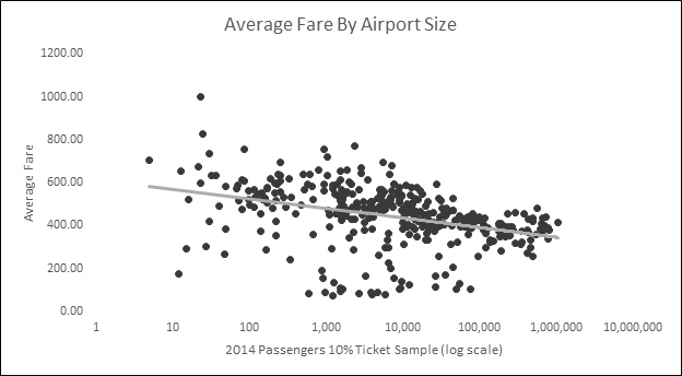
When the expanded dataset is plotted[1] the relationship between airport size[2] and average fares looks like this.

FareXAirportSize2

This makes a lot more sense to me. The most expensive airports tend to be the very small ones. Many of these have service from just one carrier, often as part of the EAS.  In general, as airports get busier average fares go down. Presumably, this is due to competition driving down fares. The airports with the lowest average fares are those small and midsize airports that are being used exclusively by Allegiant, Spirit, or another low cost carrier.

Note

Some of the language in this post might make it sound like passenger numbers cause different fare levels. This is not really the case. Both passenger numbers and prices influence each other simultaneously.  Lower fares may attract more passengers, while an increased number of passengers might drive up fares.


[1]I only include airports located in the 48 states and Washington DC. The Original dataset also includes flights to AK, HI, and US territories. Focusing on the 48 states does not significantly change the results.

[2] A few notes regarding the airport size data in this chart: This is from the BTS D1B1 itinerary 10% ticket sample data. The numbers of passengers shown here are the total passengers originating at that airport in the 10% ticket sample in 2014. There are risks in using prices from 2015 and passenger numbers from 2014, especially if passenger numbers or prices within airports fluctuate dramatically between years. I do not believe passenger numbers change dramatically enough from year to year to warrant much of a concern here, but it is a possible source of error.

THE GLOBAL POPULATION AND STANDARD OF LIVING ARE INCREASING-SO WHY ARE COMMODITIES SO CHEAP?

In the future we likely going to need more things than we do today. There will be more of us, and we are going to be richer and consume more than our predecessors. It seems only reasonable that increased future demand should drive up commodity prices.

The earth is a finite system and contains finite resources. As time goes on, we extract the easiest and cheapest resources first leaving only the more difficult and expensive sources. Combining this with increased resource consumption and an increasing population and the argument for long run increases in prices becomes clear.

To aid in empiric ease and exactness I’ll look at copper and aluminum. These metals (especially copper) are sort of a barometer of global economic conditions and correlate strongly with economic growth. This makes them a good tool to examine the relationship between economic growth, resource demand, and commodity prices.

Copper Consumption

I did a Google Image Search for the term “Copper Consumption” this chart was the first result.

world_copper_demand

This is from the website of Canadian copper company AQM Copper[1]. The image shows the amount of copper demanded by the world between 1900 and 2007 as 608 Million tonnes. It estimates that over the next twenty-five years the world will use more copper than it has in the previous one-hundred and seven. AQM says that the surging demand is largely due to increases in urbanization and consumption in China.  Similar growth can be seen in Aluminum[2].

This has been the story with copper (along with other commodities). Those in the business of producing copper have been quick to cite growing demand from an increasingly wealthy Chinese population, with additional boosts from other emerging markets, as a driver of increased commodity demand. So far, the story has been true. This is a microcosm of the question asked at the top of this post. Increases in the standard of living are indeed driving increased demand.

Cyclical Price Changes

The fact that the world is likely to need more metals in the future is hardly a secret. This is exactly what commodity traders and producers are looking at when they are trying to figure out the future price of metals.  The people who are buying and selling metals are doing it with the full knowledge that consumption is increasing. They sell it at prices that they believe to be worthwhile after considering this information.

Despite increased demand, both aluminum and copper are worth about half of what they were five years ago. That’s a serious drop.  aluminum is about 40 percent cheaper than it was ten years ago, which is also a significant drop.

After the financial crisis, many investors rushed into various commodities. Driven partially by the idea of surging demand from emerging markets, and partially by the fact that every other investment class seemed really scary at the time. They sort of overdid it, and there was a surge in copper, gold, and other commodities. Prices collapsed, bringing us to the current situation. We are currently on the downward side of a commodities cycle. Copper and aluminum had their recent peak about five years ago, and have been dropping ever since[3].


5yrAL

5yrCU

Price increases will inspire increased production, substituting, and recycling. At higher prices projects that were not viable at lower prices become worthwhile.  For metals, this means mining more difficult to reach ore, as well as increased recycling and other methods of salvage.  All of these factors help to counter the very price increases that spawned them. Both copper and aluminum production has increased over recent years.


This is the economist’s basic response to this question. As something get more expensive, people have greater reason to find more of it, find alternatives, and conserve what that they already have.

If rising prices increase production, falling prices should reduce it. This is true, but there are costs to starting and stopping operations. Mines are very expensive. A large proportion of their costs are the upfront costs of construction, surveying, satisfying regulatory agencies, and all the other costs of building a mine. Once a project has begun operations, it is likely to keep producing even if the price drops significantly. Therefore, while high prices might be enough to inspire increased production, low prices may not be able to stifle It in the short term.  For the individual producer, the most profitable course of action during low prices might be to recoup as much of their investment as they can by producing as much as they can. These asymmetries help to create the pronounced cycles commonly seen in commodity prices.

Long Run Price Trends

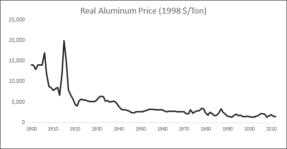
Perhaps more importantly for the answer of this question is the long term trend of metal prices. Aluminum used to very expensive. It was considered a semiprecious metal in the late 1800s[4].

AL LONG RUN.png

Both copper and aluminum prices fell during the first half of the 20th century. Since about 1950, the trend for Aluminum is down, and the trend for copper is mixed[5]CU LONG RUN

AL MED RUN

CU MED RUN


Several factors counter the long run rise of resource demand. Technological change, along with improvements in mining, leads to cheaper extraction of greater quantities. Metals, unlike other commodities such as corn or oil, stick around after being extracted. This allows for recycling, “urban mining” and selling scrap. The relationship between these forces and demand should determine long run price trends.

Just because the world will need more commodities in the future does not mean that those commodities will be more expensive now. Prices are determined by the intersection of supply and demand. Going forward, Technological improvement will make some commodities easier to produce, it will make others more important, and it may make others unnecessary. So far production has been able to keep up with demand, and current prices indicate that this trend is not expected to change in the near future.


[1] http://www.aqmcopper.com/s/copperfundamentals.asp

[2] See the first chart in this article. http://www.bloomberg.com/gadfly/articles/2016-01-12/alcoa-earnings-its-split-can-t-come-soon-enough

[3] Price charts from InfoMine.com. Obviously.

[4] http://minerals.usgs.gov/minerals/pubs/commodity/aluminum/050798.pdf

[5] The data for these four charts comes from the USGS  This data only goes through 2013, both AL and CU prices have fallen since then.

Who are the Self-Employed?

Who are the self-employed?

I thought this would be a pretty straightforward empirical question. It seems like the sort of question that has an actual answer. There are people who are self-employed, and those people have characteristics, and they are the sort of characteristics that researches would be interested in and would document. This is sort of true, but the answers are not as clear as I was hoping they would be. For one thing the material presented here is somewhat dated. I am pulling numbers from reports from 2010, and 2006. In any case, this should be a good starting point for some basic demographics regarding the self-employed.

Data and Definitions

Much of the data comes from this report which is a 2010 report using data from 2009. The report on duration of employment is older, published in 2006, uses National Longitudinal Survey of Youth (NLSY1979) Data using data that runs through 2002. With the rise of the “gig-economy” and the proliferation of startups, current trends in self-employment may be different than the data presented here.
People counted as self-employed are those who answered “self-employed” to the following question from the Current Population Survey .
“Last week, were you employed by government, by a private company, a nonprofit organization, or were you self-employed? ”
If they answer “government”, “private company”, nonprofit organization” they are counted as wage and salary workers.
The CPS goes on to ask “if this business in incorporated” if they answer yes, they get classified as incorporated self-employed, if no, they get classified as unincorporated self-employed. These two classifications have different demographics, and are probably best treated separately.

Demographics of the Self-Employed

In 2009 there were 15.3 million self-employed people in the United States, 9.8 million were unincorporated and 5.5 million were incorporated. A large clump of the self-employed in America are farmers, although the percentage has been declining, in 2009 just under 40% of the unincorporated self-employed worked in Agriculture.
In general, the self-employed are older, more likely to be white, more likely to be male, and better educated than the general workforce.

Gender

Gender_Self_Employed
Both the Incorporated and Unincorporated self-employed are more heavily male, than the general workforce. This is especially true for the Incorporated self-employed.

Age
self_employed_by_age
The Self-employed are generally older than Wage and Salary workers. This is probably because it takes time and experience to acquire the resources and skills to go into business for yourself. In general, the Incorporated self-employed are older than the unincorporated, but there are relatively more unincorporated self-employed in the greater than 65 age group. The percentages displayed here are the percentages within the employment category, so the 10% for Wage and Salary workers at 20-24 years, means that 10% of the Wage and Salary workers are between 20-24 years .

Duration

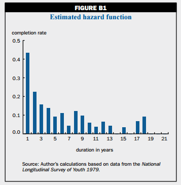
The report[1] I am using about the duration of the self-employed uses NLSY data to give the following information regarding duration of self-employment.

In general spills of self-employment are short, with many people leaving self-employment after just one year. People who have been self-employed for a while are less likely to leave self-employed for Wage or Salary work. Economic conditions seem to influence self-employment, with more people leaving self-employment when economic conditions are better. This indicates that many people are self-employed because they can’t find satisfactory work in the general labor market.

FIG_B1

The above graph is an estimation of the duration of the first self-employment spell for males over 21.  Due to censoring issues with longitudinal surveys like the NLSY It is a better estimate than the basic survey numbers. This should be interpreted as the odds that someone who has been self-employed for the duration on the x-axis rejoins the Wage and Salary labor force. So about 15% of people who have been self-employed for three years, cease being self-employed at that time.


[1] The Self Employment duration of young men over the business cycle, Ellen R. Rissman.

INTEREST RATES

Regarding the fed’s recent decision to raise interest rates:


  • Why now and not before?
  • Is it enough to make a difference?
  • If it is, what difference, inside and outside US?


Before getting to the questions let’s take a look at the purpose and goal of the fed so we can look at some of the trade-offs they are dealing with. The fed has pretty much three goals:

“The Congress established the statutory objectives for monetary policy–maximum employment, stable prices, and moderate long-term interest rates–in the Federal Reserve Act.” 

The balancing act that the fed aims to achieve is to provide enough money to keep unemployment low, without creating too much inflation and losing control of prices. The fed does provide some guidance on what it considers to be appropriate levels of these indicators. For inflation the current target is 2%. Or in fed-speak:

“The FOMC noted in its statement that the Committee judges that inflation at the rate of 2 percent (as measured by the annual change in the price index for personal consumption expenditures, or PCE) is most consistent over the longer run with the Federal Reserve’s statutory mandate.”

There is no exact target for unemployment. Estimates of the long run normal rate of unemployment among members of the FOMC range between 4.7 to 5.8 percent, however these estimates are clustered at the lower end of the range,  with the median value at 4.9. Ultimately, the Fed is looking for inflation to be around 2% and unemployment to be about 5%.  It is important to keep in mind that the fed looks to as long term goals. So just because the inflation rate is below 2% at the moment does not necessarily mean that the fed will not raise interest rates, if it predicts an increase in the inflation rate in the future.

 Why now and not before? 

For all of the quantitative tools and extensive analysis at their disposal, monetary policy remains an art not a science. The FOMC[1] meets eight times a year to decide if they want to change interests rates. Each time they meet they publish a brief press release regarding their decision. Comparing the two most recent statements will help give a sense of what changed.  Here is the one from the second most recent meeting in October of 2015.

It begins with an overall description of the current economic situation. 

“Information received since the Federal Open Market Committee met in September suggests that economic activity has been expanding at a moderate pace. Household spending and business fixed investment have been increasing at solid rates in recent months, and the housing sector has improved further; however, net exports have been soft.”

Then it starts talking about unemployment.

“The pace of job gains slowed and the unemployment rate held steady. Nonetheless, labor market indicators, on balance, show that underutilization of labor resources has diminished since early this year.”

Job growth slowed since their last meeting, and the unemployment rate did not change. However, things are better than they were at the beginning of the year. Since the unemployment rate did not decline, the fed sees evidence that they should carry on with their current policy.

“Inflation has continued to run below the Committee’s longer-run objective, partly reflecting declines in energy prices and in prices of non-energy imports. Market-based measures of inflation compensation moved slightly lower; survey-based measures of longer-term inflation expectations have remained stable.”

Again, no major changes. Inflation is below where the Fed would like it to be, so as far as the current situation is concerned there isn’t a huge need to change monetary policy to reduce inflation.

Then the fed talks about its expectations for the future. This is important. Monetary policy is not an instant tool, so the fed really needs to base its decisions on what it thinks inflation and unemployment are going to be down the road.

“Consistent with its statutory mandate, the Committee seeks to foster maximum employment and price stability. The Committee expects that, with appropriate policy accommodation, economic activity will expand at a moderate pace, with labor market indicators continuing to move toward levels the Committee judges consistent with its dual mandate. The Committee continues to see the risks to the outlook for economic activity and the labor market as nearly balanced but is monitoring global economic and financial developments. Inflation is anticipated to remain near its recent low level in the near term but the Committee expects inflation to rise gradually toward 2 percent over the medium term as the labor market improves further and the transitory effects of declines in energy and import prices dissipate. The Committee continues to monitor inflation developments closely.”


Even though currently unemployment is above the target and inflation is below, the Fed predicts that the labor market will gradually improve and that inflation will gradually rise.

Then the Fed goes on to make the call about not to change the federal funds rate.

“To support continued progress toward maximum employment and price stability, the Committee today reaffirmed its view that the current 0 to 1/4 percent target range for the federal funds rate remains appropriate.”

 Contrasting this with the latest press release where they explain their decision to raise interest rates and what changed.

“Information received since the Federal Open Market Committee met in October suggests that economic activity has been expanding at a moderate pace. Household spending and business fixed investment have been increasing at solid rates in recent months, and the housing sector has improved further; however, net exports have been soft. A range of recent labor market indicators, including ongoing job gains and declining unemployment, shows further improvement and confirms that underutilization of labor resources has diminished appreciably since early this year. Inflation has continued to run below the Committee’s 2 percent longer-run objective, partly reflecting declines in energy prices and in prices of non-energy imports. Market-based measures of inflation compensation remain low; some survey-based measures of longer-term inflation expectations have edged down.”

This is a stronger characterization of the economy than the previous month’s report, especially regarding changes in the labor market. Which, due to their mandate, is one of the things the Fed is most concerned with.

The Committee judges that there has been considerable improvement in labor market conditions this year, and it is reasonably confident that inflation will rise, over the medium term, to its 2 percent objective. Given the economic outlook, and recognizing the time it takes for policy actions to affect future economic outcomes, the Committee decided to raise the target range for the federal funds rate to 1/4 to 1/2 percent.”

This is where the FOMC makes the call to raise interest rates. They have been waiting for labor market conditions to improve to the point where they can raise interest rates without too much risk to the labor market. They believe that the labor market is now at that level.

“The stance of monetary policy remains accommodative after this increase, thereby supporting further improvement in labor market conditions and a return to 2 percent inflation.”

Even though they did raise interest rates for the first time since 2006, they didn’t raise them very much and they remain very low by historical levels. Although there have been near-zero interest rates for several years now it is important to keep in mind that they are historically abnormal. Some people have characterized this decision as lifting up on the gas pedal a little bit instead of keeping it hard pressed to the floor.[2] This is probably not a bad way to think about the change the FOMC has made.

Because of the way these decisions are made, the impact of interests rates, the huge variety of indicators that need to be taken into account, as well as different political viewpoints, there will always be people who believe that the fed should have waited, or should have raised interest rates earlier. The timing of the federal reserve’s move is not something I have an opinion on.

  • Is it enough to make a difference?
  • If it is, what difference, inside and outside US?


A difference in what? Interest rates have an incredibly broad impact on the economy. I assure you that there will be something that is affected by this change. In the most basic terms, an increase in interest rates raises the costs of borrowing money, this should reduce economic growth, job growth, and most asset prices, along with a myriad of other impacts.

As far as international impacts go, US government debt serves as a reference point for the global economy, so fed interest rate decisions do have global impacts. One impact is a likely appreciate of the US dollar, which has its own global feedback effects.

That said, the changes from this particular raise are likely to be fairly minimal. This was a small change, and one that was expected by financial markets. Expectations matter when it comes to interest rate changes, and this change was already pretty much priced into financial markets.  It is important to remember that the fed will likely continue to increase rates going forward. This isn’t the end of anything, it’s a process that will continue. Most forecasts have interest rates rising to something like 1-2 percent in the next couple of years.  Predicting the global economy is a tricky thing to do, so I’m going to refrain from guessing at specific impacts of future rate increases.


[1] Federal Open Markets Committee. Bit of the Federal reserve that actually gets together to decide what interest rates should be.

[2] In general, I don’t like analogies that equate the economy to anything like an airplane or a car. The economy is not a thing, and is much more complicated and unpredictable than any airplane.

BIG PHARMA

Does Big Pharma make unusually high profits from their high prices for patented drugs? If so, why hasn’t competition whittled them down?


Does Big Pharma make unusually high profits…

Yes.

According to this article from Forbes. The U.S. industry with the highest profit margins is “Health Technology” with a projected average profit margin of 21%.  I’m not sure exactly which companies are included in “Health Technology” but it certainly includes Pfizer, Merck, and Johnson and Johnson.


Does Big Pharma make unusually high profits from their high prices for patented drugs?

They certainly make up a big chunk of revenue. In 2014 the Global Innovating Pharmaceutical Operating Segment, the bit of Pfizer that contains new and innovative drugs, make around $14B in revenue, or about 30% of Pfizer’s total revenue from Biopharmaceuticals, which make up the vast majority of the company’s revenue.

Revenue is not profit, but seeing how fervently Pharmaceutical companies protect their patents and look for ways to extend them, it is pretty obvious that they are an important part of their profits. For example, when Pfizer lost the patent to Lipitor in 2011, their total profit dropped by 19%.


If so, why hasn’t competition whittled them down?

The whole point of patents is to give companies a monopoly on certain products as an incentive to invent more of these products. So there is no direct competition on patented drugs. Once patents expire, the introduction of generics can cause massive price drops.

The other way for competition to eat away at profits, would be if market forces drove large drug companies to spend most of their income on investment, as opposed to taking profits.  I am not familiar with what drives these decisions: It could be that executives are looking to maximize short term share price via profits. It could be that there are diminishing marginal returns to investments in new drugs. Just because a drug company has a bunch of money to spend on developing new drugs, doesn’t mean that there are a bunch of profitable new drugs to develop. This might be especially true given how long it takes to develop a new drug.

Another possible hypothesis is that there isn’t that much competition among the major drug companies. In 2008 15 companies made about half the total global revenue for the industry[1]. Combine that with drug monopolies and high barriers to entry and you end up with something that is far from a situation of perfect competition.

In the long run, in a competitive industry profits should fall. The fact that they haven’t for the pharmaceutical industry is evidence that the competitive forces are not powerful enough.

[1] http://triplehelixblog.com/2014/07/the-patent-cliff-implications-for-the-pharmaceutical-industry/

B CORPORATIONS

What is a B corporation and what problem does it solve?

 In the simplest of terms, B Corporation is a corporation that has been given the ‘B Corporation’ certification by the B-Lab nonprofit organization.

What problem does it solve?

 Most corporations have a very simple goal: maximize shareholder value by maximizing profits. Indeed, under US corporate law, companies can be sued if they deviate from this goal. Due to the important role that business play in society, many people would like them to look at other things besides. This can take the form of ‘Corporate Social Responsibility’ or ‘triple bottom line’ type thinking. These approaches usually take the form of companies acting in a socially and environmentally responsible way, the triple bottom line is “social, environmental, and financial.”

Companies, realizing that consumers value purchasing responsible products have responded by marketing themselves as “Green” and “Socially Responsible.” The issue with this is when everyone is saying how responsible they are it is hard to tell who is being honest and who is just green washing.

The solution to is to provide some sort of certification process to verify which companies are actually acting in a responsible manner. There are already a number of certifications such as LEED Certified buildings, or fair trade certified coffee. However, these tend to be focused on a single issue. B-Lab tries to develop a broader certification that covers all aspects of responsible business.

In order to become a certified B-Corporation a company needs to do three things.

  • Change their company governing documents to include statements showing commitment to consider stakeholders[1] when making business decisions.
  • Have an Assessment done by B-Lab, to score the company. A company needs a score of 80 or greater to qualify to be a B-Corp.
  • Pay an annual fee ($500-$50,000+) depending on the size of the company.

The meat of this is the assessment. If the assessment gives a proper score that accurately reflects the true impact of the company then this could be a valuable tool, if it does not, it is no better than so much green packaging.

Not all companies are given the same assessment, instead assessments are varied depending on the type of industry, size of company, location of company and other factors.

I went ahead and filled out the basic survey for a company that I made up. Colorado based ABCcorp, which is in the hospitality business.  (I pretty much filled in the bubbles at random.) They asked questions about labor (how much people are paid, what benefits, how much more is the highest paid person paid, compared to the lowest. Community(questions about who the company works with, amount given to charity etc. Environmental( Questions about Recycling, Energy Use Emissions, Etc.)

At the end of this survey ABCcorp was given a score (it did above average on 12 things and below average on 26 things.)[2] If I wanted to actually get my company certified, I would have to engage in a longer assessment in which I would have to document everything I just said about ABCcorp. Presumably, the fact that my company does not exist would disqualify it. To complete the process, companies have to send documents to B-Lab and have to undergo a more detailed analysis. After they go through this process they are scored from 0-200, with a score of 80 being the minimum needed to obtain a certification as a B-Corp.


What does being a B-Certified company actually tell you about a company?

One thing it absolutely tells you is that this company wants to be a B-certified company. This means that they have an interest in being a socially and environmentally responsible company, or at least in looking like one, and they feel that it is worth putting some time and effort to do so. It also tells you that on a number of indicators related to various aspects of responsibility they perform well. For (some?) B-certified companies you can find reports that give more details on their scores. For Patagonia we see that they perform better than the Median company assessed by B-Lab on nearly every category.  Which is nice, but I couldn’t tell you exactly what that means.

Scoring companies on their social and environmental responsibility is always going to be really hard. All companies are different and have different strengths and weaknesses, different areas where they are impactful, and different problems. Any scoring system is a judgment call on how to value these things and will always be imperfect.

Ultimately, I think there is probably some value to something like B-Corps. If only that it tells consumers that these companies find it important to consider all stakeholders when making their decisions, and that another group of people seem to think that they are doing okay at actually carrying this out. I won’t be changing my shopping to purchase more B-company products, though. If you like the B-Corp produced flour you buy, I’d probably keep buying it.


[1] Stakeholders are all those involved in a business. It includes Customers, Workers, Owners, Suppliers, any anyone in the outside community that might be affected by the companies’ actions. Ex: people in the community who have to live with effects of pollution.

[2] Here at ABCcorp we are never average!