Which Unemployment Rate is the Best?

If you ever are at a party, and you stumble into a conversation that is quickly flatlining, you can always attempt to revive it by asking your fellow revelers the following question: “Which unemployment rate do you like the best?”

There are different unemployment rates?

The BLS keeps track of six different unemployment rates. Because the BLS (like most organizations whose names consist entirely of consonants) is not the most creative organization, these are called U-1, through U-6.

Plot

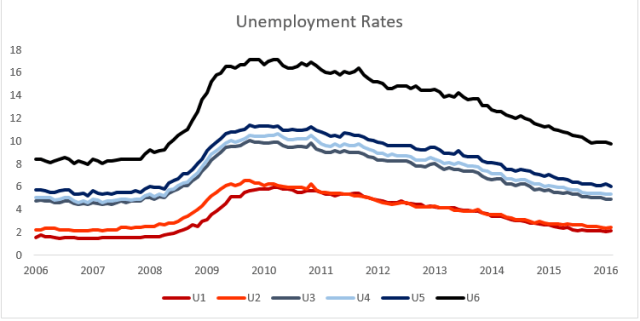
Here is a plot of the six different (seasonally adjusted) rates over the last decade. All of the rates follow each other fairly closely, so If one rate goes down, the others will almost certainly follow the same trend. There is substantial variation in terms of the absolute magnitude, and unemployment seems like an absolute magnitude worth caring about.

We should be interested in the unemployment rate for similar reasons as we are interested in the economy as a whole. However, the unemployment rate is not just an abstract index of the strength of the labor market. It is also supposed to be a meaningful measure in its own right. An unemployment rate of 5% should tell us that 5% of our labor force is unemployed. The different measures of unemployment differentiate themselves by counting different groups of people as unemployed or as looking for work.

The Different Unemployment Rates: 

U-1 = Persons unemployed 15 weeks or longer/The Civilian Labor Force.

Seasonally Adjusted Value- Feb 2016 = 2.1 Percent

The Civilian Labor Force

The group of people that gets counted as either employed or unemployed is summed up as the civilian labor force. This is everyone over 16, who is not in prison, or in the military, who is either employed or unemployed. To count as employed one needs to work any amount for pay or profit, to count as unemployed one needs to have not worked but be actively looking for work.

Some of the people who are not counted in the civilian labor force include: full time students, retirees, stay at home parents, and discouraged workers who have given up on finding a job. As of last count the civilian labor force was 158.9 Million, which is about half of the US population.

U-1 is the strictest measure of unemployment. Not only does one have to be unemployed, one has to have been that way for at least 15 weeks. This measure should capture the long term, chronically, or structurally unemployed.  This is the group of unemployed people who are unable to find work due to a fundamental disconnect between what they have to offer and what is needed by employers.

U-2 = Job losers and persons who completed temporary jobs/the civilian labor force

Seasonally Adjusted Value in Feb 2016 = 2.4 Percent

While U-2 tends to closely follow U-1 it is calculated in a different way. The BLS breaks down unemployed people into four categories based on what happened in their previous job:  Job Losers and persons who completed temporary jobs, Job Leavers, Reentrants, and New Entrants. U-2 counts only people in the first category, Job losers and persons who completed temporary jobs. These are people who have lost their jobs do to being fired or laid off, or people who have finished a temporary job and have not been able to find another one.  It does not count people who leave their jobs voluntarily, people who are reentering the labor force after a long absence, or people who are entering the labor force for the first time.

Both U-1 and U-2 are narrow measures of unemployment. They both try to emphasize the most damaging parts of unemployment. U-1 does this by counting only those people who have been unemployed for a significant period of time. U-2 does this by counting those people who recently had jobs, and were forced to leave them.

U-3= Unemployed/Civilian Labor Force

Seasonally Adjusted Value in Feb 2016- 4.9 Percent

Whenever someone in a news report mentions the unemployment rate they are talking about U-3. U-3 is by far and away the most commonly used measure of unemployment in the United States.  It is also one of the most straightforward to calculate. It is the number of unemployed people as a percentage of the total number of people in the labor force. Unlike U-1 and U-2, it does not make any further restrictions on which unemployed people to count. Everyone in U-1 and U-2 is also in U-3.

U-4= Unemployed + Discouraged Workers / Civilian Labor Force+ Discouraged Workers

Seasonally Adjusted Value in Feb 2016- 5.3 Percent

To count as part of the labor force, one needs to be working, or actively looking for work sometime in the last four weeks. Looking for employment can be a discouraging and unpleasant process, and some people give up when they cannot find employment.  People who have actively looked for work within the last 12 months, but have not looked recently due to economic conditions are counted as discouraged workers. These are people who feel (correctly or incorrectly) that there are no jobs available for them or no jobs that they would qualify for.

U-5= Unemployed + Marginally Attached Workers/ Civilian Labor Force + Marginally Attached Workers

Seasonally Adjusted Value in Feb 2016- 6.0 Percent

Discouraged Workers are a subset of people who are classified as marginally attached to the labor force. Marginally Attached Workers are workers who are available for work, who would like to work, and have sought employment within the last year (but not in the last 4 weeks). Unlike discouraged workers they do not need to have stopped looking for work due to economic conditions. This means that everyone in U-4 is also in U-5.

U-6 = Unemployed+ Discouraged Workers + Part time due to Economic Reasons/Civilian Labor Force + Marginally Attached Workers

Seasonally Adjusted Value in Feb 2016 = 9.7 Percent

The broadest measure is U-6. U-6 includes everyone in U-5 but also counts those people who are working part time due to economic conditions. These are people who are available to work full time, would like to work full time, but can only manage to find a part time job. There are a lot of these people, just under 6 million in Feb 2016, and they bump up the total value of U-6 to 9.7 Percent.  Because of its magnitude, U-6 tends to be the indicator of choice for people who would like to point out just how badly the labor market is doing.

Which Unemployment Rate is the Best?

At this point, a boring person would say that trying to figure out which unemployment rate is the best is a little silly. Each rate has its purpose and you should look at different ones (or even better at all of them) in order to get a full sense of the labor market picture.  This is true, but there is value in having an indicator you can turn to in almost all cases. Historically this has been U-3.

The Best Unemployment Rate is…

The best unemployment rate is the one that give us the most information about the strength of the labor market, while still being a real measure in its own right.  U-1 and U-2 are both too narrow for most purposes.  They really are designed to measure a subset of the unemployed and not the total unemployed population. U-3 is good, and has the added advantage of being what we are used to using and talking about. I prefer U-4. Adding in the discouraged workers gives a more accurate indicator of people who would think of themselves as unemployed. These are clearly people who are not working due to economic reasons, which is just the thing the unemployment rate is trying to capture. U-5 takes it a bit too far, everyone marginally attached to the labor force adds in a lot of people in a mess of different situations.

U-6 is interesting. The people who are working part time (especially if it’s just a few hours a week) instead of full time are surely suffering many of the negative effects of unemployment. The problem with U-6 is that it isn’t really an unemployment rate.  Once a good chunk of the people in an indicator are employed, even part time for economic reasons, it isn’t really an unemployment rate anymore. While U6 is a good indicator for the health of the labor market, it is not a good unemployment rate.

So that leaves us with U-4. Which wins the official PARTYSHEEPHATS nomination for best unemployment rate. Congratulations U-4! Go do whatever it is economic indicators do to celebrate. Go down or something.


Sources and Further Reading

http://www.economonitor.com/dolanecon/2013/09/16/what-does-the-broad-unemployment-rate-u-6-really-tell-us/

http://www.bls.gov/lau/stalt.htm

http://www.bls.gov/news.release/empsit.t15.htm

http://www.bls.gov/news.release/pdf/empsit.pdf

http://portalseven.com/employment/unemployment_rate_u1.jsp


ARE FARES HIGHER AT LARGER AIRPORTS?

Like most people, I follow the Bureau of Transportation Statistics on Twitter. Earlier this month they tweeted the following chart which breaks down different sizes of airport by average fare. The conclusion is spelled out in the tweet, “Biggest airports have highest fares, mid-size lowest”.

Capture

I was surprised by this. In my experience, larger airports are cheaper to fly to than smaller ones. A quick look at the map on Google Flights shows a snapshot of fares from Chicago (both O’Hare and Midway). Some of the cheapest places to fly are Atlanta, Minneapolis, Houston, New York, Orlando, and Las Vegas. All of these are cheaper than smaller markets like Nashville, Kansas City, or Raleigh.

GoogFLights

There might be good reasons why larger airports would be more expensive. They may have the longest flights and they are often dominated by a single carrier that has their hub there.  They also tend to have international flights, but since this data is all domestic flights that shouldn’t matter.

The BTS chart at the top of this post was based on data from the top 100 airports by originating domestic passengers. Here is the same data presented with a scatterplot.

FareXAirportSize1

There is clearly a large average fare range among the smaller airports. The airport with the cheapest average fares is Orlando/Sanford airport (SFB). The nearly 250,000 passengers who originated here paid just $103.41 on average. The only scheduled domestic service at SFB is on discount carrier Allegiant, so most passengers likely had to chip in a few extra bucks for things like carry-on baggage.  Every airport with an average fare below $200 exclusively operated as bases for ultra-low cost carriers: Orlando/Sanford(SFB), St. Petersburg/Clearwater(PIE), and Phoenix/Mesa(IWA) are all Allegiant bases, while Atlantic City’s (ACY) domestic flights are exclusively on Spirit. The most expensive airport was Madison Wi (MSN) with an average fare of $524.93, followed by Harrisburg (MDT) and United hub Newark(EWR) with average fares of $479 and $478 respectively.

There isn’t much of an overall trend, maybe a slight rise in average fare as airport size increases. Certainly, the airports with the lowest average fares are usually the smallest ones. All of the airports with average fare levels under $300 also have fewer than 4 million passengers.

How small is small?

So, do smaller airports actually have lower fares than large ones?  Well, no.

The original data is based on the top 100 busiest airports in America. None of these are particularly small. The least busy airport in this sample is Atlantic City which had 137,794 passengers in the second quarter of 2015. There are many airports with far fewer passengers than that.

Fortunately, the BTS has data on average fares from those airports as well. This data includes over 400 airports including some properly small ones. Thief River Falls Minnesota(TVF) is served exclusively by Great Lakes Airlines as part of the Essential Air Service program. The number of passengers is low, but the fares are high. Average fares at TVF are over $700.  That is not even the airport with the highest average fare. That honor goes to Wolf Point MT(OLF), with average fares at just under $1000.

When the expanded dataset is plotted[1] the relationship between airport size[2] and average fares looks like this.

FareXAirportSize2

This makes a lot more sense to me. The most expensive airports tend to be the very small ones. Many of these have service from just one carrier, often as part of the EAS.  In general, as airports get busier average fares go down. Presumably, this is due to competition driving down fares. The airports with the lowest average fares are those small and midsize airports that are being used exclusively by Allegiant, Spirit, or another low cost carrier.

Note

Some of the language in this post might make it sound like passenger numbers cause different fare levels. This is not really the case. Both passenger numbers and prices influence each other simultaneously.  Lower fares may attract more passengers, while an increased number of passengers might drive up fares.


[1]I only include airports located in the 48 states and Washington DC. The Original dataset also includes flights to AK, HI, and US territories. Focusing on the 48 states does not significantly change the results.

[2] A few notes regarding the airport size data in this chart: This is from the BTS D1B1 itinerary 10% ticket sample data. The numbers of passengers shown here are the total passengers originating at that airport in the 10% ticket sample in 2014. There are risks in using prices from 2015 and passenger numbers from 2014, especially if passenger numbers or prices within airports fluctuate dramatically between years. I do not believe passenger numbers change dramatically enough from year to year to warrant much of a concern here, but it is a possible source of error.

THE GLOBAL POPULATION AND STANDARD OF LIVING ARE INCREASING-SO WHY ARE COMMODITIES SO CHEAP?

In the future we likely going to need more things than we do today. There will be more of us, and we are going to be richer and consume more than our predecessors. It seems only reasonable that increased future demand should drive up commodity prices.

The earth is a finite system and contains finite resources. As time goes on, we extract the easiest and cheapest resources first leaving only the more difficult and expensive sources. Combining this with increased resource consumption and an increasing population and the argument for long run increases in prices becomes clear.

To aid in empiric ease and exactness I’ll look at copper and aluminum. These metals (especially copper) are sort of a barometer of global economic conditions and correlate strongly with economic growth. This makes them a good tool to examine the relationship between economic growth, resource demand, and commodity prices.

Copper Consumption

I did a Google Image Search for the term “Copper Consumption” this chart was the first result.

world_copper_demand

This is from the website of Canadian copper company AQM Copper[1]. The image shows the amount of copper demanded by the world between 1900 and 2007 as 608 Million tonnes. It estimates that over the next twenty-five years the world will use more copper than it has in the previous one-hundred and seven. AQM says that the surging demand is largely due to increases in urbanization and consumption in China.  Similar growth can be seen in Aluminum[2].

This has been the story with copper (along with other commodities). Those in the business of producing copper have been quick to cite growing demand from an increasingly wealthy Chinese population, with additional boosts from other emerging markets, as a driver of increased commodity demand. So far, the story has been true. This is a microcosm of the question asked at the top of this post. Increases in the standard of living are indeed driving increased demand.

Cyclical Price Changes

The fact that the world is likely to need more metals in the future is hardly a secret. This is exactly what commodity traders and producers are looking at when they are trying to figure out the future price of metals.  The people who are buying and selling metals are doing it with the full knowledge that consumption is increasing. They sell it at prices that they believe to be worthwhile after considering this information.

Despite increased demand, both aluminum and copper are worth about half of what they were five years ago. That’s a serious drop.  aluminum is about 40 percent cheaper than it was ten years ago, which is also a significant drop.

After the financial crisis, many investors rushed into various commodities. Driven partially by the idea of surging demand from emerging markets, and partially by the fact that every other investment class seemed really scary at the time. They sort of overdid it, and there was a surge in copper, gold, and other commodities. Prices collapsed, bringing us to the current situation. We are currently on the downward side of a commodities cycle. Copper and aluminum had their recent peak about five years ago, and have been dropping ever since[3].


5yrAL

5yrCU

Price increases will inspire increased production, substituting, and recycling. At higher prices projects that were not viable at lower prices become worthwhile.  For metals, this means mining more difficult to reach ore, as well as increased recycling and other methods of salvage.  All of these factors help to counter the very price increases that spawned them. Both copper and aluminum production has increased over recent years.


This is the economist’s basic response to this question. As something get more expensive, people have greater reason to find more of it, find alternatives, and conserve what that they already have.

If rising prices increase production, falling prices should reduce it. This is true, but there are costs to starting and stopping operations. Mines are very expensive. A large proportion of their costs are the upfront costs of construction, surveying, satisfying regulatory agencies, and all the other costs of building a mine. Once a project has begun operations, it is likely to keep producing even if the price drops significantly. Therefore, while high prices might be enough to inspire increased production, low prices may not be able to stifle It in the short term.  For the individual producer, the most profitable course of action during low prices might be to recoup as much of their investment as they can by producing as much as they can. These asymmetries help to create the pronounced cycles commonly seen in commodity prices.

Long Run Price Trends

Perhaps more importantly for the answer of this question is the long term trend of metal prices. Aluminum used to very expensive. It was considered a semiprecious metal in the late 1800s[4].

AL LONG RUN.png

Both copper and aluminum prices fell during the first half of the 20th century. Since about 1950, the trend for Aluminum is down, and the trend for copper is mixed[5]CU LONG RUN

AL MED RUN

CU MED RUN


Several factors counter the long run rise of resource demand. Technological change, along with improvements in mining, leads to cheaper extraction of greater quantities. Metals, unlike other commodities such as corn or oil, stick around after being extracted. This allows for recycling, “urban mining” and selling scrap. The relationship between these forces and demand should determine long run price trends.

Just because the world will need more commodities in the future does not mean that those commodities will be more expensive now. Prices are determined by the intersection of supply and demand. Going forward, Technological improvement will make some commodities easier to produce, it will make others more important, and it may make others unnecessary. So far production has been able to keep up with demand, and current prices indicate that this trend is not expected to change in the near future.


[1] http://www.aqmcopper.com/s/copperfundamentals.asp

[2] See the first chart in this article. http://www.bloomberg.com/gadfly/articles/2016-01-12/alcoa-earnings-its-split-can-t-come-soon-enough

[3] Price charts from InfoMine.com. Obviously.

[4] http://minerals.usgs.gov/minerals/pubs/commodity/aluminum/050798.pdf

[5] The data for these four charts comes from the USGS  This data only goes through 2013, both AL and CU prices have fallen since then.