Like most people, I follow the Bureau of Transportation Statistics on Twitter. Earlier this month they tweeted the following chart which breaks down different sizes of airport by average fare. The conclusion is spelled out in the tweet, “Biggest airports have highest fares, mid-size lowest”.

I was surprised by this. In my experience, larger airports are cheaper to fly to than smaller ones. A quick look at the map on Google Flights shows a snapshot of fares from Chicago (both O’Hare and Midway). Some of the cheapest places to fly are Atlanta, Minneapolis, Houston, New York, Orlando, and Las Vegas. All of these are cheaper than smaller markets like Nashville, Kansas City, or Raleigh.

There might be good reasons why larger airports would be more expensive. They may have the longest flights and they are often dominated by a single carrier that has their hub there. They also tend to have international flights, but since this data is all domestic flights that shouldn’t matter.
The BTS chart at the top of this post was based on data from the top 100 airports by originating domestic passengers. Here is the same data presented with a scatterplot.

There is clearly a large average fare range among the smaller airports. The airport with the cheapest average fares is Orlando/Sanford airport (SFB). The nearly 250,000 passengers who originated here paid just $103.41 on average. The only scheduled domestic service at SFB is on discount carrier Allegiant, so most passengers likely had to chip in a few extra bucks for things like carry-on baggage. Every airport with an average fare below $200 exclusively operated as bases for ultra-low cost carriers: Orlando/Sanford(SFB), St. Petersburg/Clearwater(PIE), and Phoenix/Mesa(IWA) are all Allegiant bases, while Atlantic City’s (ACY) domestic flights are exclusively on Spirit. The most expensive airport was Madison Wi (MSN) with an average fare of $524.93, followed by Harrisburg (MDT) and United hub Newark(EWR) with average fares of $479 and $478 respectively.
There isn’t much of an overall trend, maybe a slight rise in average fare as airport size increases. Certainly, the airports with the lowest average fares are usually the smallest ones. All of the airports with average fare levels under $300 also have fewer than 4 million passengers.
How small is small?
So, do smaller airports actually have lower fares than large ones? Well, no.
The original data is based on the top 100 busiest airports in America. None of these are particularly small. The least busy airport in this sample is Atlantic City which had 137,794 passengers in the second quarter of 2015. There are many airports with far fewer passengers than that.
Fortunately, the BTS has data on average fares from those airports as well. This data includes over 400 airports including some properly small ones. Thief River Falls Minnesota(TVF) is served exclusively by Great Lakes Airlines as part of the Essential Air Service program. The number of passengers is low, but the fares are high. Average fares at TVF are over $700. That is not even the airport with the highest average fare. That honor goes to Wolf Point MT(OLF), with average fares at just under $1000.
When the expanded dataset is plotted[1] the relationship between airport size[2] and average fares looks like this.
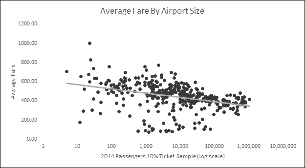
This makes a lot more sense to me. The most expensive airports tend to be the very small ones. Many of these have service from just one carrier, often as part of the EAS. In general, as airports get busier average fares go down. Presumably, this is due to competition driving down fares. The airports with the lowest average fares are those small and midsize airports that are being used exclusively by Allegiant, Spirit, or another low cost carrier.
Note
Some of the language in this post might make it sound like passenger numbers cause different fare levels. This is not really the case. Both passenger numbers and prices influence each other simultaneously. Lower fares may attract more passengers, while an increased number of passengers might drive up fares.
[1]I only include airports located in the 48 states and Washington DC. The Original dataset also includes flights to AK, HI, and US territories. Focusing on the 48 states does not significantly change the results.
[2] A few notes regarding the airport size data in this chart: This is from the BTS D1B1 itinerary 10% ticket sample data. The numbers of passengers shown here are the total passengers originating at that airport in the 10% ticket sample in 2014. There are risks in using prices from 2015 and passenger numbers from 2014, especially if passenger numbers or prices within airports fluctuate dramatically between years. I do not believe passenger numbers change dramatically enough from year to year to warrant much of a concern here, but it is a possible source of error.

My dad’s been bragging about the cheap airfares he’s getting. Now I understand why. He’s flying out of that SFB airport. Thanks for the explanation!
LikeLike