Why is Flying in Canada so Expensive?

(This is part 2 of an unintentional series on expensive Canadian things. Part 1 is here)


Flying within Canada is very expensive. It was ranked 70th of 75 in Kiwi.coms Aviation price index which gives the average cost to fly 100km.

On a couple random dates in October the cheapest flight I could find from Vancouver to Montreal was 450$ US, or about $600 Canadian. Partially, this is an expensive ticket because Canada is a big place, but a flight to Montreal out of Seattle on the same dates was $100 (USD) cheaper. This is true, even with the US ticket having more taxes and fees. Having to pay both US and Canadian fees, plus immigration fees, adds up.

While it’s true that Canadian Airports charge high landing fees to airlines. Mostly, it’s an expensive ticket because there are only two choices on airlines: Air Canada, and WestJet.

Departing Toronto Pearson


Duopoly 

Air Canada and WestJet are basically the only choices when flying domestically within Canada. Porter serves a few eastern cities, and there are airlines with awesome names like Air North, and Bearskin, which will take you to places that are even colder than Montreal or Toronto. There are also a few other Canadian airlines who mostly fly to places that are not Canada such as Air Transat, and Sunwing.

The main reason, the Seattle-Montreal Itinerary is so much cheaper is because along with Air Canada, Delta, United, and American will also sell you tickets. It’s the old recipe: more firms, more competition, lower prices.

Freedoms of the Air

With so much traffic just south of the boarder, and all major Canadian airports served by multiple US carriers, one might imagine passengers could simply book a ticket from Vancouver to Montreal through an intermediate US stop. For example, YVR-ORD-YUL. This would allow US Carriers to compete with Canadian ones, without flying directly from Canadian airport to Canadian Airport. Of course, there would be the hassle and fees involved with customs, but since most Canadian Airports have US pre-Clearance facilities, you could connect in a US airport like any domestic US passenger.

This is an impossibility. Flight searches will not display any options involving connecting in the United States. The reason for this has to do with a set of rules with the decidedly romantic name of ‘The Freedoms of the Air.’ These are negotiated between countries and govern what foreign carriers are allowed to do.  Almost nowhere in the world (except for the EU) is a foreign airline allowed to operate domestic flights within a country that does not share its flag.  Not only can US carriers not fly from Vancouver to Montreal directly, they cannot even sell tickets on this route, regardless of the actual path the aircraft takes. The same is also true if you start and end in the US, you cannot go from one US destination to another and connect in Canada.

 Room for more?

If the cause of expensive fares is limited competition, is there room for more competition to bring them down?

In markets where there is too little competition firms typically have higher profits. High profits are not something the airline industry has been historically known for and Canadian Airlines are no exception.

acvswj


2015 was a good year for pretty much every Airline[1], but Air Canada has typically struggled to make money. WestJet has been better, but it is not a market that new companies are leaping to enter. Furthermore, barriers to entry and large capital costs (planes aren’t cheap) have always made it hard to start a new airline. Canadian airline startups may be further hampered by requirements that cap foreign investment in airlines at 25%.

Maybe the problem isn’t the number of firms but rather their type. Ultra-low cost carriers (ULCCs) have been successful all around the world. Ryanair, Spirit, AirAsia, Norwegian, and company have all managed to make money by squeezing more people into planes and then charging them for everything. Canada has no low cost carriers. Until now. Startup carrier NewLeaf[2] recently started offering flights out of Winnipeg to secondary cities across Canada such as Kelowna and Hamilton. NewLeaf has not gotten off to a strong start, suspending some flights due to minimal demand.

As domestic competition is likely to remain limited, Canadian travelers will likely be stuck with expensive tickets for a while. Unless Canada wants to give 8th  or 9th freedom rights to US Carriers. Doing so would probably be bad for the Canadian airline industry, it might not be so bad for Canadians though.

Article Seven

It won’t happen. Even if the Canadian government were interested in doing this, which they arn’t, it’s not certain it would be legal. The issue comes from the international rules concerning cabotage established at the 1944 Chicago Convention. Cabotage is when a foreign carrier transports people or goods within a country, same as the 8th and 9th freedoms of the air. One of the rules (article seven) is that countries cannot give cabotage rights exclusively to another country or airline[3]. What this means is not entirely clear. The most likely interpretation of this is that the US and Canada could not make an agreement with Canada that only US airlines can conduct cabotage in Canada. An alternative interpretation could imply that Canada may not offer cabotage to US carriers without also offering it to the airlines of other countries.  At present, the only country that currently allows foreign cabotage is Chile. It seems unlikely that Canada will be the second.

Unless NewLeaf or another Low Cost Carrier is successfully able to come on the scene, it seems that Canadians will have to continue to fly on Air Canada and WestJet, and that domestic fares will remain high.


Sources, References, and Further Reading.

http://www.cbc.ca/news/canada/manitoba/newleaf-puts-brakes-on-winnipeg-flights1.3766914

https://en.wikipedia.org/wiki/Freedoms_of_the_air

http://www.bloomberg.com/news/articles/2016-09-12/can-these-new-airlines-bring-canada-s-sky-high-fares-back-to-earth

http://www.icao.int/publications/Documents/7300_9ed.pdf

https://books.google.com/books?id=yhGFiwvGg5cC&pg=PP7&source=gbs_selected_pages&cad=3#v=onepage&q&f=false


[1] Also, the only year in which I worked for one. Not a coincidence.

[2] As a virtual New Leaf owns no airplanes, but sells tickets onto flights run and operated by other airlines such as Flair Air. Most of the regional US airlines also function in a similar manner.

[3]  The actual text is: “…Each contracting State undertakes not to enter into any arrangements which specifically grant any such privilege on an exclusive basis to any other State or an airline of any other State, and not to obtain any such exclusive privilege from any other State.”

Will Vancouver’s anti-foreigner property tax hike work?

Vancouver is an absolutely lovely city. One of my very favorites. I adore its vibrant, diverse streets, its proximity to the mountains and the ocean, I even kind of like the rain. I am not unique with my preferences; Vancouver has traditionally been rated as one of the most livable cities on earth.

vancity

Vancouver, Looking lovely

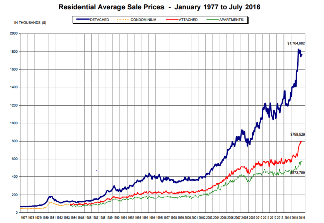
It is also spectacularly expensive. Vancouver is one of the most expensive cities in North America, and home prices have been steadily climbing to spectacular heights, for about the last 10 years.  The average price of a detached house sold in greater Vancouver in June was $1.7 Million[1].

vanhouseprice

Source: Real Estate Board of Greater Vancouver-

Graph Source: http://www.rebgv.org/sites/default/files/REBGV-Stats%20Pkg%20July%202016.pdf

I went to school in BC in the late 2000s and during that time I thought the Vancouver property market was a speculative bubble due for a sizable correction and possible crash.  In 2011, I casually predicted this would happen within the next couple years. Half a decade later, I still am.

Foreigners

Part of the story of the price rise, or at least part of a story frequently told, is the inflation is driven largely by foreign buyers. Chinese buyers are the most common culprit, seeing Vancouver real estate as an easy way to stash their money somewhere that isn’t China. Seen in this light, the Vancouver housing bubble, is not so much the Vancouver housing bubble as it is a tendril of a larger Chinese property bubble.

This story has been present for the whole course of the price rise. Foreign ownership of property was not well tracked, and there was no real data on what percentage of Vancouver’s properties were foreign owned. Until this summer, when the BC government started collected data.

During an admittedly small sample period of June and July, about 5% of the residential property purchased in Vancouver was bought by foreigners, a rate lower than the 8% average for the United States as a whole, but somewhat higher than other Canadian cities including Toronto. Some parts of Vancouver, such as Richmond experienced much higher rates of foreign ownership. Foreign owners did spend a good deal, nearly $400,000 on average, more than domestic purchasers did. This adds up to about a billion dollars’ worth of spending on property, or around 8% of all spending on home purchases.

15%

In order to curb rising house prices and try to make property more affordable for local residents, starting August 2, British Columbia instigated a 15% tax on foreigners who buy residential real-estate in the city.

Vancouver is not the first place to try this. Other cities that saw waves of foreign home buyers and high housing prices have attempted similar methods to try to cool rising property prices and limit foreign demand. Vancouver’s tax is very similar to one Hong Kong instituted in 2012. Singapore taxes foreign buyers more heavily and Australia is looking into something similar.

Will it work?

Christy Clark, the Premiere of BC, argues for the tax as a way to keep home ownership accessible to the middle class.  I think the tax alone is unlikely to make a noticeable impact.

Economists like to think of taxes as creating a gap between the amount that the buyer pays and the seller receives. This gap means that fewer transactions occur and the pre-tax price should be somewhat reduced.  Transactions go down as those who were willing to purchase a home at the pre-tax price, may not be willing to purchase the same home at a 15% price increase. The question then, becomes how many buyers will decide that a 15% price increase is not worth the trouble.

What Happened in Hong Kong?

In 2012 Hong Kong instituted a similar 15% tax on foreign home buyers. Hong Kong has elements of an attractive counterfactual, or at least a case study. It is a very expensive, land constrained city, with property buoyed by Chinese demand.

hongkong

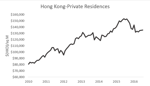
In late 2012 HK put a 15% tax on foreign property purchase. As you can clearly see in this chart.  (Average Price. 40 Square M to 69.9 Square Meters data source: HK Ratings and Valuations Department.)

Immediately following the imposition of the tax there was a decrease in the number of transactions but not a drop in prices.  A similar thing seems to have happened to Vancouver last month.  In Hong Kong, prices continued to rise for several years after the tax was implemented.

Obviously, there are differences between Vancouver and Hong Kong, but taken at face value this suggests that any immediate impact the tax will have on prices in the Vancouver Area are likely to be relatively mild.

Does 15% matter?

In order for the tax to impact demand for house prices, buyers will need to be scared off by higher prices. One of the defining characteristics of the Vancouver housing market over the last few years has been the reluctance of buyers to shy away from ever higher prices. A 15% increase for certain buyers sounds is a lot, but between 2015-and 2016 the benchmark house price in Vancouver increased by 30%. If previous price increases did not deter buyers it seems unlikely that this one will.

 The end of the Bubble?

Part of the goal of the tax was to help prick the housing bubble, giving speculators a chance to catch their breath and come to their senses. After the imposition of the tax, reports started to filter in of buyers walking away from deals. Home sales in August (the first month after the tax was implemented) hit a 4 year low. That said, the benchmark price, remained pretty constant, down just 0.1%. One month of data is not indicative of much, with the possible exception of uncertainty. It does seem likely that any potential impact will be seen first, in the number of transactions and only later, in the final selling price.

Vancouver real-estate remains very expensive, and overpriced by most conventional measures. It should be due for a correction.  I’ve been saying that for years now. If I just keep saying it, eventually I’ll be right.


Sources, References, and Further Reading:

http://www.bbc.com/news/world-us-canada-36956034

http://money.cnn.com/2016/08/02/real_estate/vancouver-foreign-property-transfer-tax/

http://business.financialpost.com/personal-finance/mortgages-real-estate/heres-why-vancouvers-property-tax-on-foreigners-wont-work

http://www.cnn.com/2012/11/13/business/hong-kong-property-tax/index.html

http://www.independent.co.uk/news/world/americas/vancouver-foreign-buyers-property-tax-houses-house-prices-canada-a7169801.html#gallery

http://wernerantweiler.ca/blog.php?item=2016-01-23

http://vancouversun.com/opinion/sherry-cooper-foreigner-property-tax-unlikely-to-improve-housing-affordability

http://www.cbc.ca/news/canada/british-columbia/vancouver-real-estate-house-prices-1.3564528

http://business.financialpost.com/personal-finance/mortgages-real-estate/reality-of-b-c-s-foreign-buyers-tax-begins-to-bite-as-realtors-report-deals-collapsing#188_1514005794_23035_-1_1470241353093

http://business.financialpost.com/personal-finance/mortgages-real-estate/north-americas-top-20-housing-markets-vancouver-the-most-expensive-on-continent-while-toronto-calgary-beat-new-york-city


[1] All dollar figures are Canadian dollars, unless otherwise noted.

What is the furthest airport you can get to (without stopping)?


Ever needed to get far away from your city of residence in a hurry? To assist in your escapes and escapades, I’ve created another long-airline-route related map. This one shows the furthest nonstop scheduled flight from the busiest 50 or so US airports.

You can view it in Tableau Public, here.

The destinations are largely what you’d expect. West coast cities tend toward Asia, east coast cities tend toward Europe, and smaller cities tend toward one of the US coasts. (Usually the west coast cities of San Francisco, Portland, or Seattle.) Seven airports (usually larger ones) have their longest route to one of the Middle Eastern hubs of Dubai, Abu Dhabi, or Doha.

A few special cases: Sacramento is the only airport with the longest nonstop destined for Hawaii, Dallas is the only one heading to Australia, and Atlanta is the only one going to Africa.

As the furthest airport from eight cities San Francisco is the most common destination. The most common international destinations are Tokyo-Narita and Hong Kong, each of which is the furthest destination from four US cities.  There is a fair number of diversity with most airports being the furthest route from just one US city. Often an airport will have one scheduled route to Asia or Europe, but the particular destination city varies from airport to airport.


NOTE: this post was corrected and data updated on Sep 5 2016.

“Furthest” is based on great circle distance not flight time, and route info is from Wikipedia. Corrections welcome.

For more on very far flights, see this post.

Where should you move if you want to qualify for the Olympics, but aren’t good enough?

olympic-rings-on-white


Earlier, I discussed what country gives you the best shot at qualifying for the Olympics. I suggested originating from a small country with a limited population. Based solely on number of Rio athletes per capita, the Cook Islands seem like a very good choice.

There is a problem with this plan, however. What if you were already born in a country with a large population of good athletes, and therefore will not qualify for the Olympic team of your home country.If you have some sort of dual citizenship, you might get two chances at this. Violinist Vanessa-Mae did something along these lines to compete in Alpine Skiing for Thailand. Vanessa-Mae, was born in Singapore and grew up in the UK, but her Father was from Thailand, so she could get a Thai Passport. She barely met the minimum standards to qualify for skiing, and since Thailand is not known for its skiing she had minimal competition.

If you fail to get on the Olympic team of the nation(s) of your citizenship, are you out of luck? Or can you gain citizenship somewhere else and try to get on their team. Where should you move, and how would do you it?

Even the weakest Olympic competitors are very good at whatever sport they do. So this will work best if you are an elite athlete who just fails to qualify for the Olympic Team. To be a member of an Olympic team you need to be a citizen of that country. So what we are looking for is a small country-so you don’t have too much competition, that also makes it easy for outsiders to become citizens. Fortunately, these are categories with some overlap.


To become a citizen, you have a few options:

  • Being born there (Going to skip this one)
  • Marry a foreign national. (Going to skip this one as well)
  • Citizenship through Ancestry. (You might have more options than you think, some countries (ex: Ireland) will let you become a citizen if you have a grandparent who was born there.
  • Citizenship through residency. If you live somewhere long enough usually you can get citizenship. Unfortunately, this is usually a long process.
  • Sometimes you can buy your way in, but citizenship ain’t cheap.
  • Some other special circumstances. Some countries (Ex: Singapore, Austria) allow the president or other government body to grant citizenship to anyone they deem worthy, regardless of other requirements. Of course, if you were a good enough athlete to get this kind of treatment, you probably could have qualified for your own country.)


If you can’t marry, ancestor, or somehow get yourself granted citizenship you are left with two bad options: Investment, or Residency. Fortunately, some countries are not nearly so painful as others, a selection of the best options are presented below.


Paraguay

Population: 6.7 Million

Number of Olympians at Rio: 11

Olympians per million people: 1.6


If you have your sights set on Tokyo 2020, but won’t qualify for the US team, and don’t have a small fortunate to spend on foreign citizenship. Paraguay might be your best option. Simply fly there, apply for residency (includes depositing $5000 in a bank account) live there for a few years. Apply for citizenship. Go to the Olympics. Easy.


Uruguay

Population 3.4 Million

Number of Olympians at Rio: 17

Olympians per million people: 4.9


To get Uruguayan citizenship before the Tokyo games you are going to have to involve your family. The minimum time an individual needs to spend as a resident before being eligible for citizenship is five years, but this is shortened for three years for families.


St Kitts and Nevis

Population: 56,000

Number of Olympians at Rio: 7.

Number of Olympians per million people: 124


You can get a St Kitts and Nevis passport without ever going there. Just give them a $250,000 donation or make an approved $400,000 real-estate investment. Plus some other fees and stuff. St Kitts and Nevis also has a tiny population so you are unlikely to face much competition in your Olympic bid. They do have a fairly strong Track and Field team (all of the Saint Kitts and Nevis Olympians have been runners) so you might want to try for other sports.

Dominica

Population: 73,000

Number of Olympians at Rio 2.

Number of Olympians per million people: 27


You can get citizenship to Dominca for a mere $100,000 donation, which makes it the cheapest legal citizenship currently available. You can also get it with the right sort of $200,000 real estate investment. The process will take a few months, but it doesn’t look like you have to spend any of that in Dominica.


Antigua and Barbuda

Population: 92,000

Number of Olympians at Rio: 9

Number of Olympians per Million people: 97.


While not as cheap as Dominica, it does offer citizenship from 250,000 donation/400,000 real estate.  It also has high rates of Olympians per Capita, much like St Kitts and Nevis.


If you have the money, all three of these citizenship by investment schemes seem like a good way to remove some of the competition from your Olympic bid. Uruguay and Paraguay, seem like possible options as well. As they are much larger countries you may have a considerably harder time making the local Olympic team.This might matter less if you are planning to compete in the Winter Olympics as both Uruguay and Paraguay have each only ever sent one athlete to the winter Olympics.


Would this actually work?

Consider the 2012 Winter Olympic team for the nation of Dominica. This team consisted of Angelica di Silvestri and Gary di Silvestri, a middle aged husband and wife pair, of cross country skiers who did not manage to finish, or in Angelica’s case start, the 15km event they had entered. The couple claimed they were given the Dominica citizenship due to their philanthropy, but it seems much more likely they simply bought it.


Sources, References, and Further Reading:

http://www.news-herald.com/article/HR/20140206/NEWS/140209426

https://www.sovereignman.com/lifestyle-design/the-truth-about-residency-and-citizenship-in-paraguay-4199/

http://nomadcapitalist.com/2015/07/27/the-fastest-countries-in-the-world-to-become-a-citizen/

https://en.wikipedia.org/wiki/Gary_di_Silvestri

http://cbiu.gov.dm/citizenship/

What is the best country to be from If you want to qualify for the Olympics?

olympic-rings-on-whiteWhile watching the world’s most expensive geography quiz on Friday night, I started to wonder about the question posed above. After an extensive but fruitless 30 seconds of googling things like “Olympic athletes per capita” I went ahead and made my own tables.


How does one qualify for the Olympics?

There are no hard and fast rules for qualifying for the Olympics. It varies from sport to sport and from country to country. Each country has a National Olympic Committee (NOC) which decides which athletes it will send. For athletics, each country is allowed a maximum of 3 athletes per event, and there is a minimum qualifying standard per event. If a nation does not have anyone who meets the request time-they are still allowed to enter one male and one female athlete.

To qualify for the marathon, one method is a top ten finish in any of the Gold Label Marathons. In this year’s most amusing qualification story, Michalis Kalomiris, a Greek lawyer and amateur marathoner happened to finish 8th in the Rome Marathon. He wasn’t trying to qualify for the Olympics and had not realized he had done so until he found his name on a track and field website.


Small is better

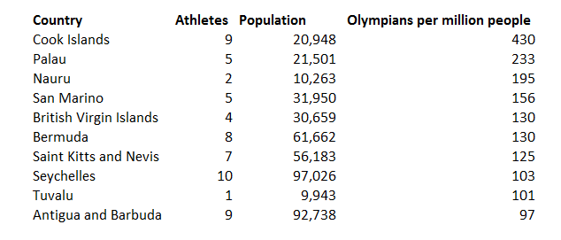
Basically, due to lots of different rules trying to make sure the Olympics have representatives from many countries, and not just a bunch of people from a few countries, you have a much better chance to make the Olympics if you are from a small country than a large one.  The countries[1] that have the most Olympians per capita are all islands[2] with populations under, sometimes well under, 100,000.small

In terms of countries with populations over a million, New Zealand, Estonia, Slovenia, Bahrain, and Jamaica have the most athletes per person.

nzandfriends
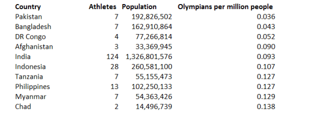
The counties with the fewest Olympians per person often have very large populations, or fairly large populations and low overall wealth.

big

While Olympic delegations do increase with the size of a nations population the effect isn’t that strong. The USA has the largest Olympic team at the 2016 Rio Games, but it only has 1.7 athletes per million people. This is just a bit higher than the global average of 1.59 Rio Olympians per million people on earth.

No Country?

New for this Olympics is a team composed of refugees. I used the UNHCR number of 65.3 million refugees to get the population for the refugee athletes. While becoming a refugee is likely not an ideal step to becoming an Olympic athlete. There are about 0.15 Olympic athletes per million refugees. Two of the refugee athletes, Yolande Mabika and Popole Misenga, are originally from the Democratic Republic of the Congo. A country with an even smaller ratio of Olympians per person. The DRC is one of 12 countries where a randomly resident is less likely to be an Olympian than a randomly chosen refugee is.


[1] Several of these are overseas territories or otherwise have some sort of quasi-nation status.

[2] Or San Marino. Which you can also count as an island, as long as you pretend that Italy is made entirely of water.

Which Unemployment Rate is the Best?

If you ever are at a party, and you stumble into a conversation that is quickly flatlining, you can always attempt to revive it by asking your fellow revelers the following question: “Which unemployment rate do you like the best?”

There are different unemployment rates?

The BLS keeps track of six different unemployment rates. Because the BLS (like most organizations whose names consist entirely of consonants) is not the most creative organization, these are called U-1, through U-6.

Plot

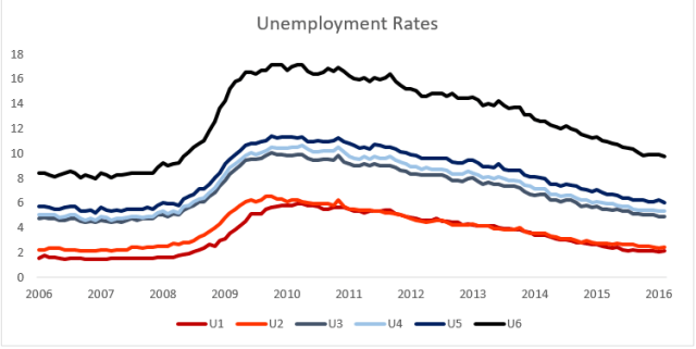
Here is a plot of the six different (seasonally adjusted) rates over the last decade. All of the rates follow each other fairly closely, so If one rate goes down, the others will almost certainly follow the same trend. There is substantial variation in terms of the absolute magnitude, and unemployment seems like an absolute magnitude worth caring about.

We should be interested in the unemployment rate for similar reasons as we are interested in the economy as a whole. However, the unemployment rate is not just an abstract index of the strength of the labor market. It is also supposed to be a meaningful measure in its own right. An unemployment rate of 5% should tell us that 5% of our labor force is unemployed. The different measures of unemployment differentiate themselves by counting different groups of people as unemployed or as looking for work.

The Different Unemployment Rates: 

U-1 = Persons unemployed 15 weeks or longer/The Civilian Labor Force.

Seasonally Adjusted Value- Feb 2016 = 2.1 Percent

The Civilian Labor Force

The group of people that gets counted as either employed or unemployed is summed up as the civilian labor force. This is everyone over 16, who is not in prison, or in the military, who is either employed or unemployed. To count as employed one needs to work any amount for pay or profit, to count as unemployed one needs to have not worked but be actively looking for work.

Some of the people who are not counted in the civilian labor force include: full time students, retirees, stay at home parents, and discouraged workers who have given up on finding a job. As of last count the civilian labor force was 158.9 Million, which is about half of the US population.

U-1 is the strictest measure of unemployment. Not only does one have to be unemployed, one has to have been that way for at least 15 weeks. This measure should capture the long term, chronically, or structurally unemployed.  This is the group of unemployed people who are unable to find work due to a fundamental disconnect between what they have to offer and what is needed by employers.

U-2 = Job losers and persons who completed temporary jobs/the civilian labor force

Seasonally Adjusted Value in Feb 2016 = 2.4 Percent

While U-2 tends to closely follow U-1 it is calculated in a different way. The BLS breaks down unemployed people into four categories based on what happened in their previous job:  Job Losers and persons who completed temporary jobs, Job Leavers, Reentrants, and New Entrants. U-2 counts only people in the first category, Job losers and persons who completed temporary jobs. These are people who have lost their jobs do to being fired or laid off, or people who have finished a temporary job and have not been able to find another one.  It does not count people who leave their jobs voluntarily, people who are reentering the labor force after a long absence, or people who are entering the labor force for the first time.

Both U-1 and U-2 are narrow measures of unemployment. They both try to emphasize the most damaging parts of unemployment. U-1 does this by counting only those people who have been unemployed for a significant period of time. U-2 does this by counting those people who recently had jobs, and were forced to leave them.

U-3= Unemployed/Civilian Labor Force

Seasonally Adjusted Value in Feb 2016- 4.9 Percent

Whenever someone in a news report mentions the unemployment rate they are talking about U-3. U-3 is by far and away the most commonly used measure of unemployment in the United States.  It is also one of the most straightforward to calculate. It is the number of unemployed people as a percentage of the total number of people in the labor force. Unlike U-1 and U-2, it does not make any further restrictions on which unemployed people to count. Everyone in U-1 and U-2 is also in U-3.

U-4= Unemployed + Discouraged Workers / Civilian Labor Force+ Discouraged Workers

Seasonally Adjusted Value in Feb 2016- 5.3 Percent

To count as part of the labor force, one needs to be working, or actively looking for work sometime in the last four weeks. Looking for employment can be a discouraging and unpleasant process, and some people give up when they cannot find employment.  People who have actively looked for work within the last 12 months, but have not looked recently due to economic conditions are counted as discouraged workers. These are people who feel (correctly or incorrectly) that there are no jobs available for them or no jobs that they would qualify for.

U-5= Unemployed + Marginally Attached Workers/ Civilian Labor Force + Marginally Attached Workers

Seasonally Adjusted Value in Feb 2016- 6.0 Percent

Discouraged Workers are a subset of people who are classified as marginally attached to the labor force. Marginally Attached Workers are workers who are available for work, who would like to work, and have sought employment within the last year (but not in the last 4 weeks). Unlike discouraged workers they do not need to have stopped looking for work due to economic conditions. This means that everyone in U-4 is also in U-5.

U-6 = Unemployed+ Discouraged Workers + Part time due to Economic Reasons/Civilian Labor Force + Marginally Attached Workers

Seasonally Adjusted Value in Feb 2016 = 9.7 Percent

The broadest measure is U-6. U-6 includes everyone in U-5 but also counts those people who are working part time due to economic conditions. These are people who are available to work full time, would like to work full time, but can only manage to find a part time job. There are a lot of these people, just under 6 million in Feb 2016, and they bump up the total value of U-6 to 9.7 Percent.  Because of its magnitude, U-6 tends to be the indicator of choice for people who would like to point out just how badly the labor market is doing.

Which Unemployment Rate is the Best?

At this point, a boring person would say that trying to figure out which unemployment rate is the best is a little silly. Each rate has its purpose and you should look at different ones (or even better at all of them) in order to get a full sense of the labor market picture.  This is true, but there is value in having an indicator you can turn to in almost all cases. Historically this has been U-3.

The Best Unemployment Rate is…

The best unemployment rate is the one that give us the most information about the strength of the labor market, while still being a real measure in its own right.  U-1 and U-2 are both too narrow for most purposes.  They really are designed to measure a subset of the unemployed and not the total unemployed population. U-3 is good, and has the added advantage of being what we are used to using and talking about. I prefer U-4. Adding in the discouraged workers gives a more accurate indicator of people who would think of themselves as unemployed. These are clearly people who are not working due to economic reasons, which is just the thing the unemployment rate is trying to capture. U-5 takes it a bit too far, everyone marginally attached to the labor force adds in a lot of people in a mess of different situations.

U-6 is interesting. The people who are working part time (especially if it’s just a few hours a week) instead of full time are surely suffering many of the negative effects of unemployment. The problem with U-6 is that it isn’t really an unemployment rate.  Once a good chunk of the people in an indicator are employed, even part time for economic reasons, it isn’t really an unemployment rate anymore. While U6 is a good indicator for the health of the labor market, it is not a good unemployment rate.

So that leaves us with U-4. Which wins the official PARTYSHEEPHATS nomination for best unemployment rate. Congratulations U-4! Go do whatever it is economic indicators do to celebrate. Go down or something.


Sources and Further Reading

http://www.economonitor.com/dolanecon/2013/09/16/what-does-the-broad-unemployment-rate-u-6-really-tell-us/

http://www.bls.gov/lau/stalt.htm

http://www.bls.gov/news.release/empsit.t15.htm

http://www.bls.gov/news.release/pdf/empsit.pdf

http://portalseven.com/employment/unemployment_rate_u1.jsp


ULTRA LONG-HAUL FLIGHTS

(The best part of this post is the map at the end)

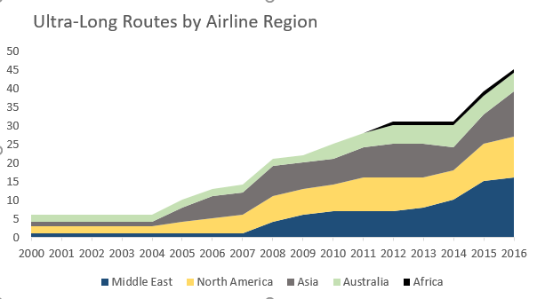
On March 2, an Emirates Airbus A380[1] landed in Auckland nonstop from Dubai. Dubai to Auckland is 14,200 km (8823 Miles) and takes 17 hours and fifteen minutes to fly. It is the longest nonstop route currently operating. There has been a spate of new ultra long-haul routes launched recently. The previous record holder-Sydney to Dallas/Fort-Worth on Qantas-was launched in 2014. None of these can match the all-time longest route, until 2013, Singapore Airlines flew a nonstop between Singapore and Newark that covered 15,345 km and took nearly 19 hours.

GRAPH

Number of Flights by Airline Region. Airline Region is the home country of the airline so Qatar is Middle East, Air Canada is North America, etc.

How Far is Ultra Long?

There is no official definition of what makes a flight count as “ultra long-haul”. For my purposes I’ve arbitrarily decided to call any flight over 12,000 km great circle distance as an ultra long-haul flight. This is a pretty high benchmark. Sydney to San Francisco doesn’t make the cut nor does Dubai to Rio de Janerio.

emirates_a380_full

Are Ultra Long Flights Sustainable?

Long distance flights require a lot of fuel to reach their destinations. All this fuel adds weight, this weight makes the airplane less fuel efficient, which requires more fuel. Fuel is essentially being used to carry around all the fuel that will be used later in the flight. For these reasons ultra long-haul flights are expensive to operate, and are very sensitive to changes in fuel prices and economic conditions.  Many of the longest nonstop flights ever offered, are no longer being offered.  These mostly include flights from Southeast Asia to the United States and Canada. Just a few years ago, one could fly from Singapore, Bangkok, and Manila nonstop to North America. Today you can’t[2].

Partially this is due to the aircraft that were used. These flights were operated with Airbus A340s which had a very long range, but used a lot of fuel. The Airbus A350-900ULR which is due to be delivered in 2018, would allow for Singapore Airlines to resume the longest ever scheduled flights.

One might question if the current crop of ultra long flights will be able to sustain themselves. The current low fuel prices and advances in aircraft will help, but there may not be many more economical ultra long-haul routes left to launch. Emirates was supposed to launch Dubai-Panama City earlier this year, but is delaying the start until the end of March.

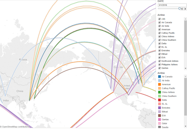
Map of Past and Present Ultra Long Haul RoutesMAP

What would be really neat is if there was a map that showed ultra-long-haul routes over time. You can view just such a map here.

Some Interesting Things:

  • The increase in flights from the Middle East three.
  • The rise and fall of flights from Southeast Asia to North America
  • Withdrawal of US Flights to the Middle East and India
  • Concentration of ultra long-haul  flights in a few cities: NYC, LA, Hong Kong, Dubai, Sydney
  • Increase in ultra long-haul flights over time.

Data and Sources

My flight data comes largely from this Wikipedia article, plus any other long haul routes that I could think of. If there are any AvGeeks who would like to point out that I forgot that MIAT Mongolian Airlines offered flights between Ulan Batar and Quito for several months in 2002, or anything else I may have overlooked, please leave a comment or send a tweet.

Flight distance data is from Great Circle Mapper.

It was difficult to find start dates for some routes and some route dates are imprecise. Date data comes from news articles, press releases, forums such as Flyertalk, airlineroute.net and other sources.

Great circle paths were done using the geosphere package in R, with help from this tutorial by Nathan Yau.


Additional Links

http://www.airbus.com/presscentre/pressreleases/press-release-detail/detail/airbus-launches-new-ultra-long-range-version-of-the-a350-900/

http://www.ft.com/intl/cms/s/2/689a1618-814d-11e5-8095-ed1a37d1e096.html#axzz43E0JLb6S


[1] This was just for fun. The route will typically be operated by a more reasonable 777-200LR.

[2] United is launching SFO-SIN nonstop later this year.


What is the Economy?

(AND SHOULD YOU CARE ABOUT IT?)

If you ever watch, read, or listen to something called “the news” you will likely hear people talking about “the economy.” People on the news might say that the economy is getting bigger or smaller, weaker or stronger. They might compare one economy to another, in rather the same way they compare the polling results of presidential candidates. Listening to all of this, one begins to see the economy as an almost living thing. Nor is it a particularly sensible one. It has spells where it gets all sluggish and depressed or irrationally exuberant. The whole thing can seem both random and distant, and you reasonably might wonder if you should care.

WHAT IS THE ECONOMY?

Usually when people talk about the economy they do so in terms of one of a few numbers. The most common one is Gross Domestic Product (GDP). GDP measures all of value of the final output produced in a place in a period of time.  If you add up all the goods and services produced in the United States and subtract the goods and services spent in their production, you get a number, in 2015 this number was just shy of 18 trillion dollars.

Fortunately, this is not a post about the GDP, so we don’t need to worry about how exactly this number is calculated, or how it could be calculated better, or what other numbers one might use instead. The important thing is what is attempting to be measured-the value of everything produced in a country. If you read most definitions of “economy” you will usually read something like this. The economy is the value of everything produced in a society, or the ability of a society to produce valuable things, or something like that.

While GDP and the economy are often talked about as being synonymous the GDP is only one measure of the economy.  A change in the methodology of calculating the GDP will change the GDP numbers, but does not change the real situation. Hopefully any methodological changes to GDP would bring it more in line with the real thing it is trying to measure.

THE ECONOMY IS NOT A THING


We tend to talk about the economy as a singular thing. It isn’t.  It is better thought of as a summation and aggregation of many things. When you hear “the economy grew by .4% in the fourth quarter” you should not think about one vague thing changing, but many concrete things changing. There might have been more cars produced, less tax accounting done, and about the same amount of pies and cookies baked.  Since we can measure each of these things in terms of their dollar value, we can add them all up and come up with a sort of aggregate that we call ‘the economy’.

TheEconomy

The Economy

SHOULD YOU CARE ABOUT THE ECONOMY?

No one, with the possible exception of some economists, should care about the economy in and of itself. That said, the economy does have an influence over things that most people do care about. The first is the wealth and livelihood of yourself and your friends and family. For this, nationally reported measures such as GDP growth or unemployment rates are likely to be mediocre indicators.  You should probably pay them some mind, but in the context of your own situation.  You likely already know what your own economy looks like. You know if it looks weak or strong, if your wealth is likely to increase or decrease. Depending on who you are, your own economy might follow the larger economy closely or not at all.

This is fine as far as you are concerned, but what about everybody else. What if you care about how everyone else in your society is doing?

If you care about the well-being of your fellow members of society, you will likely want to pay at least some attention to their economic and financial situations.  The aggregate of everyone’s individual economic situations is not vaguely correlated to the economy, it is the economy.

A desire to see how everyone is doing is why we started measuring the economy in the first place.  During The Great Depression, there was a sense that things weren’t working very well, but there was no way to really capture the whole of what was going on, to see if things were getting better or worse. In response to this the government started measuring National Income, which would later be replaced by Gross Domestic Product.

At a fundamental level, economic well-being tends to gives people choices, and a lack of wealth takes away choices. You should care about how the economy is doing, not because we like bigger numbers on our GDPs, but because we like more people to have more and better choices about how they live their lives.


Should We Get Rid of the $100 Bill?

In the past few days I’ve seen several articles about the elimination of high denomination bills. Lawrence Summers suggests a moratorium on high denomination notes, and cites this paper by Peter Sands which argues the benefits of removing high denomination notes. I found it interesting, and have used it as the primary source for what follows.

7643873724_f0c02e023f_z

A Picture of Some Money. Image Source:ptmoney.com


Who uses high denomination notes?

No one will be surprised that the most common dollar bill is the $1. You likely have some of the 11.4 billion $1 bills currently in circulation in your wallet right now. What is likely not in your wallet is the second most common bill-the $100. There are nearly as many $100s as there are $1s. In terms of the monetary value, the $100 bill kills it, with about 80% of the all the value of cash coming from $100 bills.

Despite this prevalence, almost none of us use $100 bills in our daily lives. If we need to spend a bunch of money, we reach for our Visa or MasterCard instead. This is better. It gives us an electronic record of the transaction, removes the necessity and stress of carrying large amounts of cash, and might even give us some frequent flyer miles.  So if most people aren’t using $100s to buy things, who is?

A huge chunk of the $100s are outside of the United States, but estimates of what percentage that “huge chunk” is very widely between 25% and 75%. High denomination notes are attractive to the sort of people who do not want to keep their money in the formal banking system. This could because they do not trust their local banking system or currency, or it could because the money has been attained illegally. The people who really benefit from high denomination notes are those people who need to move very large sums of money (think millions of dollars) without the banking system.

Cash is particularly attractive to drug trafficking organizations, because they deal with large sums of money, and because they often have to move that money across international borders. In the largest drug cash seizure so far, $205.6 Million was seized by the Mexican government, virtually all of it was in genuine $100 dollar bills.  In 2010, currency exchanges in the UK stopped selling the €500 note due to their prevalence in crime. At the time, it was estimated that 90% of all the €500 euro notes in the UK were in the hands of organized crime. Some denominations continue almost exclusively in the hands of criminal organizations. The Canadian $1000 bill was discontinued in 2000 following a request from the RCMP, but about a billion Canadian dollars’ worth remain in circulation, essentially all in the hands of criminal organizations. High denomination notes make it easier to store money in cash, which helps with tax evasion, they also make it easier to engage to bribery.
Since cash must be physically transported, usually in a clandestine manner, there are benefits to using as a high a denomination as possible. A million dollars in $20 Bills weighs about 110lbs and takes around four briefcases. As anyone who has ever smuggled a million dollars in 20s through an airport[1] will tell you, that is an irritatingly cumbersome burden. Much better to take the million dollars in 100s where it will weigh only about 22lbs and could fit in a single briefcase, better still to take it in €500 euro notes where it would weigh just a few pounds and you could easily fit into the sort of bag the qualifies as a ‘personal item’ on Spirit Airlines.

euro-note-1205315_640

A different picture of money

What notes should we get rid of?

Most high denomination notes are from the major rich country currencies. The two most popular notes in terms of illegal activity are the US $100 bill and the €500 bill.  These are attractive due to their high value, and the widespread use and acceptance of euros and dollars.

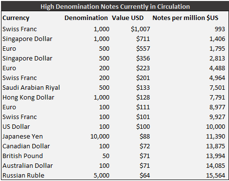
Here is a list of most of most of the world’s highest denomination bills currently in circulation[2].

HDNotesTable

While there are higher value notes, the €500, €200, €100, and $100 notes are probably the notes that would have the biggest bang for buck (as it were) in making life more difficult for criminal organizations. However, eliminating high denomination notes of all currencies would be useful. Pretty much everywhere, high denomination notes are not widely used by the general population. The exception to this might be cash-centric Japan where the ¥10,000 note is used in normal transactions.

Arguments for retaining high denomination notes 

Legitimate Use

There are two basic situations where law abiding folks might want to have large denomination notes. One is storing money “under the mattress” or somewhere that is not a traditional bank account.  Even when this is not being done as a method of tax evasion, which is often the case, this does not seem a compelling reason to keep these notes. Unless one is storing many millions of dollars, storing it in 20s is not that much less convenient than storing it in 100s. I imagine that the number of people who are storing millions of dollars in legally acquired cash to be trivially small.

Another argument for legitimate use is that large denominations come in handy in emergency situations where normal financial systems do not work properly. This is especially true for refugees who will need to transport as much money as they can in some form of cash.  I do not know how much money the typical refugee travels with, but I would guess that it is not the sort of quantity that would be prohibitive to carry in $20 or $50 notes.  Wealthier refugees who would have large amounts of money to transport (a small minority) might also have more options about how they transport their wealth.

Seigniorage

Seigniorage is the amount that a government makes from printing money. Central banks typically define this as the interest from bonds received from issuing new banknotes, minus the cost of making the banknotes in the first place.  Nothing of value is created in this process, but it does give the government a convenient revenue stream.

This ends up being a lot of money, especially for the United States. The seigniorage on US $100 bills is worth around $23.1 Billion annually. This number is directly related to two things: the amount of currency in circulation and interest rates.

Removing the $100 bill would not get rid of all of this 23.1 Billion, much of it would be replaced by seigniorage on $20 Bills or other smaller denomination notes. Exactly how big the end result would be is tricky to estimate, but something in the nature of $6 Billion is a reasonable guess[3]. That is a lot of money. However, the net impact of eliminating $100 bills would not be that great. Some of this will likely be offset by increased tax revenue as the cost of using cash transactions to hide taxable income increases.

It is also worth considering who is paying these billions of dollars. if the primary users of the $100 bill are people engaged in shady activity outside of the US, then the US government receiving money to essentially help facilitate these transactions seems questionable at best.

Lastly, there is the issue of interest rates. Seigniorage is most valuable when interest rates are high. At the moment they are not. If interest rates are negative, hording large quantities of cash becomes an increasingly attractive idea. Why pay a bank to hold your cash when you can do it for free? Due to the very low interest rates that currently prevail, seigniorage is less beneficial than it has ever been.

Effectiveness

Finally, there is the simply issue of efficacy. Will the removal of high denomination notes actually make things tougher on the worlds criminals?  No one is suggesting that criminals will give up being criminals just because they can’t get large bills, but would it have any effect at all? There are lots of things that are easily transferable, anonymous, and valuable. Gold or diamonds are certainly possibilities, as are things like bitcoin.  While all of these are substitutes, they have their disadvantages: gold is heavy, diamonds are hard to spend, and bitcoin is volatile.

So far, cash has been preferred over these items. The best substitute for cash, has been different cash. In 2010 when the UK decided to restrict the use of the €500 bill, a 2012 report found that there was “a smooth transition by criminal organizations from use of €500 note to €200 note and high denominations banknotes in other currencies (particularly the $100 Bill).” This strongly reinforces the idea that for eliminating high denomination notes to be an effective irritant for criminals, there needs to be a multinational effort to eliminate as many of them as possible.

High denomination foreign notes as an alternative to a local currency or banking systems

In parts of the world where there is little trust in the local currency, local banking system, or both, foreign currency is often seen as a way to securely store wealth. This partially explains the large amount of US cash that is overseas. This is a mixed blessing. It’s nice in that it allows people an alternative to a broken system, but in doing so slows the motivation to fix that system. This is especially true for the nations elites who have both the greatest power when it comes to motivating policy change, as well as best access to foreign currency.  As with the refugee case, unless one is regularly transporting very large amounts of money, storing wealth in 20s or 50s is not that much more annoying than storing it in 100s.

Sentimental Reasons

I like hundred dollar bills.  They are one of those special sort of things. Rather like an expensive car or a fancy drink, they make you feel like you are living a more exciting life just by being near them. There is this sort of wonder of having a relatively large sum in such a compact and easily spendable package. While I am in favor of their elimination on practical grounds, I will be a little bit sad if they go.

I support a multinational effort to get rid of high denomination notes

Getting rid of high denomination notes is a pretty cheap policy.  it is clear that the legitimate uses of these notes are far overshadowed by the illegitimate ones. Moreover, the legitimate users that are harmed the most are the ones with the most money. These people will likely find the loss of high denomination notes annoying, but nothing more.

It is true, that the impact on any particular criminal enterprise will likely be slight, but this is a broad policy. Raising the costs of the major drug cartels and terrorist groups by even a percentage point or two could have a significant impact globally, given the scale of these operations. Combine this with even a slight reduction in tax evasion and the benefits are pretty compelling.

Additionally, there has never been a better time to do this. Improvements in electronic payments, mobile banking, and other alternatives to cash have made cash less important generally. Low interest rates mean seigniorage is less valuable than it has been in the past. We should do this, the sooner the better.


[1] It looks like people do actually smuggle large amounts of cash through airports. Though, they usually are a bit sneakier than just shoving it into their carry-on.

[2] The previous champion the 10,000 Singapore dollar note was scrapped in 2014 to prevent money laundering

[3] This is Peter Sand’s guess, it is arrived at by taking 23B, assuming that 75% of the value will be replaced by $20s and other lower denomination notes. 24B*0.75 =18B and 24B-18B=6B.

Sources and Further reading:


ARE LOW GAS PRICES HURTING THE ECONOMY?

I always thought that the relationship between American economic growth and gas prices was a pretty straightforward one. High gas prices were bad for the economy and low gas prices were good for it[1]. It was pleasingly simple.

So when I googled “gas price economy” and saw a first page of results that consisted of things like “Gas Prices under $2 per gallon wreak havoc on economy, and “The Downside of Low Gas Prices” I felt more than a little perplexed, what was wrong with the story I’d always heard?

Thanks largely to a supply glut, the average gas price in the United States is right around $2.00 a gallon. This is cheaper than it has been in a while. It seems natural that having to spend less on gas would give Americans some extra money which they could spend on other things, and equally natural that this additional spending would give the economy a nice boost.

There are certainly some economic actors who suffer from low gas prices. The oil industry and the industries that work with it are the hardest hit.  US oil industry employment is down eight percent since October 2014[2]. This negative impact is greater than it used to be, as energy’s share of the US economy has been steadily increasing. The decrease in gas prices has had a disproportionately negative impact on the sorts of places that produce oil. In the US, this is places like Texas, Louisiana, Alaska, and the northern plains states.  Fall in revenue from oil companies hurts taxes, jobs, investment and other forms of economic activity.

A fall in oil prices is a genuine bummer for a lot of people. For the vast majority of us, who do not work in the oil business, it is a boon. Falling gas prices saved the average American $659 in 2014. This money not spent at the pump is usually spent elsewhere, and this additional consumption is historically thought to boost economic activity by something like 0.15-.25% per a 10% drop in real oil prices.

To determine the overall impact of a change in gas prices, one needs to calculate the amount of extra consumption by gasoline consumers and subtract out the amount lost by producers. Unfortunately, this simple calculation isn’t so simple to actually do. There are a lot of difficult variables, necessary assumptions, and complicated feedback loops that are tricky to untangle. An EIA economist roughly calculated (in his own independent research) a net impact of around zero, with the possibility that the decline in oil prices could hurt the American economy. A Credit Suisse team attempted to calculate the current aggregate benefit to the US and global economies and came up with numbers around zero for the net impact to US growth.

The economic benefit of cheaper gas prices comes in the form of this increased consumption. For this to happen, consumers have to go out and actually spend the additional money they have received. In aggregate, consumers have elected to save instead of spend. In the last quarter of 2015 the savings rate was 5.4%, the highest it has been in three years[3].  This increased savings rate has given commentators ample opportunity to express skepticism about the benefits of cheaper gas prices in terms of consumer spending.

It is worth being wary of such skepticism. A nifty report from the JP Morgan Chase Institute uses recent credit and debit card data to conclude that Americans spend around 80 cents of every dollar they would have spent on gas. This is a fairly high estimate, and provides evidence that Americans are actually spending their cheap oil windfall, just as we would have predicted them to.

Most observers, myself included, stick to the conventional wisdom that falling oil prices are a boost to the American economy. One cannot just look at high savings and weak economic growth in the fourth quarter and conclude that the fall in oil prices has had no effect. It is likely, that without the recent fall in oil prices the economic outlook would be bleaker still.

Gas prices certainly affect the economy, but the economy also affects gas prices. It is important to remember that gas prices are as much of indicator of economic health as they are a source of it. One reason gas is so cheap right now is fear of relatively slack global economic performance, and therefore energy demand, especially in places like China.

In some reporting, the three big economic stories: cheap gas prices, weak economic growth, and writhing financial markets often get lumped together in ways that imply a misleading causality. This story is a pretty good example of that sort of reporting. Despite some of the headlines, the net effect of falling oil prices is probably still beneficial to the economy.  Falling gas prices are good for the economy is not an interesting news story, but it probably remains the truth.

[1] Good for the economy. There are certainly downsides, especially environmental ones, to low gas prices.

[2] http://www.bloomberg.com/news/articles/2015-10-07/four-ways-the-oil-price-crash-is-hurting-the-global-economy

[3] http://www.economist.com/news/finance-economics/21689741-slower-consumer-spending-dragged-down-growth-americans-are-flush